Lesson 1: The Building Blocks of All Charts
Learning Objective: By the end of this lesson, you will be able to:
- Grasp how the human visual system functions and its role in interpreting charts, including common cognitive biases that affect our perception of visual information.
- Identify the key building blocks of the most common data visualizations including heatmap tables, bar charts, pie charts, line charts, histograms, scatter plots, and maps.
- Understand how the four common data scale types map to visual traits like length, size, and color to enhance clarity and accuracy in data presentation.
- Critically assess the effectiveness of different visual representations of data.
Knowledge Check
Click the accordions below to expand the question and answer.
Question

What concept is being demonstrated in this image, where the yellow circle on line A stands out compared to the gray circle on line B?
a. Magnitude Channel
b. Identity Channel
c. Optical Illusion
d. Pop-out Effect
Answer
d. Pop-out Effect
The Pop-Out Effect
The “pop-out effect” happens when a particular visual element in a data visualization instantly grabs attention because of a distinctive feature, such as its color, shape, or size. This effect enables our visual system to quickly and easily recognize the standout element, directing our focus to it almost instinctively. When used effectively in data visualization, the pop-out effect helps ensure that critical information is immediately noticed, allowing viewers to concentrate on the most important data with minimal effort.
Basics of Visual Perception
As light enters our eyes, our brain processes it into images, allowing us to recognize patterns, shapes, and colors. However, our visual system, while highly sophisticated, is not infallible. It can be easily deceived by optical illusions and overly complex visuals, leading to misinterpretations of what we see.
For example, when we look at this solid-colored rectangle placed against a gradient background, our brain might interpret it as also having a gradient, even though it’s uniformly colored. This is because our perception is influenced by the surrounding colors and shapes, causing the rectangle to appear as though it changes in tone from one side to the other. Such visual tricks highlight the limitations of our perception and remind us that what we see is not always an accurate reflection of reality.


These visual processing quirks can pose challenges, especially in data visualization, where clarity and accuracy are paramount. If the visual elements of a chart or graph are too complex or misleading, they can lead to incorrect conclusions. This underscores the importance of designing visuals that align with our brain’s natural processing capabilities. Recognizing these limitations in our visual perception is the first step toward mastering data interpretation.
The Building Blocks of Charts
Every chart, regardless of its complexity, is built from three essential components: variables that fall into different scale types, the visual marks that represent data, and the encodings that modify these marks. When these elements come together, they form a complete chart.
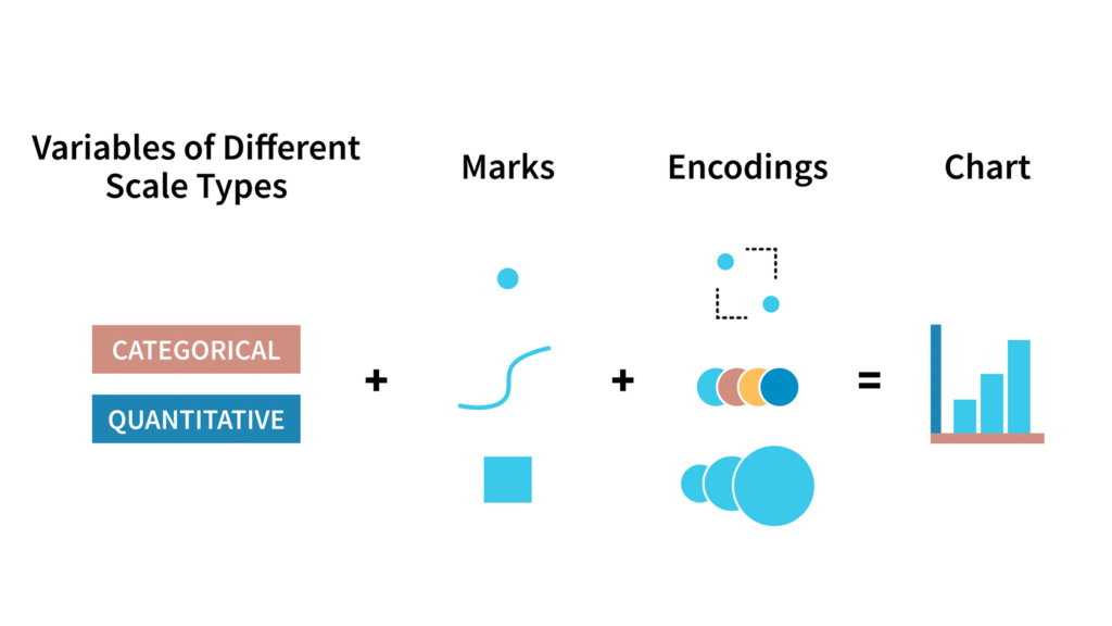
Click through the tabs below to explore these components in more detail.
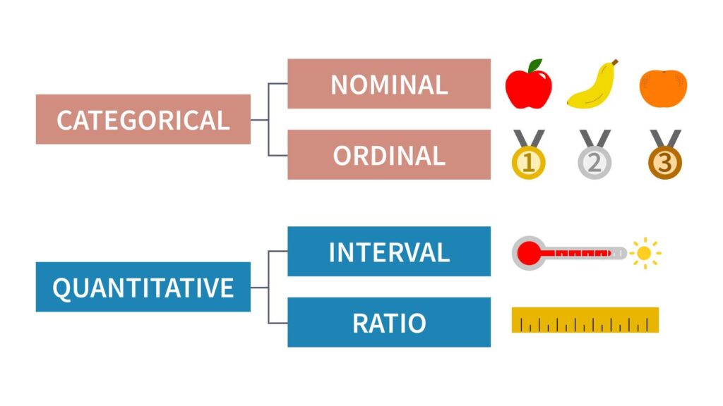
Variables are the characteristics tied to each data point in a chart. These variables fall into two main categories: categorical and quantitative.
- Categorical variables can be either nominal or ordinal. Nominal variables classify data into groups without any specific order—like different types of fruit. For example, whether an apple is listed before or after a banana doesn’t affect the meaning, as there’s no inherent ranking between them. On the other hand, ordinal variables have a defined sequence, such as medal rankings. Listing them as silver, bronze, and gold wouldn’t make sense because their order is significant.
- Quantitative variables, on the other hand, are numerical and can be further divided into interval and ratio scales. Interval scales maintain equal intervals between values but lack a true zero point, as seen with temperature in degrees Fahrenheit. Here, zero doesn’t signify the absence of temperature but is merely a reference point. Ratio scales, however, have both consistent intervals and an absolute zero, making them ideal for measuring quantities like length or counting items.
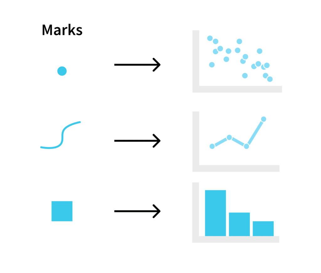
Marks are the basic shapes or symbols—such as points, lines, or areas—that represent data within a chart. They are the building blocks that transform raw data into a visual format that can be easily interpreted.
For instance, when you look at a scatter plot, the individual dots represent the data points; in a bar chart, it’s the bars that convey the information. The specific type of mark chosen for a chart depends on the nature of the data being presented and what the chart aims to communicate.
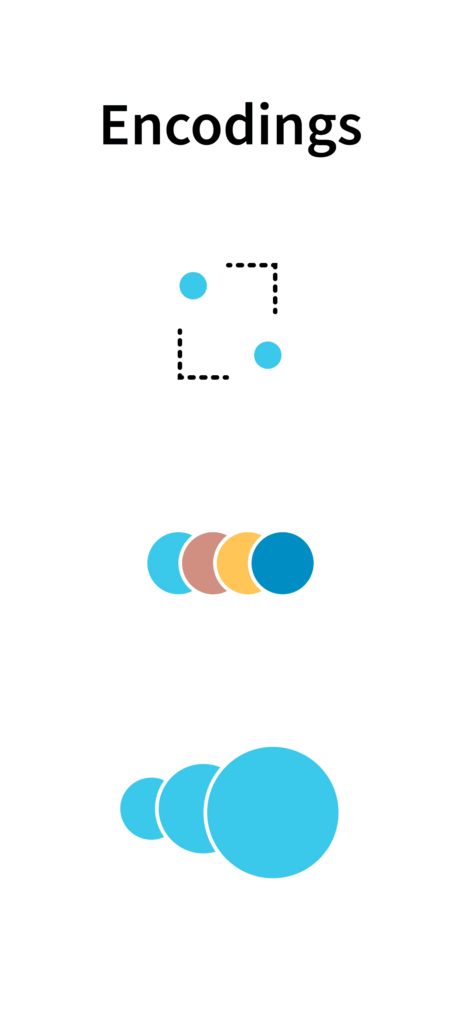
Encodings are the ways in which data is visually represented through the modification of marks in a chart. They are the visual attributes—such as position, color, size, or shape—that are applied to marks to convey additional information. For example, in a bar chart, the height of the bars (an encoding) represents the value of the data. Encodings are crucial because they determine how effectively a chart communicates its underlying data. By choosing the right encoding methods, you can make your visualizations clearer, more accurate, and easier for viewers to interpret.
Knowledge Check
Click the accordions below to expand the question and answer.
Question
Fill in the blanks:
In a chart, _____ are the visual elements like points, lines, or areas that represent data, while _____ are the modifications to these elements, such as color, size, or position, that convey additional information.
a. marks, encodings
b. encodings, marks
Answer
a. marks, encodings
How to Pick an Effective Encoding
This idea of marks is part of a broader framework outlined by Tamara Munzner, a renowned expert in the field of data visualization. Munzner’s work delves into how different marks and their associated encodings can vary in their effectiveness, depending on how they align with our natural visual perception.
Munzner categorizes the ways data can be encoded into two primary types: magnitude channels and identity channels.
- Magnitude Channels are used to represent ordered data, like quantities. These channels include attributes such as position on a common scale, length, and area. For example, using length to represent a value in a bar chart is a magnitude channel, as it visually conveys the magnitude of the data.
- Identity Channels are used for categorical data, helping to differentiate between categories without implying order. Examples of identity channels include color, shape, and spatial region. In a pie chart, different slices might be colored differently to represent various categories, relying on color as an identity channel.
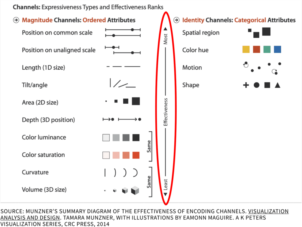
Munzner’s framework also introduces the concept of Effectiveness Ranks, which help us understand that not all marks and encodings are created equal. Some methods are inherently more effective at conveying information in a way that aligns with how our brains naturally process visuals. For instance, using position along a common scale is considered one of the most effective ways to encode data because it allows for precise comparisons. On the other hand, using color saturation to represent quantitative differences is less effective because it’s harder for our visual system to accurately assess those differences.
In the four images below, you’ll see different encoding methods in action, ranked from least to most effective, from left to right. The first image uses color saturation to represent two data points, one of the least effective methods, making it hard to determine how much larger value A is than value B. The second image uses 2D area, which makes the comparison slightly easier but still not precise. The third image uses position along a common scale, allowing us to easily see that value A is about three times larger than value B. The fourth image combines all three methods—color saturation, 2D area, and position along a common scale—emphasizing the difference between value A and value B.

As we continue to explore different types of charts throughout this course, Munzner’s effectiveness ranks will serve as a crucial guide. By understanding which marks and encodings are most effective, you’ll be better equipped to select the appropriate visual elements for your data, ensuring that your charts are both clear and impactful. This knowledge will help you create visualizations that not only look good but also communicate information accurately and efficiently.
Knowledge Check
Click the accordions below to expand the question and answer.
Question
Which of the following best describes the difference between magnitude channels and identity channels according to Tamara Munzner’s framework?
a. Magnitude channels represent categorical data, while identity channels represent ordered data like quantities.
b. Magnitude channels are used for ordered attributes such as quantities, while identity channels are used to differentiate between categories without implying order.
c. Magnitude channels focus on color and shape, whereas identity channels focus on size and position.
d. Magnitude channels are less effective at conveying information than identity channels.
Answer
b. Magnitude channels are used for ordered attributes such as quantities, while identity channels are used to differentiate between categories without implying order.
Key Terms & Definitions
Hover over each card to flip it over and reveal its definition.
Categorical Variables
Variables that categorize data without implying any numerical value. They can be nominal, where there is no inherent order (e.g., types of fruit), or ordinal, where there is a specific order (e.g., medal rankings).
Effectiveness Ranks
A concept from Tamara Munzner’s framework that ranks different encoding methods based on their effectiveness in helping viewers understand data. Some encodings, like position on a common scale, are more effective at conveying information than others, such as color saturation.
Encodings
The visual modifications applied to marks, such as color, size, position, or shape, that convey additional information about the data.
Identity Channels
Encoding methods used to represent categorical data, helping to differentiate between categories without implying order. Examples include color, shape, and spatial region.
Interval Scale Variables
A type of quantitative variable where the intervals between values are consistent, but there is no true zero point (e.g., temperature in degrees Fahrenheit).
Magnitude Channels
Encoding methods used to represent ordered data, such as quantities. These include attributes like position on a common scale, length, and area.
Marks
The visual elements in a chart, such as points, lines, or areas, that represent data. Marks are the building blocks of any data visualization.
Nominal Scale Variables
Nominal variables are categorical variables that classify data into distinct groups or categories without implying any order or rank. Examples include types of fruit, colors, or countries. Each category is mutually exclusive, and there is no inherent sequence among them.
Ordinal Scale Variables
Categorical variables that not only classify data into distinct groups but also imply a specific order or rank among the categories. However, the intervals between the categories are not necessarily equal. Examples include education levels (e.g., high school, bachelor’s, master’s) or satisfaction ratings (e.g., dissatisfied, neutral, satisfied).
Pop-Out Effect
A phenomenon where a specific visual element within a data visualization stands out immediately due to a unique property, such as color, shape, or size, making it easier to identify and focus on key information.
Quantitative Variables
Variables that measure quantities and can be further divided into interval and ratio scales. Interval scales have consistent intervals but no true zero (e.g., temperature in degrees Fahrenheit), while ratio scales have consistent intervals and a true zero point (e.g., length or count).
Ratio Scale Variables
A type of quantitative variable that has consistent intervals and a true zero point, allowing for meaningful comparisons of absolute quantities (e.g., length, weight).
Variables
The attributes or characteristics associated with each data point in a dataset. Variables can be categorical (nominal or ordinal) or quantitative (interval or ratio).
Further Learning
If you’d like to further your learning of the topics covered in this lesson, here are some resources for you to explore:
- Book: Visualization Analysis and Design. Tamara Munzner, with illustrations by Eamonn Maguire. A K Peters Visualization Series, CRC Press, 2014.
- Book: Mind in Motion: How Action Shapes Thought, by Barbara Tversky
- Article: “A Mathematical Theory of Communication” by Claude Shannon
- Blog Post: Vision: It All Starts With Light, BrainFacts.org
- Blog Post: “Data Types, Graphical Marks, and Visual Encoding Channels” by Jeffrey Heer, on Observable HQ Visualization Curriculum
- Research paper: “Graphical Perception and Graphical Methods for Analyzing Scientific Data” by Cleveland & McGill (Aug 1985)
- Research paper: “Attention and Visual Memory in Visualization and Computer Graphics” by Christopher G. Healy and James T. Enns (July 2012)
- YouTube Video: Stanford Seminar – Mind in Motion: How Action Shapes Thought, by Barbara Tversky
- YouTube Video: Data Literacy Whiteboard #001 – The Four Data Scale Types
- YouTube video: “Playfair Data Presents: Preattentive Attributes”