1.5 Effectiveness of Encodings
Topic Summary
As we learned in Topic 4, we have to first establish that a visual encoding follows the expressiveness principle, and shows all of, and only, the information contained in the data itself – nothing more, nothing less. In Topic 5, we’ll focus on the next step which is determining whether the visual encoding is effective for our purposes or not. There are many ways to determine effectiveness of encodings and we will review several examples in this topic. Ultimately, a chart is effective if it accomplishes what it was intended to accomplish, so long as the intended goal is ethical. And different situations will call for different criteria to be used.
Key Points to Remember
- A chart is effective if it accomplishes what it was intended to accomplish, so long as the intended goal is ethical. Achieving an unethical goal (e.g. misleading an audience with a purposefully deceptive chart) won’t be defined as “effective”. Different situations will call for different criteria to be used to gauge a chart’s effectiveness.
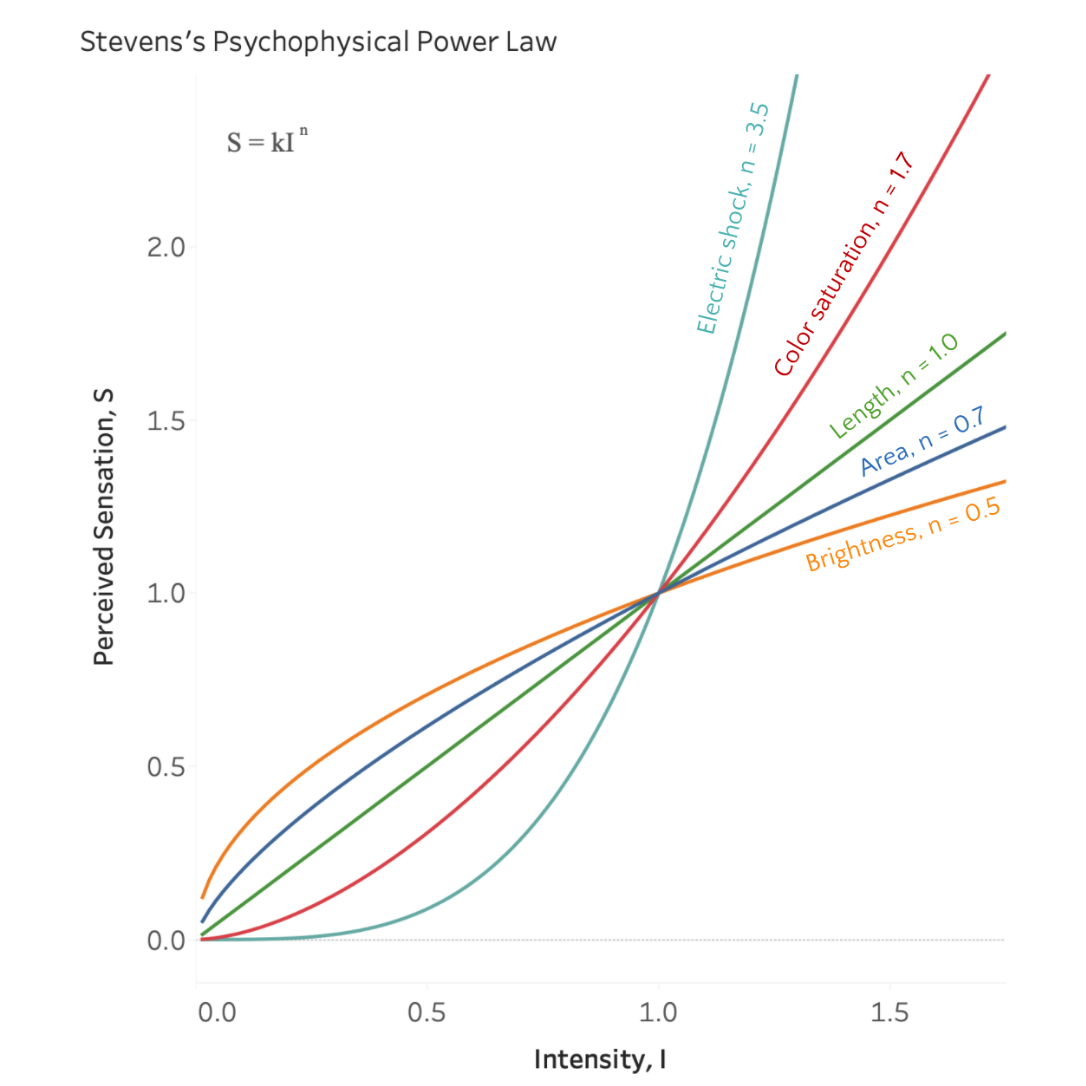
- Stevens’s Psychophysical Power Law, conceptually depicted in figure below, shows that as the intensity of various physical stimuli are increased, our perception of the degree of increase is different for different stimuli. We perceive some stimuli (like electric shock or color saturation) to increase more than they actually do. We perceive other stimuli (like brightness or area) to increase less than they actually do. And we perceive LENGTH to increase in direct proportion with its actual increase. This is a big reason why bar charts are so common and useful.
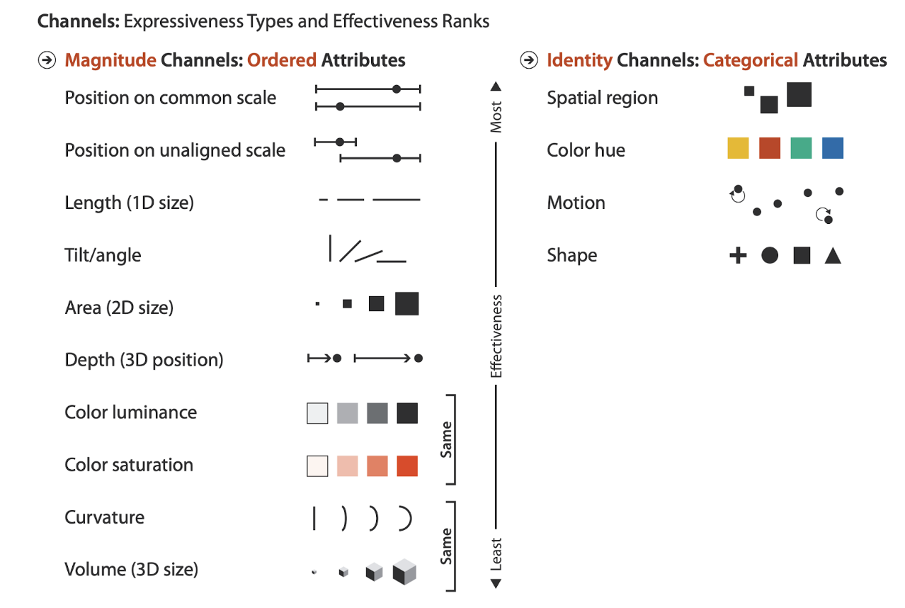
- Different encodings have different levels of effectiveness in terms of our ability to use them to make accurate comparisons. In Tamara Munzer’s diagram (2nd figure below), the encoding channels that tend to result in higher accuracy judgments are at the top of the list, and ones that tend to involve less accurate judgments toward the bottom of the list. Notice the vertical “Effectiveness” axis in the center of the diagram. This diagram will be referenced throughout the course and thus it’s important to understand this diagram well.
- The effectiveness principle is a helpful rule of thumb that states that, in general, we should use encoding channels toward the top of the list for variables that are the most important to us in a particular situation. Ultimately, it really matters what is most important to you (what you want to highlight) that will dictate the best type of chart or encoding for you to use.
Definitions
- magnitude channels – suitable for encoding quantities and ordered variables (ordinal, interval and ratio scale). Suitable channels for encoding magnitudes are listed on the left hand side of Munzner’s diagram below.
- identity channels – suitable for encoding unordered categories (nominal scale). Suitable channels for encoding identities are listed on the right hand side of Munzner’s diagram below.
Diagrams

Stevens’s Psychophysical Power Law

Munzner’s summary diagram of the effectiveness of encoding channels
Visualization Analysis and Design. Tamara Munzner, with illustrations by Eamonn Maguire. A K Peters Visualization Series, CRC Press, 2014
Exercises
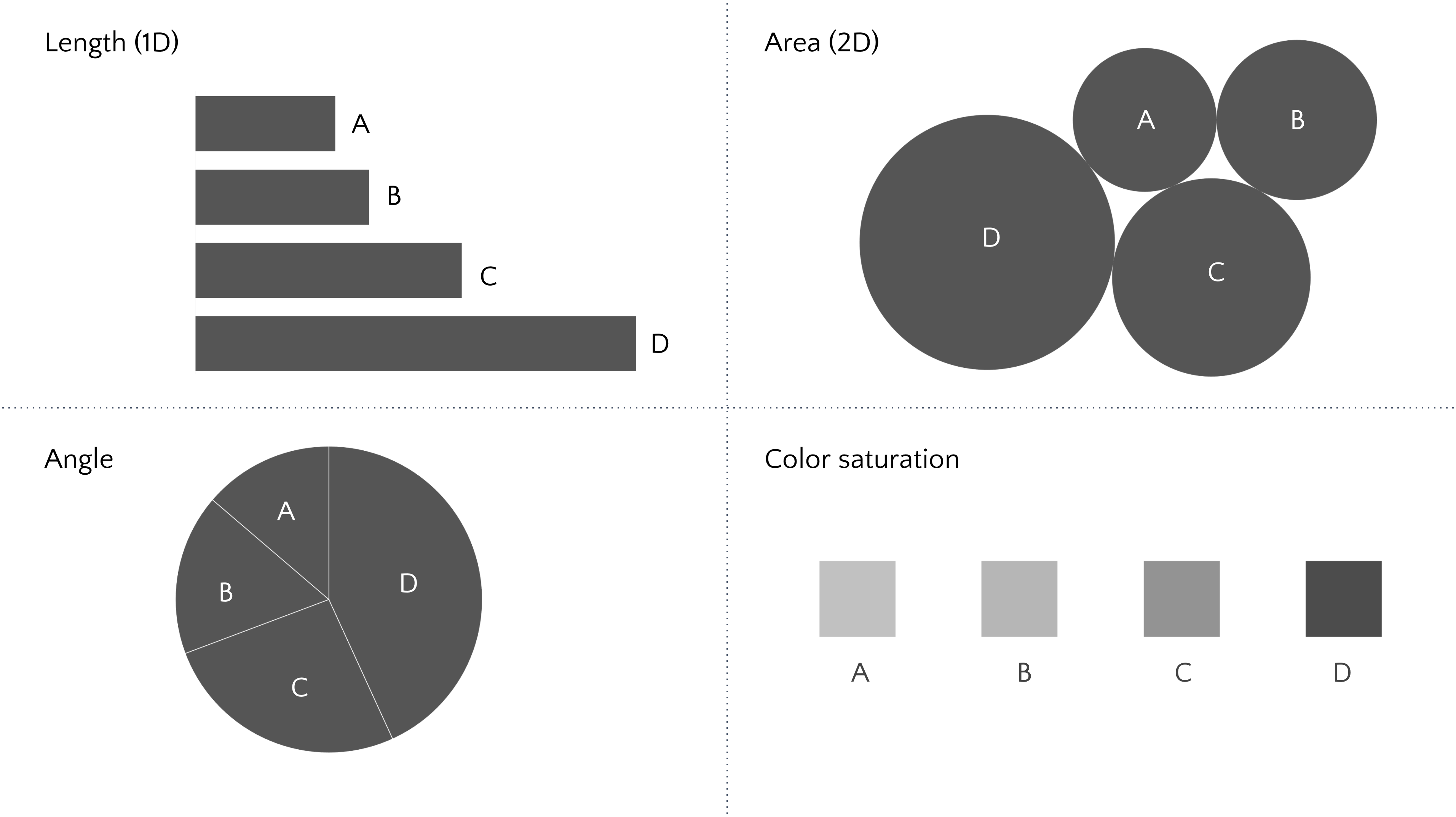
Exercise 1.5. Take a look at the four different ways of encoding the exact same four quantitative values below: bar length (top left), circle area (top right), pie slice angle (bottom left) and color saturation (bottom right). Compare each of the charts to see how easy it is to confidently answer the questions (i – iv) below:

- Which is bigger, B or A?
- How much bigger is C than A?
- Is D bigger than the combined values of A, B, and C?
- If A has a value of 1, what do you estimate is the value for D?
Now note that A, B, C, and D are the 2019 populations of France, Germany, Mexico, and Brazil, respectively, as follows:

Compare your answers to the above with this Exercise 1.5 answer key:
- Answer: B is bigger
- Answer: C is 1.9 times bigger than A
- Answer: A+B+C is bigger than D
- Answer: if A = 1, then D = 3.15
Quotes
“When a graph is constructed, quantitative and categorical information is encoded, chiefly through position, shape, size, symbols, and color. When a person looks at a graph, the information is visually decoded by the person’s visual system. A graphical method is successful only if the decoding is effective. No matter how clever and how technologically impressive the encoding, it fails if the decoding process fails.”
William Cleveland and Robert McGill
Expand for Solution to Exercise 1.5
- Answer: B is bigger
- Answer: C is 1.9 times bigger than A
- Answer: No, A+B+C is bigger than D
- Answer: if A = 1, then D = 3.15
Further Learning
- Book: Visualization Analysis and Design. Tamara Munzner, with illustrations by Eamonn Maguire. A K Peters Visualization Series, CRC Press, 2014.
- Research paper: “Graphical Perception: Theory, Experimentation, and Application to the Development of Graphical Methods” by William S. Cleveland & Robert McGill (Sept 1984)
- Research paper: “Graphical Perception and Graphical Methods for Analyzing Scientific Data” by Cleveland & McGill (Aug 1985)
- Research paper: “Crowdsourcing Graphical Perception: Using Mechanical Turk to Assess Visualization Design” by Jeffrey Heer & Michael Bostock (2010)