
1.1 The Human Visual System
Topic Summary
In Lesson 1, Topic 1, we will begin this course by understanding how the human visual system functions in order to help us understand its’ significance in reading and interpreting data. With this understanding, we will be able to avoid common pitfalls that are easy to fall into when consuming data visualizations. Given how the human visual system works, it turns out that we are able to carry out some visual tasks and comparisons more easily and effectively than others. In order to know how to move forward, we need to be able to look closely at the different elements of visuals we see and understand how these elements have been put together.
Key Points to Remember
- Variances in our visual capacities apply to the way we read and interpret charts, maps and dashboards that we encounter every day.
- By understanding which tasks tend to be easier and which tend to be more difficult and error prone for us, we can avoid two common pitfalls: first, the pitfall of misinterpretation, and second, the pitfall of self-blame.
- In order for us to become fluent readers and interpreters of visual displays of data, we need to have our minds opened to the way our mind itself works when it encounters such displays.
- Our visual cortex isn’t a completely flawless engine of interpretation. It can fall prey to optical illusions.
Definitions
- Human Visual System – the visual system comprises the sensory organ (the eye) and the part of the central nervous system which gives organisms the ability to process visual detail as sight, as well as enabling the formation of several non-image photo response functions. It detects and interprets information from visible light (visible to that species) to “build a representation” of the surrounding environment. (source: Wikipedia)
Diagrams
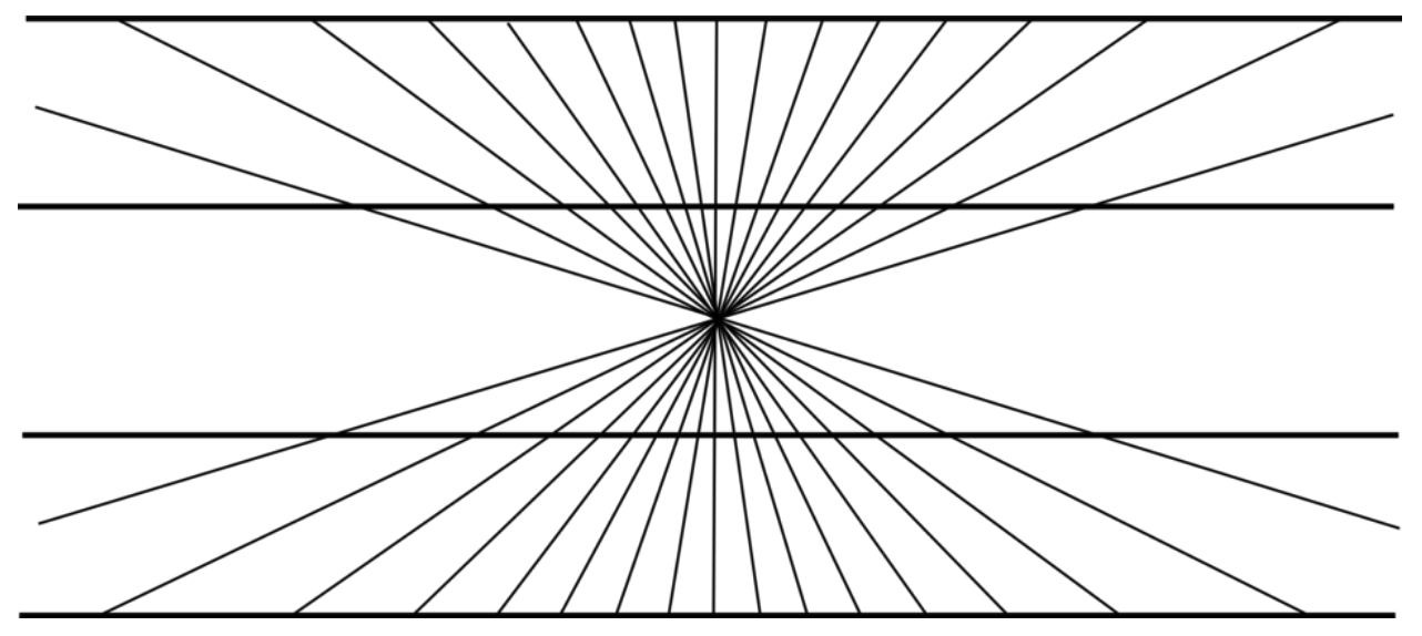
An optical illusion of straight lines that seem to curve
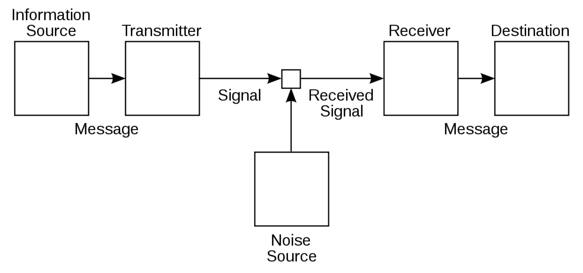
Claude Shannon’s schematic diagram of a general communication system, from “A Mathematical Theory of Communication”
Exercises
Exercise 1.1a. Write down a list of three different graphical displays of data (charts, maps, dashboards, etc) that you have interacted with in the past month. Let one of them be from your professional life, another from public life (your community, state, country or even global), and the last one from your own personal life. For now just write down a simple phrase or sentence that describes the source, like “fitness activity tracker” or “team performance dashboard”. We’ll use the answer to this question as the starting point for your course project.
- Professional life:
- Public life:
- Personal life:
Exercise 1.1b. Take a look at this image and answer the two questions below.

- Describe the appearance of the bar in the middle
- What does the knowledge that the middle bar is actually a constant gray tell us about our visual system?
Expand for Solution to Exercise 1.1b
- The bar in the middle appears to gradually change from a lighter shade of gray on the left to a darker shade of gray on the right.
- Knowing that the middle bar is actually a constant shade of gray tells us that our visual system sometimes misleads us, and is susceptible to optical illusions.
Further Learning
- Online Course: Data Literacy Fundamentals, Lesson 1 (free sample lesson)
- YouTube Video: Stanford Seminar – Mind in Motion: How Action Shapes Thought, by Barbara Tversky
- Book: Mind in Motion: How Action Shapes Thought, by Barbara Tversky
- Article: “A Mathematical Theory of Communication” by Claude Shannon
- Blog Post: Vision: It All Starts With Light, BrainFacts.org