1.3 Graphical Marks & Encoding Channels
Topic Summary
In Lesson 1, Topic 2 we reminded ourselves about the different scale types that our data variables can fall into (nominal, ordinal, interval, ration). In this 3rd topic of Lesson 1, we’ll consider how people use these variables to create graphical displays that can show us what the data contains. Instead of just jumping right into consideration of common chart types, we’ll first consider the basic building blocks of all charts: marks and channels. In the next topic, we’ll cover the first of two criteria of evaluation: expressiveness of encodings.
Key Points to Remember
- The basic building blocks of charts are 1) marks, the graphical elements in the chart and 2) channels, attributes of the marks that can be controlled by the data.
- Charts can serve as a shortcut for the human mind to convert data into knowledge.
Definitions
- marks – the graphical elements in the chart, such as points, lines, bars, circles, squares and other
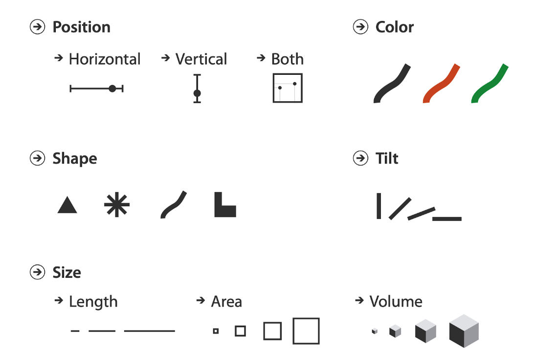
- channels – the attributes of the marks that can be controlled by the data, such as length, area, and color
- encoding – encoding is the process of using underlying data values to control the visual attributes of marks such as length, area, position or color. (Source: Jeffrey Heer)
Diagrams

Munzner’s diagram showing different types of marks

Munzner’s diagram showing different types of visual channels
Exercises
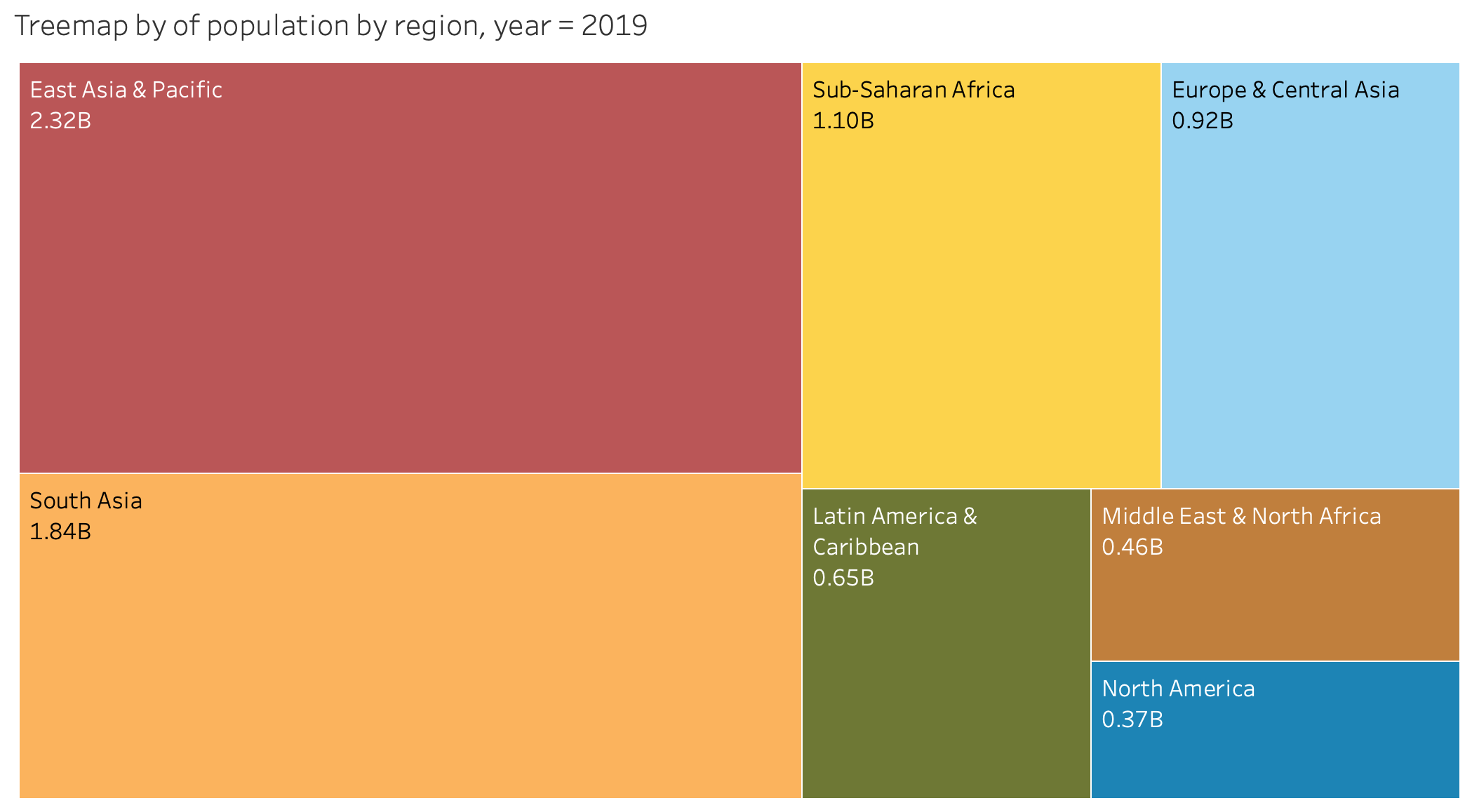
Exercise 1.3. Take a look at the chart below – a chart called a Treemap that we’ll cover in Lesson 4 – and see if you can identify the mark type used in the chart as well as the encoding channel used for the Population variable:
Mark type (points, circles, squares or rectangles):
Encoding channel for Population (position, area, volume, tilt, or color):

Expand for Solution to Exercise 1.3
Graphical mark type: Rectangular Areas (2D)
Visual encoding channel: Area (length times width of each rectangle) encodes country population
Quotes
“A visualization represents data using a collection of graphical marks such as bars, lines, and point symbols. The attributes of a mark — such as its position, shape, size, or color — serve as channels in which we can encode underlying data values. With a basic framework of data types, marks, and encoding channels, we can concisely create a wide variety of visualizations.”
Jeffrey Heer
Further Learning
- Book: Visualization Analysis and Design. Tamara Munzner, with illustrations by Eamonn Maguire. A K Peters Visualization Series, CRC Press, 2014.
- Blog Post: “Data Types, Graphical Marks, and Visual Encoding Channels” by Jeffrey Heer, on Observable HQ Visualization Curriculum