1. Principles of Visual Data
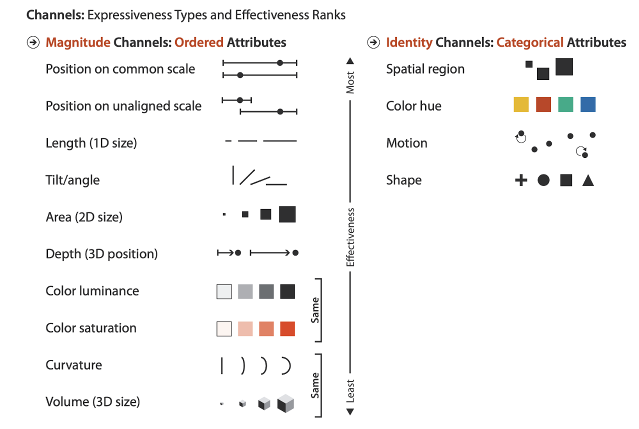
Munzner’s summary diagram of the effectiveness of encoding channels
Visualization Analysis and Design. Tamara Munzner, with illustrations by Eamonn Maguire. A K Peters Visualization Series, CRC Press, 2014
Lesson 1 Overview
Welcome to the first lesson of “Learning to See Data”, the Data Literacy Level 1 course! In this lesson, we’ll set ourselves up for success by covering the most critical principles of visual data. After reviewing four data scale types – nominal, ordinal, interval & ratio – we’ll learn how these different variables can be turned into the graphical marks we see on charts such as bars, lines, points and shapes. Then, we’ll see how the attributes of these marks, such as their position, size and color, can be used to encode our data to help us see what’s going on. Finally, we’ll learn how to evaluate encodings by considering the principles of expressiveness, effectiveness, and the “pop out” effect.
Lesson 1 Exercise Sheet
Click here to download the Lesson 1 Exercise Sheet in .docx form.
Course Project Next Steps
For your Level 1 Course Project, you’ll identify charts in your own world and you’ll learn how to look at them closely to see what they show you. You’ll learn how to evaluate them and to identify ways they could be improved to make them even more helpful to you.
- Let’s start with gathering 3 different charts from your own world, one from each of the 3 domains of application of data:
- Professional – a chart, map, or dashboard that applies to your work team (e.g. your team’s performance dashboard or a chart from your company’s quarterly report)
- Public – one that applies to your community, state, country or the world as a whole (e.g. results of a recent election or a chart from a news article about crime rates in your city)
- Personal – one that applies to your own personal life (e.g. a fitness app tracking or a chart of your utility usage over time)
- Next, for each of these 3 charts, identify the following:
- A short, descriptive title for each chart
- At least one data variable shown, and what scale type it is (nominal, ordinal interval or ratio)
- The mark type used in the chart (e.g. points, lines, areas), the channel(s) used to encode the data (e.g. position, color, shape, tilt, size and volume), and the variable that the channel encodes.
