Beyond the Map: How Marimekko Charts Offer a New Perspective on Election Results
Written by Jon Schwabish for The PolicyViz Newsletter
Note: this blog post serves as the fourth in our Data Literacy for U.S. Voters series.
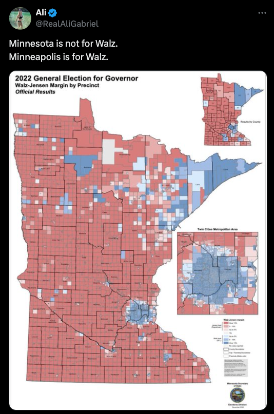
Maybe the most common data visualizations to show election results are maps. Maps, maps, maps. People love maps. The challenge with maps related to elections, however, is that they don’t always accurately present the results. In the simple and oft-repeated phrasing: “Land doesn’t vote, people vote.”
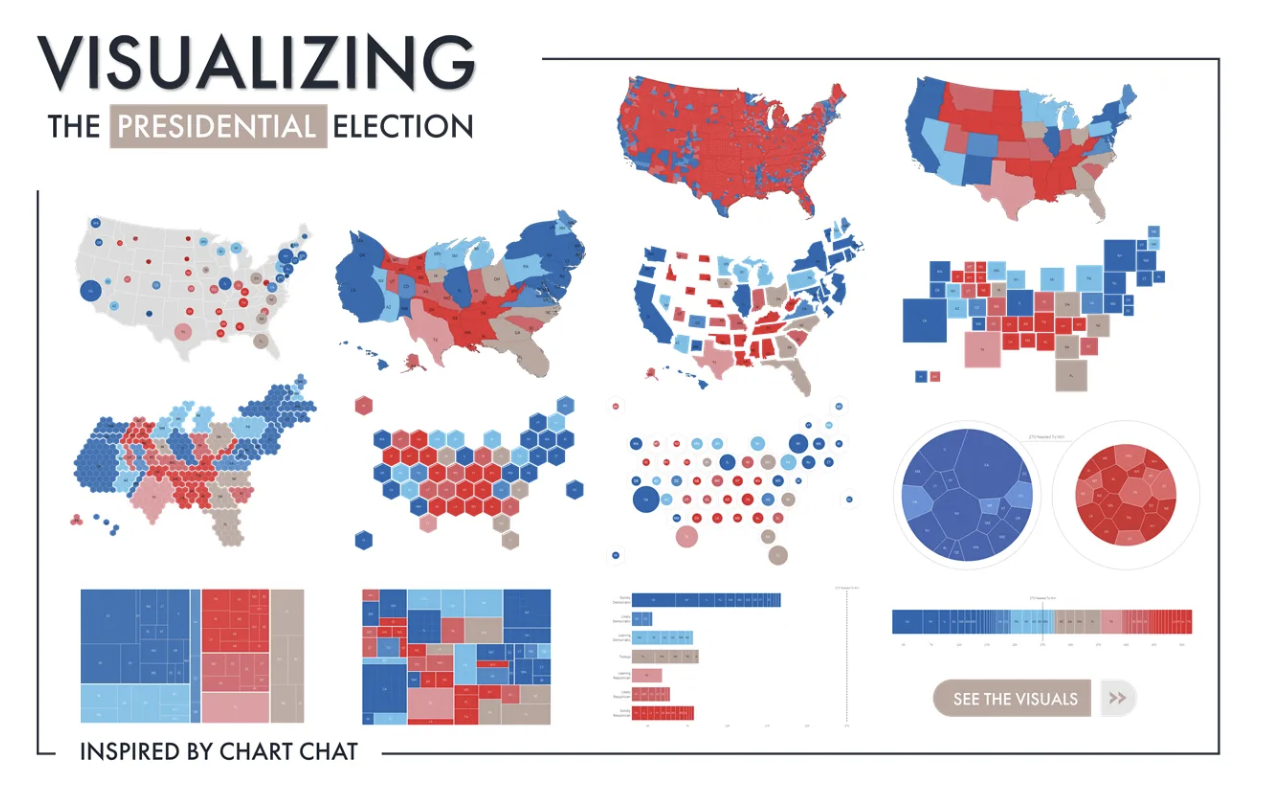
There are lots of alternatives to showing election results as maps, including different kinds of cartograms that scale geographic areas based on other values, treemaps, bar charts, and more. In 2020, Ken Flerlage published an amazing Tableau dashboard with 14 different ways—including 9 maps—to present the presidential election results.
I think I have one more option to add to the mix.
The map below recently showed up in my Twitter feed. The author states, “Minnesota is not for Walz. Minneapolis is for Walz.” The implicit argument is that because the state has more red areas (in this case election districts), that the entire state doesn’t support the Democrat (and now VP candidate) Tim Walz. But, as you might guess, the Minneapolis area is a home to a lot of people: Hennepin County, which is home to most of the city, accounts for 22% of all votes in that election and the broader seven-county area accounts for 56% of all votes. Thus again, land doesn’t vote, people vote.
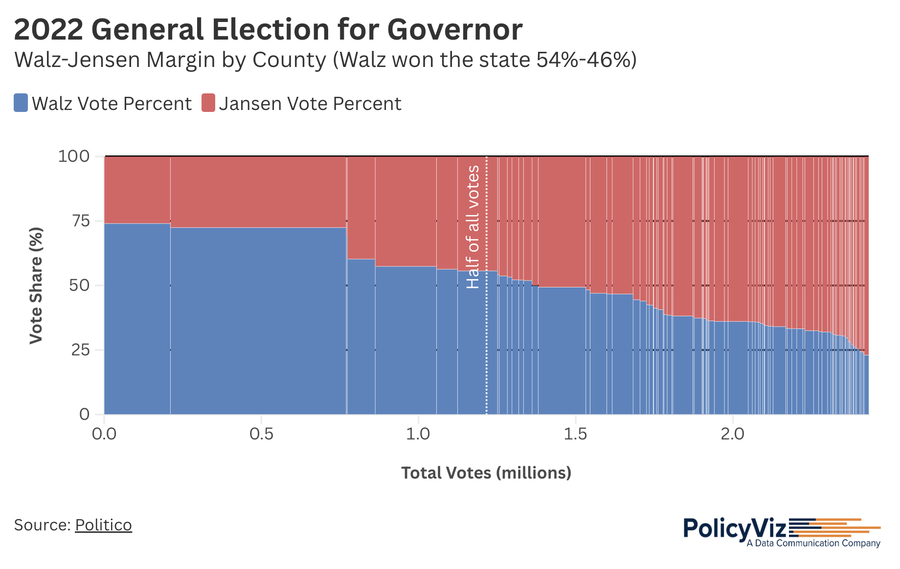
So, with the voting shares in each area (I’m using county-level data here) and the total number of votes in each area, I’m proposing to add a Marimekko chart to our library of visualization types for election results (everything I’m showing below was built in Flourish).
What you see here is percentages of votes for Tim Walz (D; blue) and Scott Jensen (R; red) along the vertical axis and total number of votes (in millions) along the horizontal axis. I’ve sorted the results by the percentage of votes for Walz, so the tallest blue bar is on the left and the shortest is on the right.
What you can see is that the counties with more votes—especially Hennepin county in the second bar—have a greater share of votes going to Walz. You’ll also note that I inserted a vertical line at the 50% point for all votes, to help make two additional points: First, that the more populous counties make a big difference in the total and second, that it’s not like Walz got zero votes in the smaller counties, just a smaller relative share. (If you want to play with the interactive version, you’ll see that I’ve added a standard choropleth map in the tooltip.)
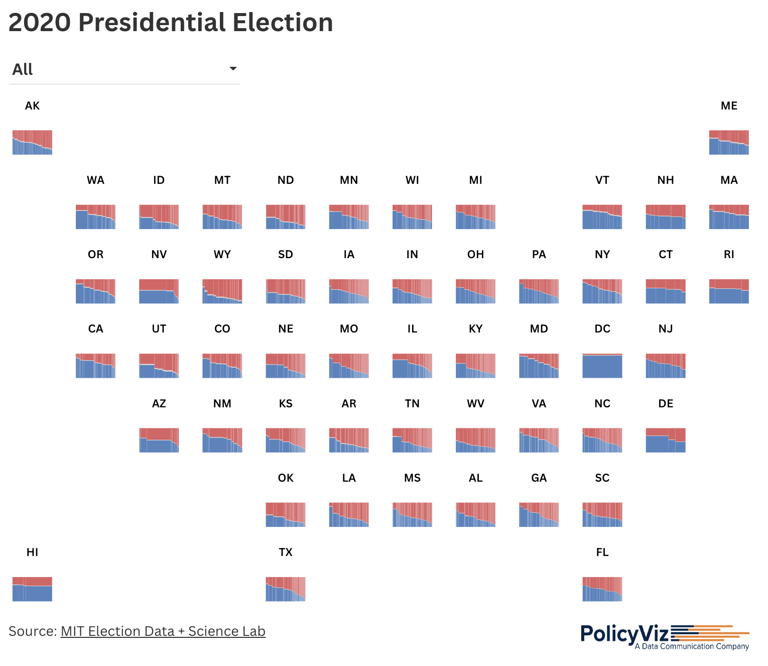
With this in hand, I tried extending the approach to the full country. The folks at Flourish have introduced a new feature that allows users to create a custom tile layout, so I created a separate Marimekko for each state and laid it out as a tile grid map. You can also choose to zoom into any of the states, to see the data in more detail (that functionality is a little janky at the moment and doesn’t work exactly the way I’d like it; hopefully, the Flourish team will fix it soon). As with the Minnesota visualization, clicking on any state opens up a county-level map of the entire country.
I don’t know if this Marimekko approach is objectively better than a standard map or cartogram map; after all, people are more familiar with maps and find them easy to read. But these alternative depictions can help users better understand that just because there are more pixels of a single color on a map doesn’t necessarily mean there are more votes for that person.
Let me know what you think! Reach out on Substack, LinkedIn, Twitter/X, or wherever you like to connect!
Thanks,
Jon
Watch the video below to learn how to create the Marimekko chart of election results in Minnesota in Flourish.

Jonathan Schwabish is an economist and a Senior Fellow at The Urban Institute’s Income and Benefits Policy Center, focusing on data visualization and presentation design. He founded PolicyViz to enhance the communication of research and data, sharing insights through blog posts, tutorials, and the PolicyViz Podcast. Schwabish is recognized as a leader in data visualization and has written three books on more effective ways to communicate data – Better Presentations: A Guide for Scholars, Researchers, and Wonks (2016), Elevate the Debate: A Multilayered Approach to Communicating Your Research (2020), and Better Data Visualizations: A Guide for Scholars, Researchers, and Wonks (2021). His ongoing research explores social security behaviors, food insecurity, and child nutrition programs, alongside his role in the Do No Harm Project, promoting equitable and accessible data practices.

