Bing Chat’s Powerful but Flawed Chart Reading Capabilities
Due to the ubiquity of data visualizations in our world, the ability to read and interpret charts and graphs has become a critical skill for everyone. It’s so important, we created our Level 1 training course around it, along with my book Learning to See Data.
Enter LLMs. Can they help with this all-important endeavor? Can AI read our charts for us, and spoon feed us the key take-aways? I took a quick look at this functionality this past week, uploading a series of charts to Bing Chat and asking it to tell me what it makes of them.
While I was impressed with what Bing Chat could do, it became clear to me that its chart reading skills are still highly flawed at this point in its development. If you want to follow the entire conversation that I had with Bing Chat, you can use this link in a Microsoft Edge browser window.
First, in a separate chat, I asked Bing about its new image recognition abilities. It replied, as shown in the screenshot below, that it can “now respond to questions with images, charts, and other visual elements.”

OpenAI, the maker of ChatGPT and GPT-4, which powers Bing Chat, took it a step further and stated in their Sept 25, 2023 blog post announcing the new features, that “you can now show ChatGPT one or more images. Troubleshoot why your grill won’t start, explore the contents of your fridge to plan a meal, or analyze a complex graph for work-related data.”
ChatGPT is not the same product as Bing Chat, though they’re both based on the GPT-4 LLM. So I don’t know whether ChatGPT will perform differently than Bing Chat in this respect, but I plan to repeat this simple, non-scientific test of ChatGPT when I get access to its image recognition abilities. Stay tuned for that…
These are bold promises, so I decided to put it to the test for Bing Chat. I gave it four different data visualizations – two bar charts, a choropleth or filled map, and a line chart – and I asked it to simply tell me what it found in the charts.
To see first-hand both its triumphs and its trip-ups, read along.
1. A Simple Bar Chart
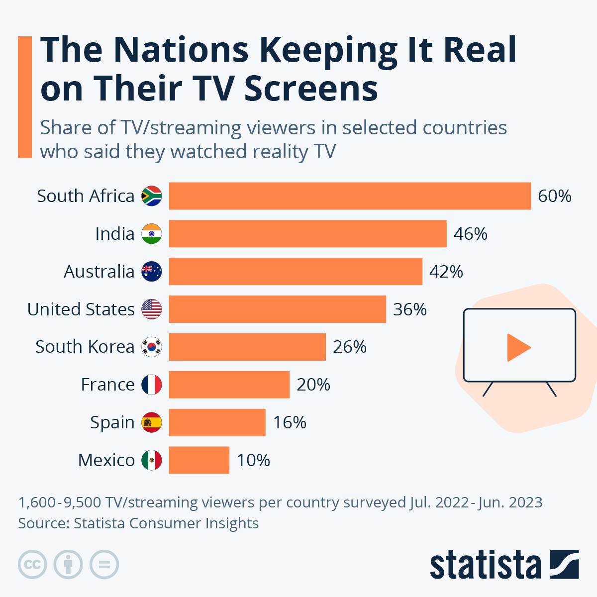
The first image I fed it was a very basic bar chart with eight bars. The chart is from Statista, and shows the percent of sampled viewers in different countries who responded to a survey saying they watched reality TV. Here is the image:
And here is how Bing Chat responded, as shown in italics as well as in the screenshot of the chat below. Pay particularly close attention to the text I highlighted in yellow:
“This infographic, titled “The Nations Keeping It Real on Their TV Screens”, provides interesting insights into the share of TV/streaming viewers in selected countries. Here are some key takeaways and interpretations:
- South Africa leads in viewership: With 60% of the population watching TV/streaming content, South Africa has the highest viewership among the countries listed. This could indicate a strong media consumption culture or widespread access to TV/streaming services in the country.
- Spain has the lowest viewership: At the other end of the spectrum, Spain has the lowest viewership at 10%. This could suggest that Spaniards might prefer other forms of entertainment or have less access to TV/streaming services.
- Diverse media landscapes: The significant variation in viewership percentages across different countries suggests diverse media landscapes globally. Factors influencing these differences could include cultural preferences, economic conditions, technological infrastructure, and regulatory environments.
- Shift towards streaming: The inclusion of streaming viewers in the data might reflect the global shift towards digital media consumption. As internet access improves worldwide, more people are likely to use streaming services, potentially changing these percentages in future surveys.
Remember, these interpretations are based on the data presented in this specific infographic and may not fully capture the complexities of global media consumption trends. For a more comprehensive understanding, additional data and context would be beneficial.”
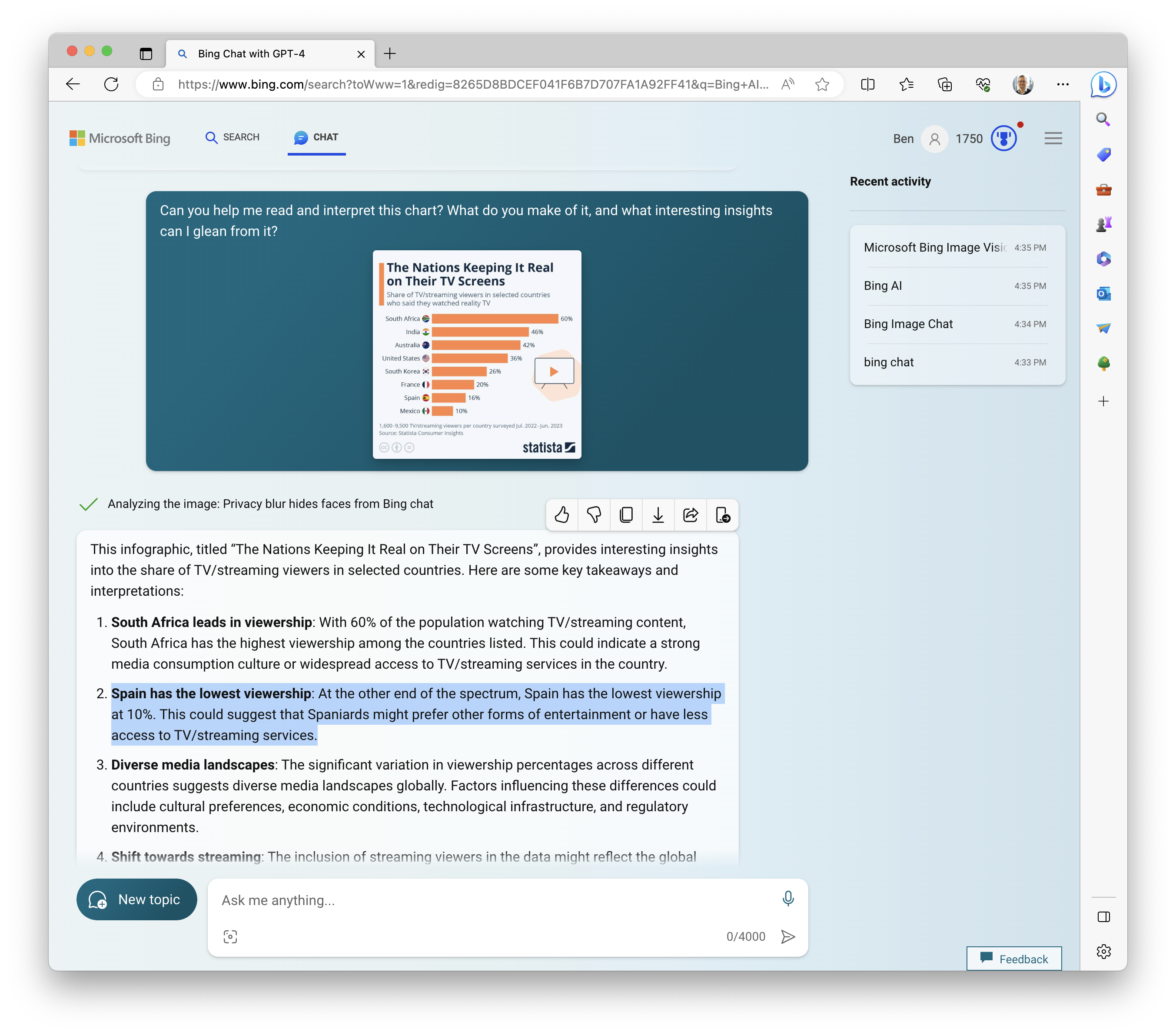
Here are my thoughts about Bing Chat’s response to my one-shot prompt:
- The Triumph: It correctly and accurately discerned the topic from the title, which clearly it is able to pull out of the image. It noted and mentioned an interesting data point (that South Africa has the highest viewership share at 60%), and it even gave me advice at the end to further explore the topic by gathering additional data. Bravo, Bing!
- The Trip-Up: Bizarrely, it misidentified Spain as having the lowest viewership share of 10% instead of Mexico, which is quite clear to see to the human eye. I don’t know how or why it could have made such a mistake, as it didn’t seem to have this problem at the other end of the sorted bars. At its core, an LLM is a next-word predictor, so perhaps it based its response on training data that indicated Spain had a lower viewership share, or perhaps it has some issues with alignment of the pixels themselves in image recognition. I have no idea, and I’m just guessing. What I can say for sure, though, is that it seems it cannot be relied upon at present to accurately match labels with individual bars. How strange.
2. A Stacked Bar Chart of Racial Disparity in Sports
Okay, we saw some issues with basic bars, what about stacked bars? Next up we have a New York Times stacked bar chart that shows racial disparity in major sports leagues in the United States:
And here’s how Bing Chat responded, as shown in italics as well as in the screenshot of the chat below. Again, pay particularly close attention to the text I highlighted in yellow:
“This table provides a comparison of the racial disparity in major sports leagues, specifically the National Football League (NFL), National Basketball Association (NBA), Major League Baseball (MLB), and Major League Soccer (MLS) for the years 2019 and 2020. Here are some key takeaways and comparisons:
- Representation of Players of Color: The table shows the percentage of players of color in each league. This can provide insight into the diversity of the player base in each league. Comparing these percentages across leagues can highlight which leagues have more diverse player bases.
- Representation of Head Coaches of Color: The table also shows the percentage of head coaches of color in each league. This is an important metric as it can indicate opportunities for people of color in leadership positions within these leagues. Comparing these percentages can reveal disparities between player diversity and leadership diversity.
- Yearly Changes: By providing data for both 2019 and 2020, the table allows for a comparison over time. This can show whether representation is improving, staying the same, or worsening in each league.
- League Comparisons: Comparing the data across different leagues can reveal which leagues have more racial diversity among players and coaches.
Remember, while this table provides valuable data, it is just one piece of the puzzle when it comes to understanding racial disparities in sports. Other factors such as hiring practices, league policies, and societal factors also play a significant role.“
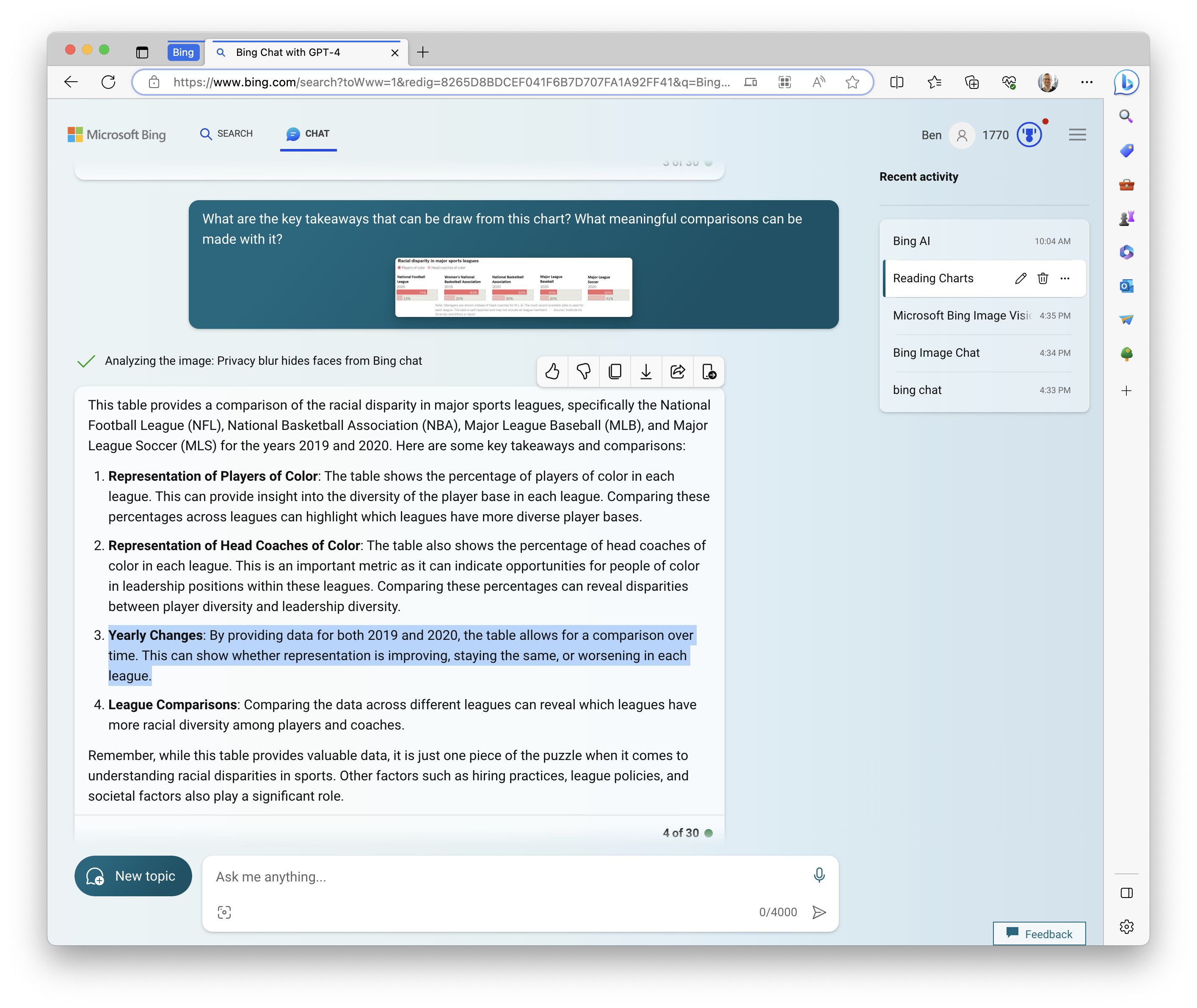
Here are my thoughts about Bing Chat’s response to my one-shot prompt of the faceted set of paired stacked bars:
- The Triumph: It correctly and accurately discerned the topic once again, and it gave me an idea how the bars could be used, and what kinds of comparisons could be made. I find it bizarre, though, that it gives zero specific take-aways or findings. It doesn’t explicitly compare this versus that, or provide even factual statements, such “the NBA had the highest percent of players of color in 2020,” or “MLS had the highest percent of head coaches of color in 2020.” These very bland, generic, and non-specific responses, especially when compared to the nature of the responses for the other charts, makes me wonder if racial disparity is a topic that has been highly controlled in the fine-turning and guardrail formulation process. What other topics are tightly censored, and how will these safety controls affect the chart interpretations it provides us with?
- The Trip-Up: A few things here.
- First, the Big Mistake: it incorrectly told me that I can use this chart to make comparisons over time. It’s true that it does include data from both 2019 and 2020, but not for any one league. One league (WNBA) just has data for 2019, and the rest just have data for 2020. Therefore, we can’t say how any one league changed from one year to the next. We simply can’t learn about year changes from this chart. No Whammies, Bing!
- Another trip-up, and this one is more of a miss than a mistake, but I’m sure many of my readers will sympathize: these are only U.S.-based “major sports leagues.” What about the Premier league, or La Liga, the Indian Premier League of cricket, or Campeonato Brasileiro de Futebol Feminino Série A1? Sure, it would be difficult to include an exhaustive list of “major sports leagues” across the globe, but if you’re only going to include leagues from one country, you should call that out in the chart. Now, you may say, ‘Wait a minute, that’s an error of the chart maker, not Bing!’ That may be true (we can’t know for sure as the chart itself is shared out of context), but it’s the job of the chart reader to notice omissions like that. Nowhere in the chart is the United States mentioned, and nowhere in Bing Chat’s response is the United States mentioned. The implication: it doesn’t seem that we can depend on LLMs, at present, to catch societal biases in our charts.
3. A Filled Map of Climate Risks
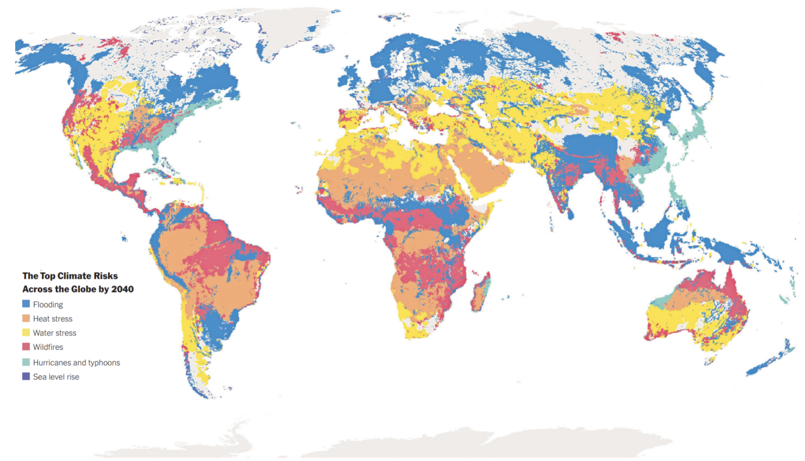
Two more to go! Next up we have a New York Times map showing top climate risks across the globe by 2040:
Bing Chat’s response:
“This world map provides a compelling visualization of the top climate risks across the globe by 2040. Here are some key insights:
- Flooding: South America, Africa, and Southeast Asia are most at risk for flooding. This could be due to a combination of factors such as heavy rainfall, poor drainage systems, and low-lying areas.
- Water Stress: The Middle East and North Africa are most at risk for water stress. These regions are known for their arid climates and lack of freshwater resources, which could be exacerbated by climate change.
- Heat Stress: Africa and the Middle East are also most at risk for heat stress. Rising temperatures due to global warming could make these already hot regions even more inhospitable.
- Hurricanes and Typhoons: The Caribbean and Southeast Asia are most at risk for hurricanes and typhoons. These regions are in the path of these powerful storms, which are expected to become more frequent and intense due to climate change.
- Sea Level Rise: The Pacific Islands and coastal regions are most at risk for sea level rise. As global temperatures rise, ice caps melt, causing sea levels to rise and threatening low-lying areas.
- Wildfires: The map does not provide specific regions for this risk, but wildfires are a growing concern in many parts of the world, including Australia, the western United States, and parts of Europe.
This map underscores the urgent need for climate action to mitigate these risks and protect vulnerable regions.”
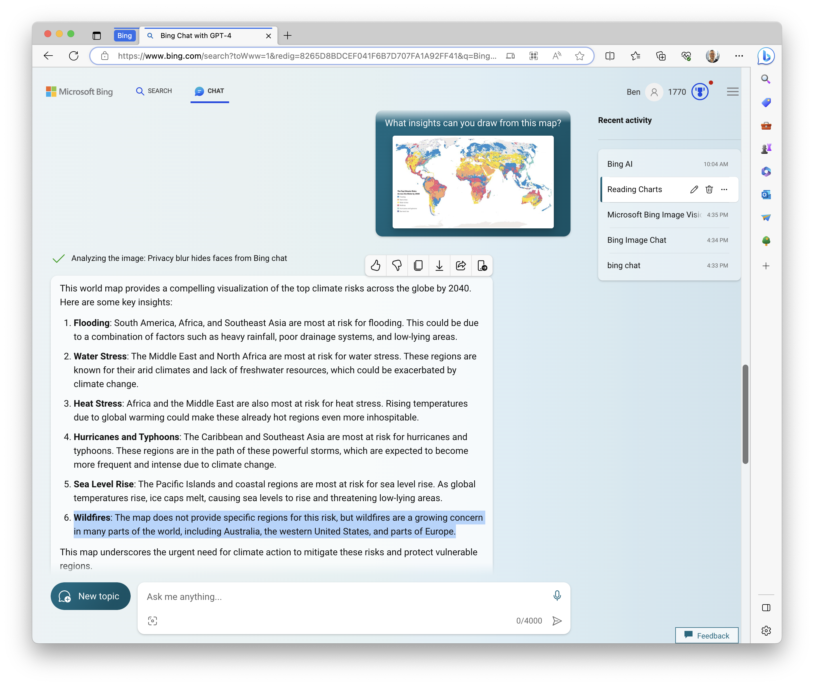
Here are my thoughts about Bing Chat’s response to my one-shot prompt of the beautiful (and frightening!) choropleth:
- The Triumph: It correctly and accurately discerned the topic yet again, this time for a chart with no title or lead-in text whatsoever. The legend title serves as the chart title, and Bing found it. By now it’s clear that the LLM can identify text in an image. Not too ground-breaking. What I found more fascinating than that was that Bing was able to call out which regions are associated with which risks. This is remarkable because the region names are not included anywhere in the chart, and the borders of the shaded regions are obviously very irregular and spotty in places.
- The Trip-Up: A few things here.
- By my judgement, Bing very much oversimplifies in its summary of the regional risks. For example, it only mentions Europe once, and not in the summary of the Flooding risk, when it seems clear that this is a major concern, especially in Northern Europe. In its summary of the Hurricane and Typhoon risk, it mentions the Caribbean, but not the Eastern United States. It doesn’t mention that most continents have places that face almost all of the different risks, giving rise to the most striking visual aspect of this map – it’s splotchiness and patchiness. Bottom line: an LLMs summarizations of a visualization might be different than the ones we’d come up with, and simply not as interesting as our own.
- It calls out the Pacific Islands in its comments about Sea Level Rise risks, and while I’m sure that’s the case, I simply can’t see any purple on the map due to the fact that these regions are vanishingly small when viewing the entire world on a map projection. Maybe that’s just me, and you can see Hawaii, Samoa, Fiji (among others) just fine. I can’t. Does it actually find those pixels our eyes can’t, or did it fill in those words from its training data on the topic? The fact that we don’t know raises a question: how much of its findings are based on the chart itself, and how much are based on its training data on the topic?
- The most confusing aspect of its response can be found in its summary take-aways for the Wildfire risk. It tells us that “the map does not provide specific regions for this risk…” but the red regions are impossible for me to miss. I know that others might struggle to differentiate red from other colors, like green, but why did Bing seem to miss the clear presence of this color in the map? I don’t know. Concerning…
4. A Line Chart of Egg Prices
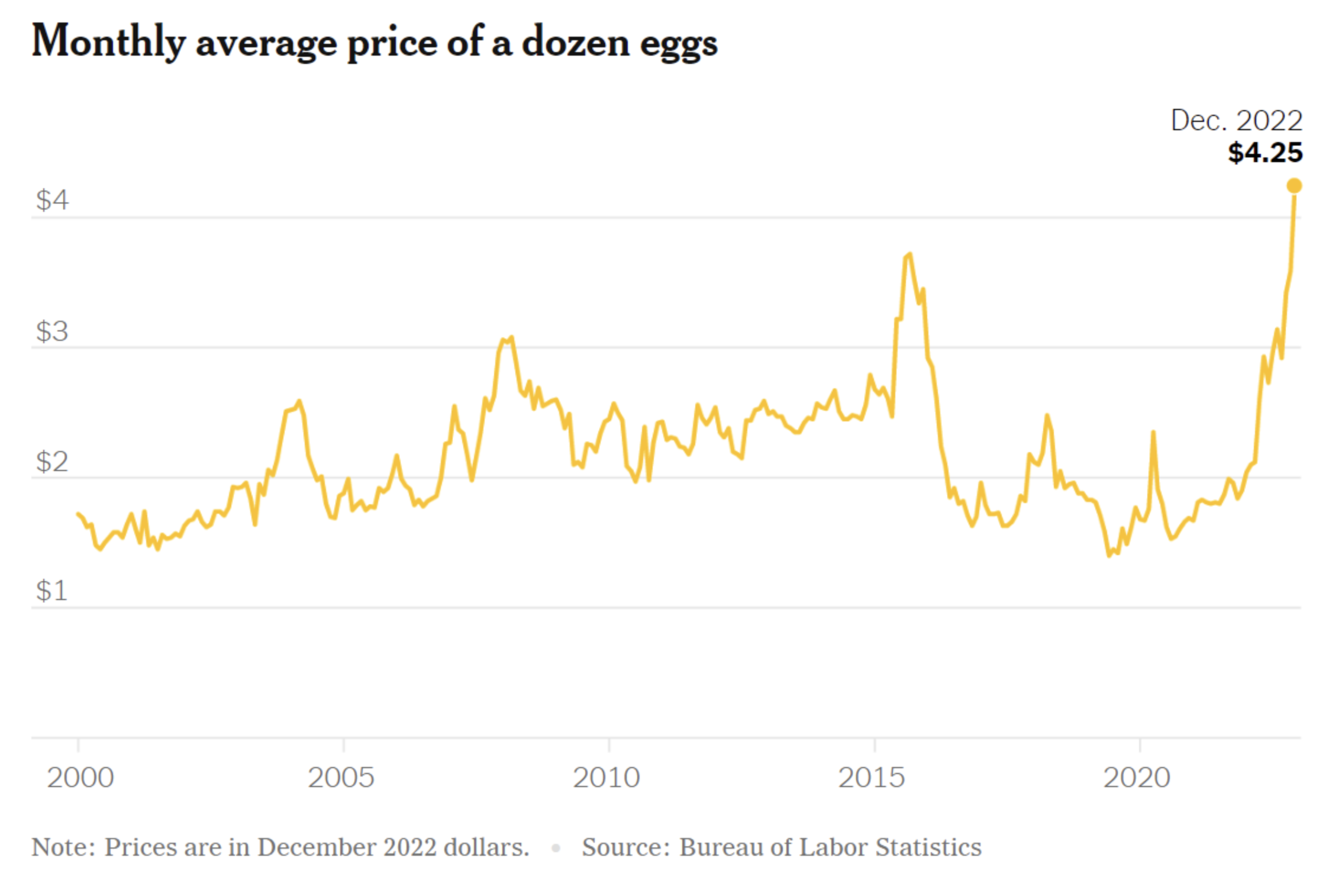
Last one! Let’s turn our attention to a New York Times line chart showing over two decades of changes in the monthly average price of a dozen eggs.
Bing Chat’s response:
“This line graph represents the monthly average price of a dozen eggs from 2000 to 2022. Here are some key takeaways:
- Price Increase Over Time: The graph shows a general upward trend in the price of eggs over the 22-year period. This could be due to various factors such as inflation, increased production costs, or changes in demand.
- Highest and Lowest Prices: The highest recorded price is $4.25 in December 2022, while the lowest price is around $1 in 2000. This indicates a significant increase in the price of eggs over two decades.
- Yearly Fluctuations: The graph also shows some fluctuations in price within each year, which could be due to seasonal variations in egg production or market demand.
- Prices Adjusted for Inflation: The note below the graph indicates that the prices are in December 2022 dollars. This means the prices have been adjusted for inflation, providing a more accurate comparison over time.”
This data is sourced from the Bureau of Labor Statistics, which lends credibility to the information. However, it’s important to note that many factors can influence the price of eggs, and this graph represents a simplification of a complex economic phenomenon.
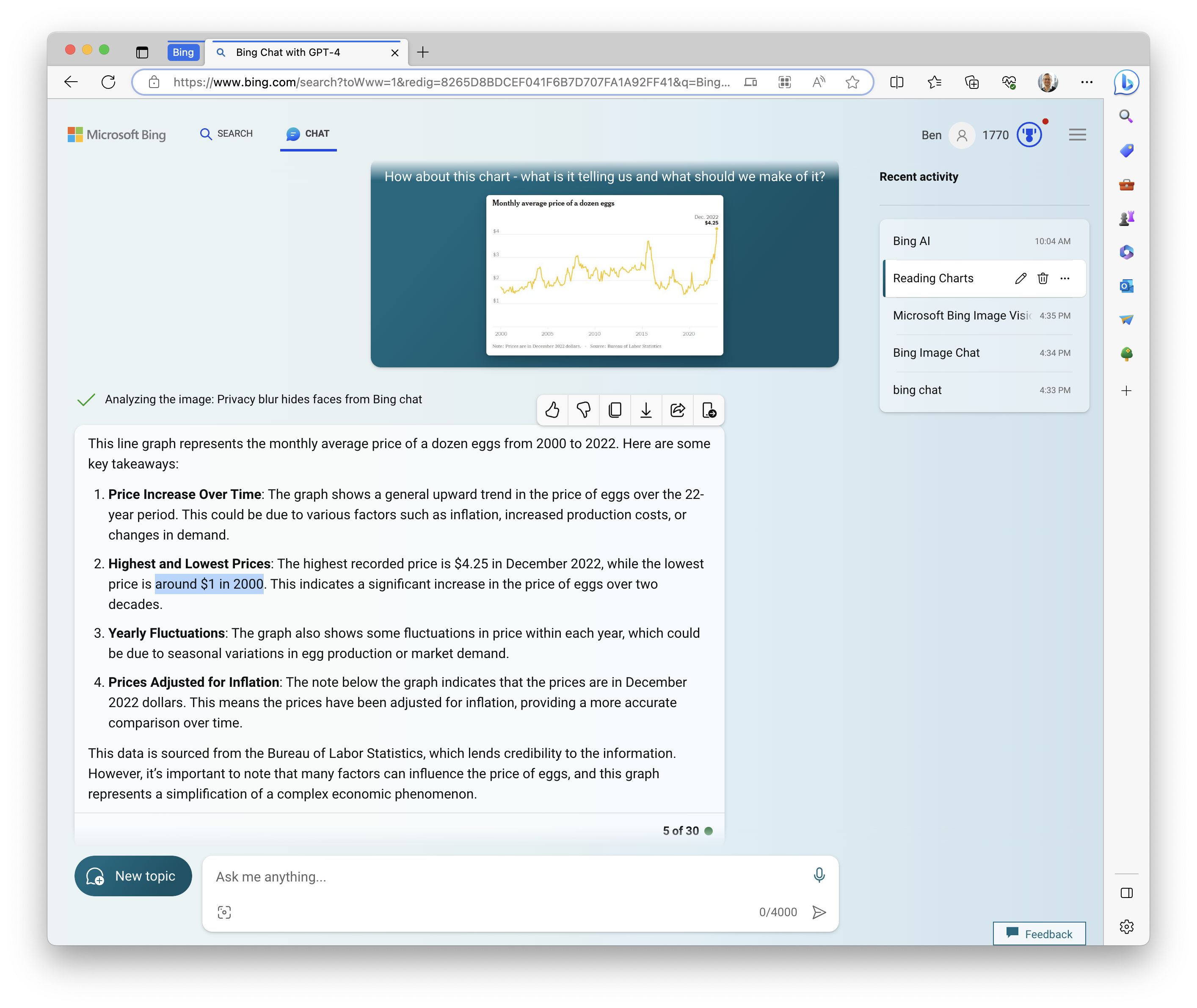
Let’s see if Bing Chat has egg on its face about its interpretation of a super simple line chart:
- The Triumph: Topic: Check! Call-out of reputable source: Check! Reminder that the topic is a complex one and the chart might oversimplify things: Check!
- The Trip-Up: Once again it misses the U.S.-specific nature of the chart ($USD?), but by now we’ve come to expect that. A couple more things to call out – one a minor quibble, and the other a broader concern, in my estimation.
- The quibble: would you say the price of a dozen eggs was “around $1 in 2000?” I wouldn’t. It hovered in the mid-$1 range for over a few years in the early aughts, and didn’t seem to dip below $1.50 much at all. Personally, given the scale of the y-axis ($0-$4), I’d only describe the line as being “around $1” for times that it comes much closer than it does to actually touching the line – maybe at heights of $1.10 or less. The point is that our approximations and estimations of values might not quite be calibrated, or even very close to the same.
- The bigger issue: I just don’t think it captures the key take-away from this chart. To me, I look at this chart, and I say, “Wow, the price of eggs sure has jumped in the past year or two!” Bing Chat? “The graph shows a general upward trend…” Okay, if we zoom in to show only 2000 through 2014, we’d be on the same page about that. The big “U-shaped” scoop from 2015 to 2022 isn’t mentioned at all. My biggest concern is that the LLM might not use the same words to describe specific shapes that emerge in the data.
Summary of My Thoughts and Findings
First: I don’t want to downplay the amazing nature of what Bing Chat can do with charts. It’s amazing how quickly we go from having our minds blown about some new technology to basically yawning about it. I uploaded four charts – providing no explanation of what they are, no source link to where I found it, and no context whatsoever – and Bing Chat read them and interpreted them for me, providing key insights, helpful warnings and reminders, and comments about what I can do with the insights in the chart. Just, WOW!
Second: Houston, we have a problem. The insights that Bing Chat extracts from those charts weren’t always correct. It’s subject to errors of commission and those of omission. Its summaries are less than spot-on. It flat-out misses key pieces of information and fails to spot or mention societal (or at least regional) biases. It seems almost totally blind to some aspects of the chart, and it seems to totally fabricate other aspects.
And this should surprise us not at all about LLMs at this point. What it means to me is that we can use them for an interesting take on our charts, but we have to question and cross-check literally EVERYTHING it gives us. In this respect, the image recognition functionality is the same as text-only prompt responses and code creation: incredible, and sometimes, well, not credible.
In a word: be amazed, but proceed with caution. More than anything, educate yourself about these new AI technologies. Hype cycles will continue, but these tools aren’t going away any time soon.

