Data Memos
12 reflections on data (and its representation) that we don’t want to forget in the “next-normal”
Data is everywhere: in every headline, and at the center of every conversation. In only a few months since the pandemic began, data of all types has become an essential language to understand and make sense of a rapidly changing world.
But how fluent in this language is the general public? And how can we as practitioners and researchers design data visualizations that fully represent the nuances and the implications of a very complex situation?
Due to the media coverage of the COVID-19 data, we have been exposed to (very) bad and (very) good examples of visualizations. We’ve seen visualizations used to both clarify and hide arguments, to both support and deny research evidence — even as tools for propaganda. We want to make sure we’ll always contribute to clarity and consistency, being fully aware of the potential risks and pitfalls and — in the end — the responsibility of shaping data and making it available for the public discourse.
This is a summary of what we’ve observed and “pinned,” a checklist to stay on track for a more transparent and open future of data visualization.
*** These reflections originated in response to the way data has been displayed through the course of the Covid19 pandemic. While most examples are Covid19 specific, we believe they are valid in a broad sense.
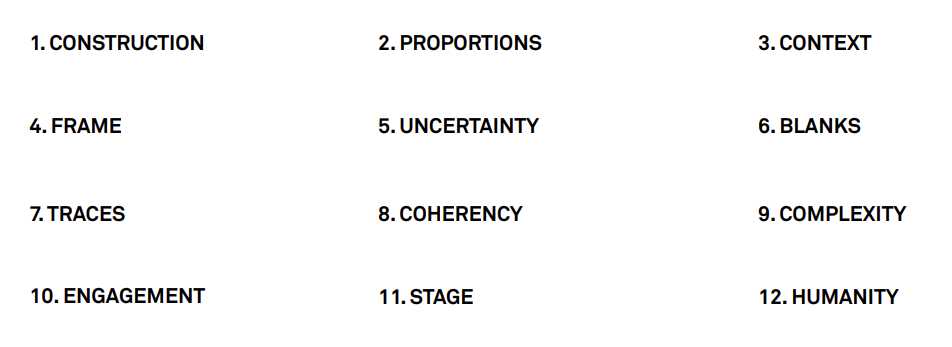
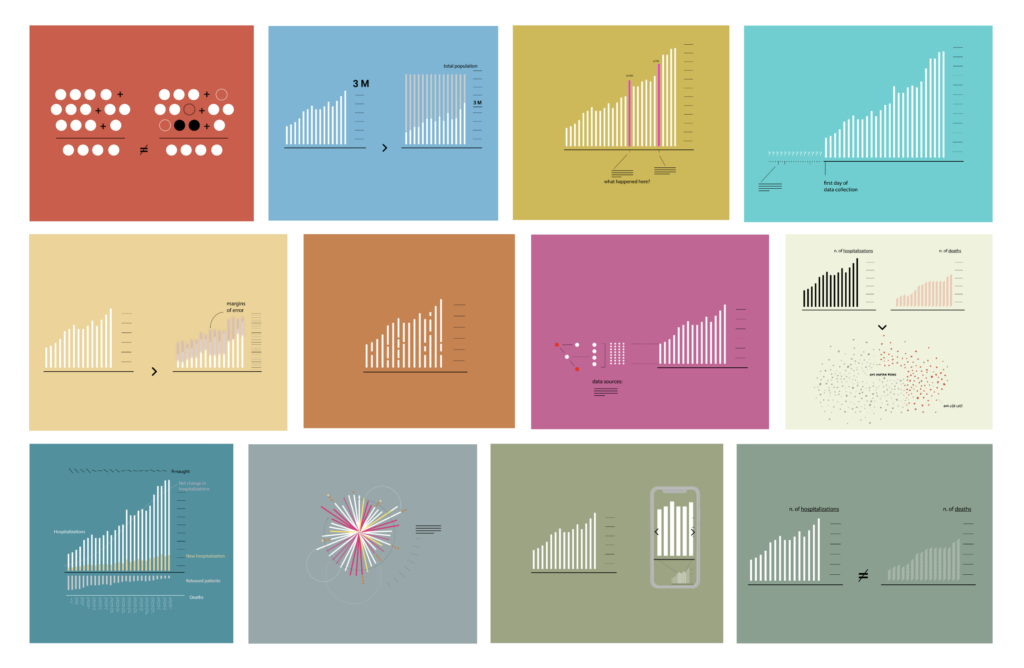
1. CONSTRUCTION
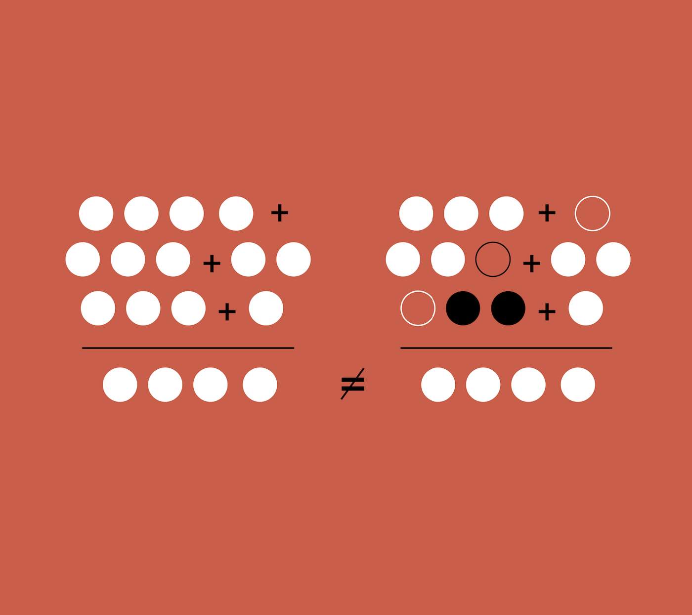
Data isn’t neutral. How it’s created and calculated determines its meaning. The methods by which data has been derived must be accounted for in its visualization.
Have these two numbers of cases been calculated using the same methodologies? A death can have different “meanings” as countries measured it differently (e.g., people that died and were also positive versus people that directly died because of Covid-19 who did not have underlying conditions, etc.).
2. PROPORTIONS
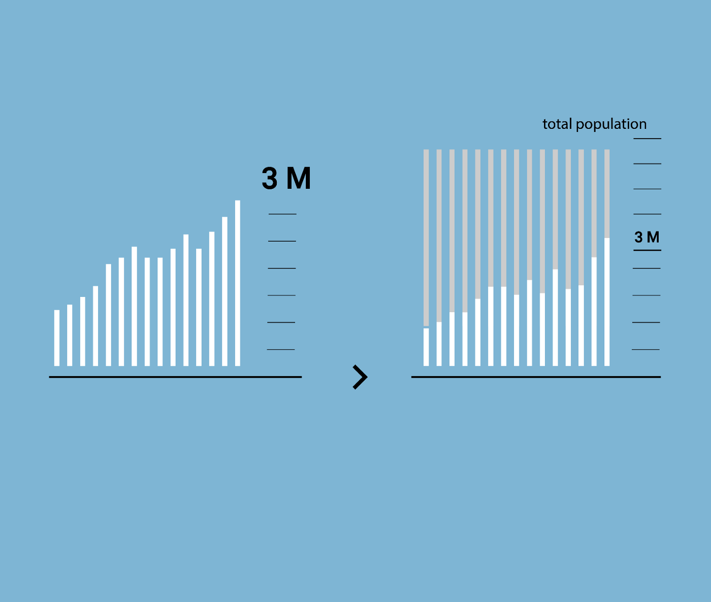
The ratio between data points is often more relevant than absolute numbers.
Is it right to compare positive cases of cities with a different number of residents? Do two datasets share the same denominator or baseline?
3. CONTEXT
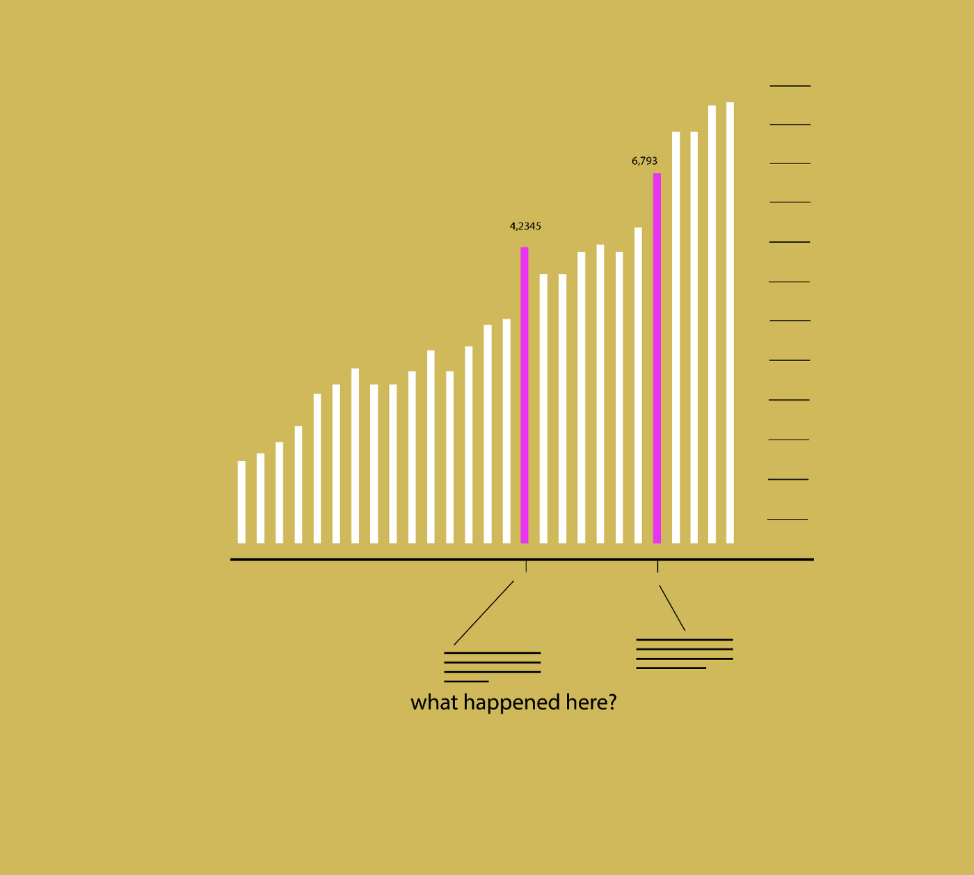
Context is key. To fully understand a phenomenon, the surrounding circumstances of a number must be treated with the same importance as the number itself.
What policy changes could have caused that peak in the curve? What regulations and norms were in place? When were strict isolation measures introduced in this timeline?
4. FRAME
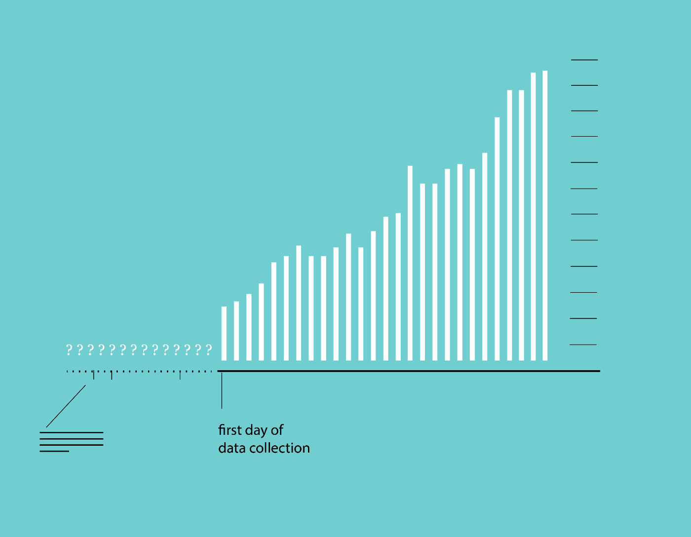
Data representing a specific moment in time may not tell the full story. Extending the frame of reference to account for events before and/or after a phenomenon can give a fuller picture of the forces at play.
Could information from the past help bring clarity to this issue? What was the situation before the data collection started? Is our current perspective too narrow?
5. UNCERTAINTY
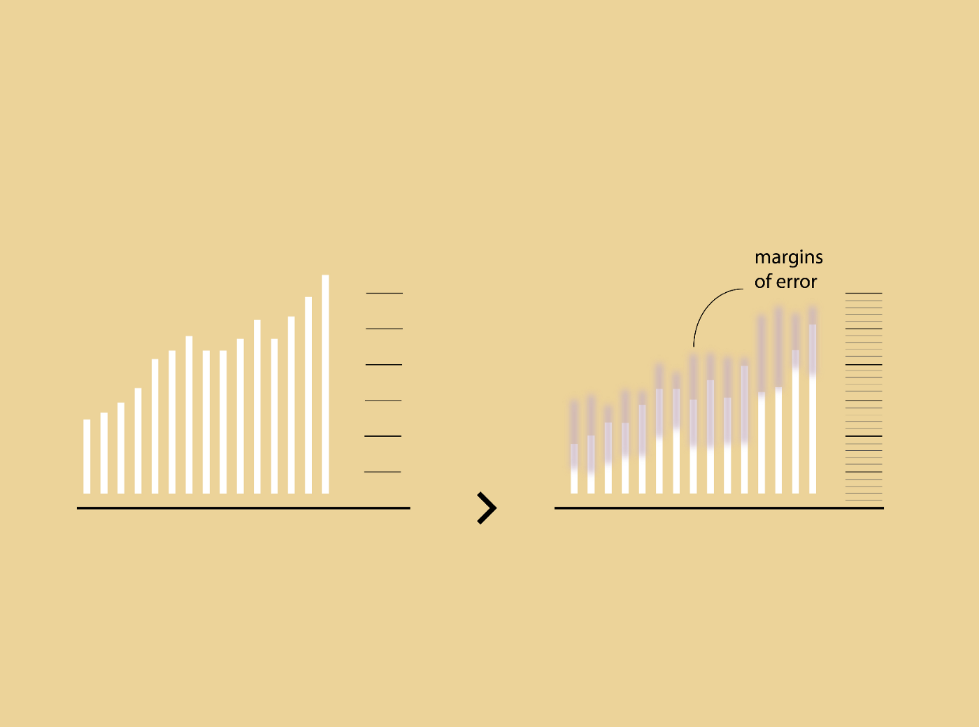
Data visualization design prioritizes certainty, and calcifies it as an absolute fact. Yet uncertainty is a fact of life, and inherent in any phenomenon. Uncertainty is often just as important to visualize as certainty.
How (un)reliable is the process? How big is that margin of error? How can we render fuzziness, ambiguity and reliability and margins of errors?
6. BLANKS
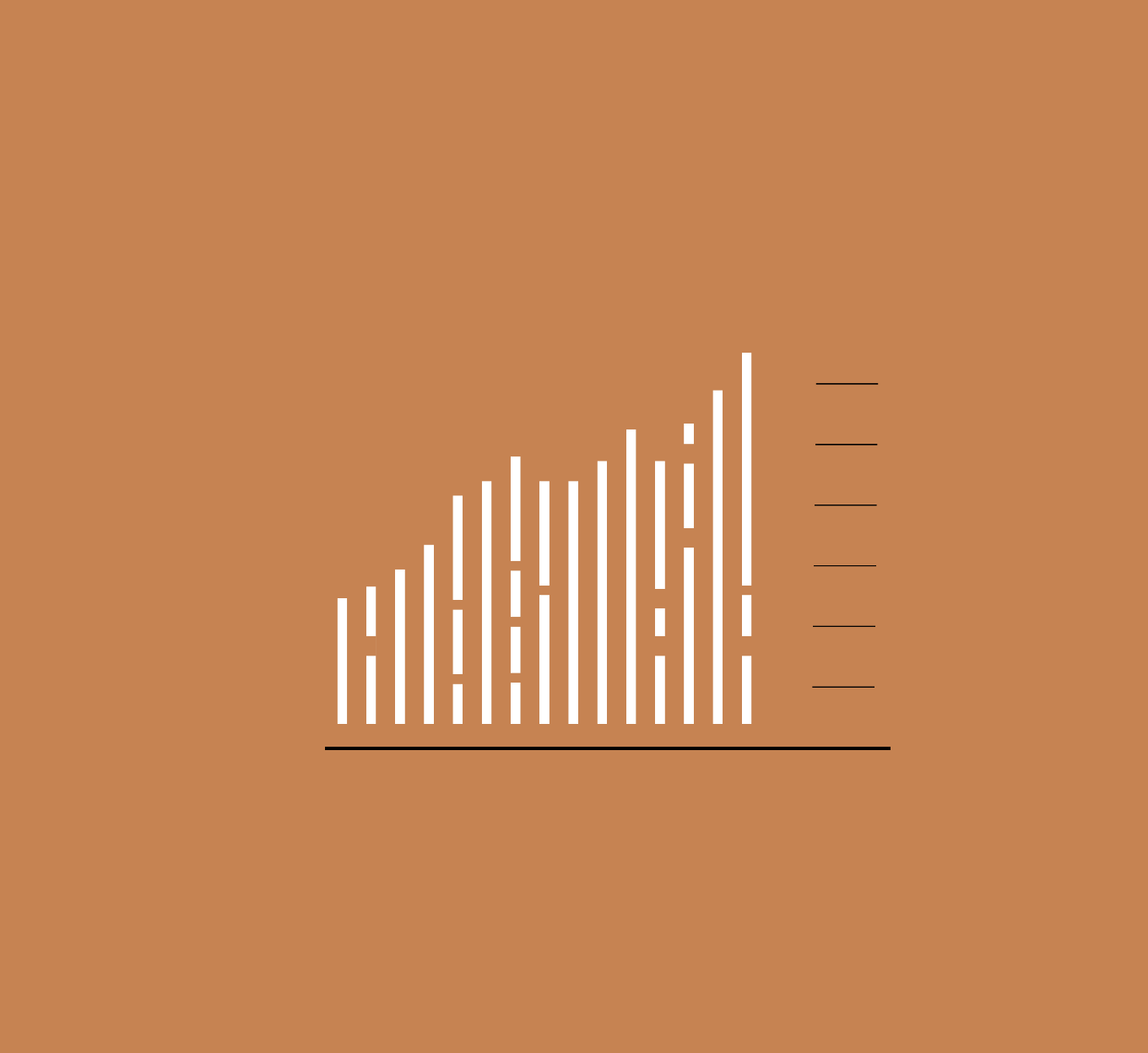
The data we don’t have (i.e. gaps and holes in datasets) could be as important as the data points we do have.
In which days cases have not been recorded? For how long tests have not been available? Is this a zero or there is no data?
7. TRACES
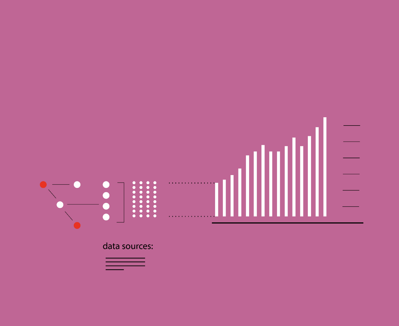
Show the origin of data and how it is processed to help readers fully understand it.
Is it clear what the source of these data is? How have they been combined? Which process of analysis and aggregation they went through?
8. COHERENCY
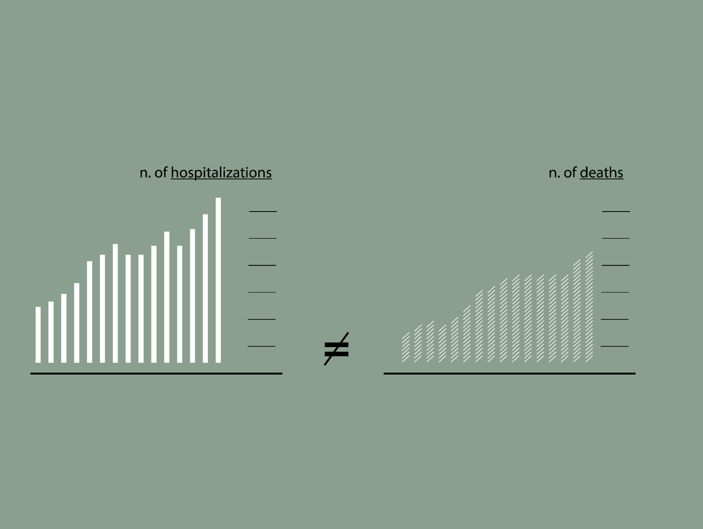
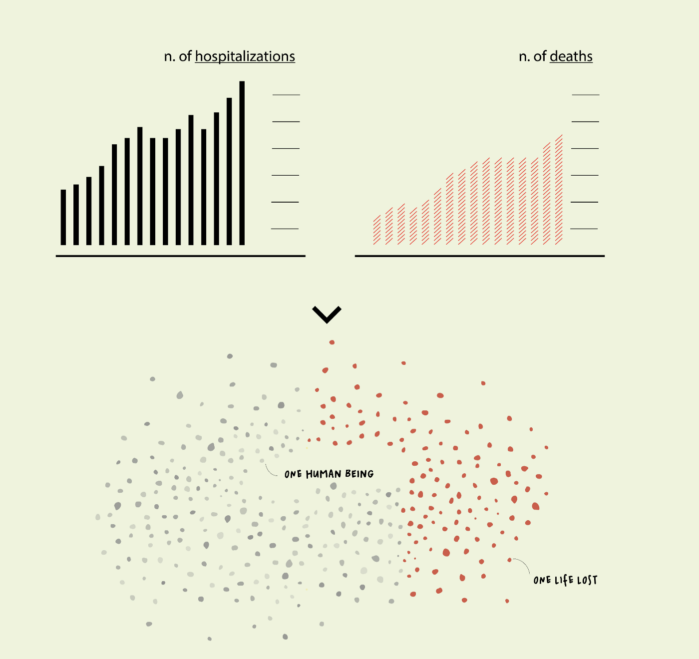
One size does not fit all. The design of a visualization should respond to the specificities of the dataset in question, what it stands for, and its communicative purpose.
Should we represent numbers of hospitalizations with the same chart we use for numbers of deaths in the same presentation? Is the chart appropriate for the specific purpose of that visualization?
9. COMPLEXITY
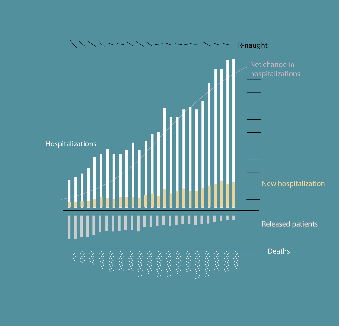
Most of the observed phenomena are complex in nature. We aim at visualizations that preserve as many dimensions as possible of this complexity and represent its richness, within the limits of readability and understanding.
Can I integrate another variable in the visualization without making it too complicated? What would be useful to add to understand the big picture?
10. ENGAGEMENT
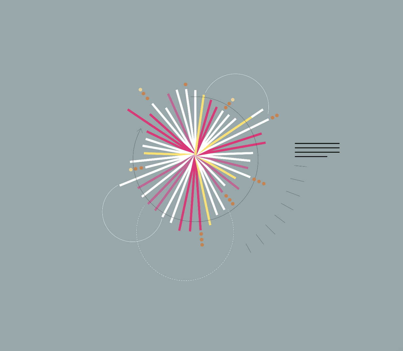
Attention and interest are not granted, especially with a general audience. Aesthetics and rhetoric are powerful triggers to spark people’s curiosity and drive it through data.
Is this chart able to attract readers and guide them through the data? Is it rich enough and yet simple to be read?
11. STAGE
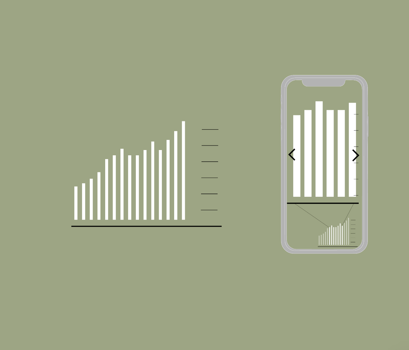
Every data visualization lives and performs on a “stage” that shapes the reader’s relationship to the data.
Does the visualization exploit the specific features of the medium? Is it appropriate for the digital device the reader will be using? Would interaction and animation add value, and are they possible in this format?
12. HUMANITY
To truly connect numbers to what they stand for, data visualization should acknowledge, and even accentuate, the inherent human component.
Can people relate what they read in the form of charts to what they are experiencing in daily life? How can we preserve individuality when aggregating data? Can we make readers “feel” the phenomenon behind the data?
As design researchers and practitioners, we commit to remembering these memos and addressing them in our future work.
Paolo Ciuccarelli is professor of Design at Northeastern University, where he founded and directs the Center for Design. He is member of the board in the Interdisciplinary Design and Media PhD program at the College of Arts, Media and Design and affiliated member of Harvard MetaLab and the Roux Institute at Northeastern. His research focuses on design-driven data transformations across different languages and modalities, to address non-expert stakeholders especially. Paolo is currently co-editor of Big Data & Society (SAGE) and chaired the Communication Design program at Politecnico di Milano, where he also founded and directed the DensityDesign Research Lab from 2010 to 2019.
Giorgia Lupi is a Partner at Pentagram in New York. She has advanced degrees in Architecture as well as Design, and she co-founded Accurat, an internationally acclaimed data-driven design firm with offices in Milan and New York. She is also the co-author of Dear Data and Observe, Collect, Draw. She is a world renowned public speaker, award-winning communication designer, and her work is part of the permanent collection of the Museum of Modern Art.

