NEW COURSE! 🤖 AI Literacy Fundamentals is now available On-Demand and Instructor-Led
NEW COURSE! 🤖 AI Literacy Fundamentals is now available On-Demand and Instructor-Led
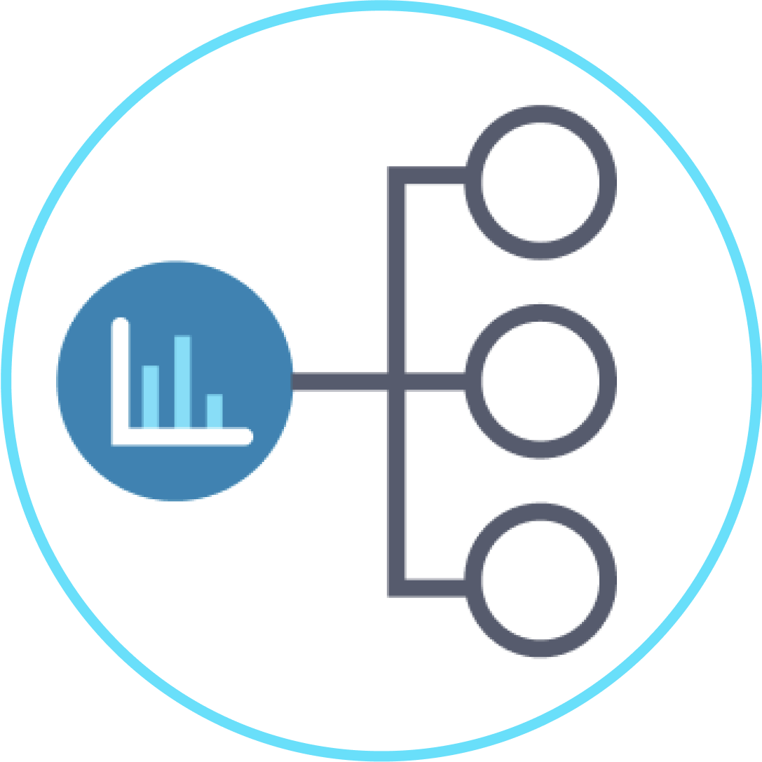
DATA LITERACY
Tailored training and assessments for building a strong data and AI culture, going beyond standard one-size-fits-all libraries.
What are you looking for?
STRESS-FREE LEARNING WITH OUR EFFECTIVE TEACHING MODEL

Skilled and friendly instructors
Data concepts supported by frequent learning checks

Easy integration with your LMS (or use ours!)

“The Fundamentals of Data Literacy course has provided a great foundation for our employees as they begin their data fluency journeys. Our staff members quickly grabbed onto the idea of being data-informed and considering the role of intuition in their data work. The course is unintimidating and accessible for colleagues that are completely new to data, but the project work allows more experienced team members to challenge themselves by applying their learning to their daily work. This course has helped us to create a common language around data and is a valuable starting place for our data fluency programming.”
“Ben is an exceptional teacher. Definitely in my top 5%. He invites learners to engage fully, answering questions with respect and providing ideas for further study. Ben showed us dozens of useful tips to present our data professionally and with integrity. He creates efficient lesson plans, designs useful homework exercises, and provides feedback and support that helps us all excel as busy, adult learners. I finished the class feeling that it was the highest value class I’d ever taken.”
“Ben Jones is a fantastic teacher whose passion for data that leaves an impression. It’s hard not to get excited about data visualization in his class, between all the jaw-dropping examples and interesting history. I learned a lot and would highly recommend working with Ben if you’re looking to enter the data viz world!”
“Ben’s classroom presence and the ease with which he leads is inspiring. He has an infectious passion for Data that transcends into every single student bringing out the very best in them. He made me fall in love with data visualization. One of the things he said in the class that stuck with me is “with the power of data comes responsibility”.”
“In our class Ben expertly guided us through working with data and exploring how it touches our careers and lives. In each session I knew we’d learn useful tips and approaches to finding the stories in data. Every day I use the skills and insight Ben taught us.”
“Ben’s incredible depth of knowledge and passion for this field really shine through, and combined with his ability to explain the material in such a clear and straightforward manner really made the class valuable and fun.”
“I feel very fortunate to have begun my data visualization training with Ben. His ability to weave theory and practice together seamlessly left me with an understanding not just of how to assemble good visualizations, but why different data stories lend themselves to different visualization techniques.”
“I highly recommend taking a course from this team. You could be a seasoned data analyst however the information covered in the courses really cements you in understanding concepts rather than specific analytical tools. It helps you hone the analytical skills that can be applied to any type of analysis tool. The instructor was very passionate about the subjects which resulted in a very engaging experience which can often be lost on Zoom.”
“Data Literacy is very important and this company is bringing DL to everyone. The course I took was great and very interesting. I’ve got to know the fundamentals of DL, which I knew very little 😀 I recommend the courses of Data Literacy to anyone who wants to know more about data, or anyone who wants to improve the quality of their work.”
“As an aspiring data analyst, I truly learned so much from Data Literacy Level 1 course! I am definitely walking away with a broader level of fluency and also a clear set of chart reading tips to make visual representations of data more effective. This course also offers an important dimension of context to charts that helps tremendously in orienting yourself while navigating charts as a beginner.”
“The learning experience was effortless. Everything was well designed and planned.”
“Content is spot on. The time to ingest the material is very manageable.”
THE SIMPLE PATH TO QUALITY TRAINING

Find the right training
We offer training, assessments, books, and more! Find the right solution for your journey and goals.

Get to know us a bit more
Meet our team of recognized data experts who are knowledgeable and friendly. Then enjoy a complimentary course lesson, available without any need for email registration or login.

Enroll, learn, and succeed
Begin your journey right away by purchasing training and books in our store. For team training, have a quick chat with our COO, Becky Jones, to discuss the details.
