Episode 8: 3 Chart Swaps to Make Your Graphics More Effective
Listen on Spotify, Apple Podcasts, YouTube, or wherever you get your podcasts!
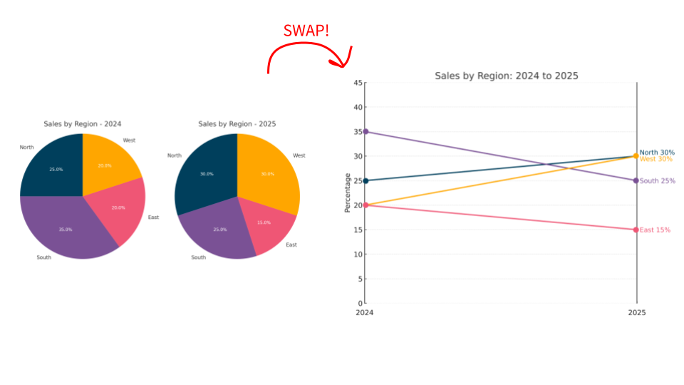
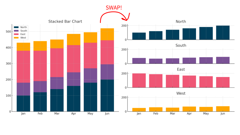
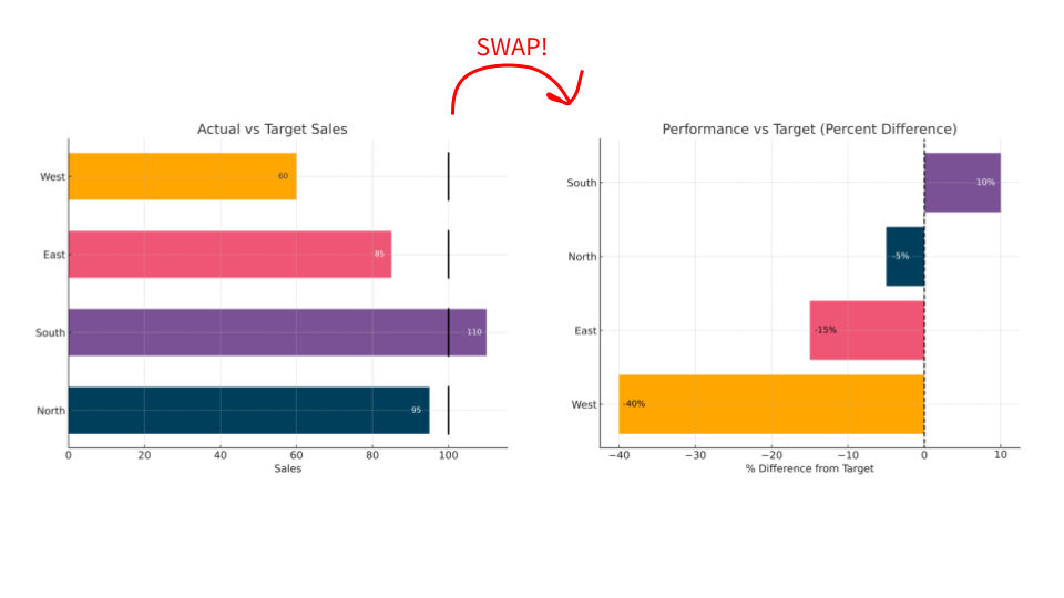
In this episode of The Data Literacy Show, hosts Ben Jones (CEO of Data Literacy) and Alli Torban (Senior Data Literacy Advocate) share 3 smart chart swaps that instantly improve the clarity and impact of your data graphics. Whether you’re presenting to executives or designing reports, these quick swaps help your audience grasp what matters.
Topics covered:
-
Why using two pie charts to show change over time is hard to read, and what to try instead
-
How small multiples can solve the problems of cluttered stacked bar charts
-
When to swap a bullet chart for a diverging bar chart to better show performance vs. target
Links mentioned: Level 1: Learning to See Data on-demand course: learn the building blocks of charts, common types, when to use them, and more.
Episode show notes: http://dataliteracy.com/episode-08

