An Illustrated Guide to Data Literacy:
Bias in Research
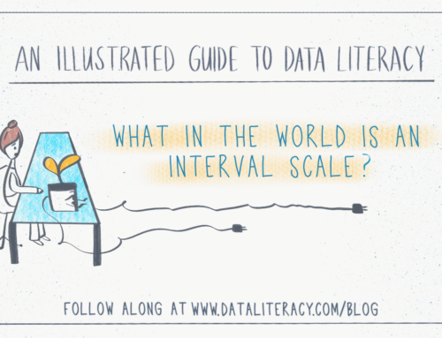
Welcome back to our comic series that explores a range of data literacy concepts. We follow Becky, who describes herself as a bit data-phobic, as she navigates tricky situations at her new job. She’ll learn to create effective charts, grasp statistical concepts, and confidently clean data for analysis with the help of her faithful desk plant Fern. (If you missed the first comic about pie charts, check it out here!)

Sources:
If you know anyone who would enjoy following Becky’s journey becoming a confident data communicator, then please feel free to share this comic series!
Behind-the-Scenes
Comics are such an effective way to communicate concepts in a welcoming way. I think they’re so engaging because the comic format forces you to show a real-life example, and you really don’t have the luxury of being long-winded. Each frame uses a mixture of visuals and text to move the story forward, so every pixel is crucial! Because of this, there is a ton of planning and sketching that happens before the final comic is inked. If you’re interested in learning about the process, read on. 🙂
Step 1: Create your world
Comics are about telling visual stories, so you need to envision who your characters are, their personality, their relationships to each other, and their environment. It’ll be difficult to go to the next step if you don’t have an idea of your world. We decided that our main character is Becky, the every-woman in the typical workplace. She’s a bit data-phobic but humble and ready to learn. I wanted another character that could help guide Becky through sticky situations, but I was afraid that character would come across as a know-it-all. So I made that character Becky’s desk plant named Fern. If the character is a plant, we don’t assign it the same motives as we would a human so Fern can give out advice freely!
Step 2: Write a script
Next, we decide what the topic will be, which three main ideas or concepts we’ll explain, and then begin writing a script that includes these things in our new world. This is difficult work. Coming up with a storyline that makes sense, can be told succinctly, and also conveys new ideas clearly is no small feat. Try to write it out in paragraph form like it’s a screenplay (some dialogue, some describing what the characters are doing, etc), and have someone else read it. It should make sense at this point even though there are no visuals.
Step 3: Circle/underline key phrases
Once you have your script, read through it and circle key phrases that would work well as visuals. Then underline phrases that need to be written out as dialogue or narration in the comic.

Step 4: Rough sketch the frames
With the script annotated, start roughly sketching out what would be included in each frame. Think about where this comic will be posted or printed. Does it need to fit into a certain space? This will help you decide how many frames you have to work with, and how you might combine or split up certain actions. Many small frames make the comic feel fast-paced. Few large frames make the comic feel slower and freer. Use this to your advantage when you need to manipulate how much time is passing. Hold your sketches out in front of you and look at the diversity of each frame. Does each frame show two people staring at each other? Maybe you can zoom in on one person’s face to highlight emotion. Maybe you can zoom out and show the location first. The comic looks much more interesting if there are different kinds of views.
Step 5: Neatly sketch the frames
Once you’ve weeded through the script and roughly sketched out the most important bits, you can start refining your sketch. The goal is to make sure each frame has a good balance of visuals and text, all of the frames together clearly communicate your main points, and there is diversity in each frame’s viewpoint. I try to sketch just enough that the point is conveyed neatly, but I don’t strive for completely fleshed-out details. My goal is to sketch neatly enough that I can show it to other people to get feedback.

Step 6: Final ink!
After you’ve received feedback on the clarity of your message in your sketch, it’s time to add the final ink! I use an app on my iPad called Procreate to draw the comic, but you can use any other tools you’re comfortable with or pen and paper. I trace over my sketch with an ink brush and adjust the characters and text in the frame so everything fits nicely. I’m not a trained artist, and drawing people is pretty difficult for me. I found this great web app called Pose by Gal Shir, which lets you pose an outline of a person in any way and download the image. So I can create a pose, add it to my comic, and trace around it.
The hardest part for me is to write the text neatly and consistently. I’ve thought about using a font, but I love the charm that truly hand-written comics have. Maybe I’ll turn my handwriting into a custom font. 🙂 After I ink it, I add another layer of color. Since this is an educational comic, I don’t think the color should take center stage here. I used Data Literacy brand colors and made them about 50% transparent.

That’s it! The inking and coloring are the easiest part because you’ve done so much work leading up to it. Sometimes I get stuck in the trap of trying to make every line perfect, though. I try to remember that it’s the message that’s most important, and people’s eyes are pretty forgiving. 🙂
Futher learning: I enjoyed reading many of Scott McCloud’s books about creating comics, and this Skillshare class by Ira Marcks was really useful.
If you make your own educational comic, make sure to tag Data Literacy so we can celebrate you!

Alli Torban is a contributor to Data Literacy LLC. She’s an Information Design Consultant based in Washington, D.C., and hosts the podcast Data Viz Today. Alli specializes in designing data visualizations for researchers to help get their work understood by a wider audience. She enjoys creating whimsical patterns and spending time with her husband and two daughters.