Patient and Persuasive
How Florence Nightingale conveyed data insights to all
Written by RJ Andrews of Info We Trust
Note: Register now to join a free webinar conversation between RJ and Data Literacy CEO Ben Jones on 23 Feb, 2023 at 10:00am PST.
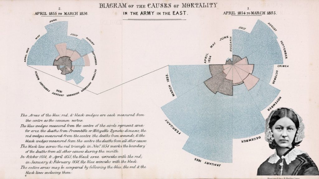
When it comes to data storytelling, Florence Nightingale is known for her association with one colorful polar-area diagram. But that chart was not designed to be seen in isolation. It was meant to be read as a part of a narrative that included an integrated sequence of graphics, tables, and prose.

While Nightingale’s diagrams might be the most salient artifact of her persuasive power, her writing may be the most important. If you want to learn how to better communicate with data, study how she wrote about statistics.
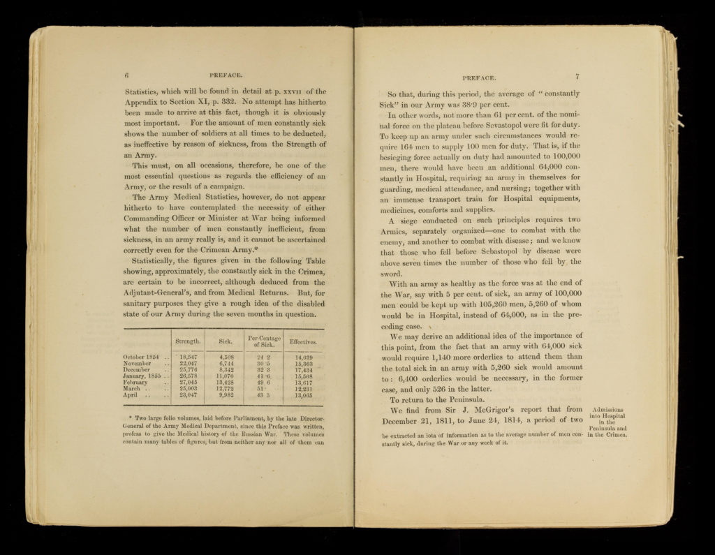
For example, read how Nightingale developed a particular percentage:
So that, during this period, the average of ‘constantly Sick’ in our Army was 38.9 per cent.
In other words, not more than 61 per cent. of the nominal force on the plateau before Sevastopol were fit for duty. To keep up an army under such circumstances would require 164 men to supply 100 men for duty. That is, if the besieging force actually on duty had amounted to 100,000 men, there would have been an additional 64,000 constantly in Hospital, requiring an army in themselves for guarding, medical attendance, and nursing; together with an immense transport train for Hospital equipments, medicines, comforts and supplies.
A siege conducted on such principles requires two Armies, separately organized—one to combat with the enemy, and another to combat with disease; and we know that those who fell before Sevastopol by disease were above seven times the number of those who fell by the sword.
Florence Nightingale, Notes on Matters Affecting the Health, Efficiency, and Hospital Administration of the British Army, Founded Chiefly on the Experience of the Late War (London: Harrison and Sons, 1858), Preface, 7.

From a single medical statistic, Nightingale builds an economic argument by reframing it, reframing it again, scaling the percentage to real-world proportions, and finally giving its second-order implications.
Nightingale’s focus on this summary value of 38.9% is both generous and effective. It is generous because her tour creates successive opportunities for readers of all numerical abilities to appreciate what this percentage actually means. This was essential for her success because her writing was for influencers, such as the Queen and Prime Minister, who were not trained in statistics like she was. (In private, she ungenerously called this type of person “vulgar.”)
The repetition was effective because it trained her reader’s attention to where she wanted them to look. It was impossible to miss this scandalous fact. One could look away from the evidence, but they could not deny it.
The passage is a microcosm of how Nightingale argued with facts. She knew it wasn’t enough to have the right answer. Knowing is not enough. Once you have the insight, the real work has just begun. Attracting, engaging, and motivating others to do something about it is the hard part. The math of statistics is pretty easy, it’s mostly addition and subtraction. The people part is what makes data hard.
William Farr, England’s top statistical talent and Nightingale collaborator, once complimented her writing. “It is like light shining in a dark place.”
Today, we should aspire to achieve the same.
About the author:
Data storyteller RJ Andrews helps organizations solve information problems. His passion is studying the history of information graphics to discover design insights. See more at infowetrust.com.
RJ’s recently published series, Information Graphic Visionaries, features three books, each celebrating the spectacular work of pioneering data visualization creators.


