Bing Chat’s Powerful but Flawed Chart Reading Capabilities

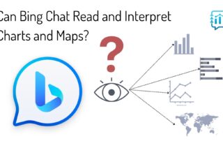
Bing Chat's Powerful but Flawed Chart Reading Capabilities Due to the ubiquity of data visualizations in our world, the ability to read and interpret charts and graphs has become a critical skill for everyone. It's so important, we created our Level 1 training course around it, along with my book Learning to [...]

By |2023-09-30T11:09:51-07:00September 30th, 2023|Helpful Explainers, Thought Leadership|Comments Off on Bing Chat’s Powerful but Flawed Chart Reading Capabilities

Resource Review: Nightingale Magazine by DVS

Resource Review: Nightingale Magazine In our latest video in the Resource Reviews series on our Data Literacy video channel on YouTube, our CEO Ben Jones gives you a sneak peek at the latest issue of the Nightingale Magazine that's published biannually by the Data Visualization Society, and he talks about why he's such [...]

By |2023-07-11T16:16:55-07:00July 11th, 2023|Helpful Explainers, Videos|Comments Off on Resource Review: Nightingale Magazine by DVS

Data Memos

Data Memos 12 reflections on data (and its representation) that we don’t want to forget in the “next-normal” Written by Giorgia Lupi and Paolo Ciuccarelli Originally published on Giorgia's Medium Account and Center for Design's Medium Account, and covered by Ben Jones in the "Resource Reviews" video series on the Data Literacy [...]

By |2022-10-25T10:34:05-07:00October 4th, 2022|Helpful Explainers|Comments Off on Data Memos

VIDEO: Avoiding Graphical Gaffes

VIDEO: How to Avoid "Graphical Gaffes" Our CEO Ben Jones, author of Avoiding Data Pitfalls (2019, Wiley) and Learning to See Data (2020, Data Literacy Press), discusses some examples of visualizations he has seen "in the wild" recently that provide opportunities to learn what to NOT to do when communicating data visually. Watch [...]

By |2022-02-21T18:35:00-07:00February 21st, 2022|Videos|Comments Off on VIDEO: Avoiding Graphical Gaffes