VIDEO: How to Avoid “Graphical Gaffes”
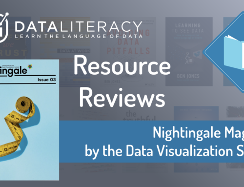
Our CEO Ben Jones, author of Avoiding Data Pitfalls (2019, Wiley) and Learning to See Data (2020, Data Literacy Press), discusses some examples of visualizations he has seen “in the wild” recently that provide opportunities to learn what to NOT to do when communicating data visually. Watch the 36 minute recording below to see his deconstruction of 20 different charts grouped into 4 different categories.
To learn more about the critical language of data, enroll in our upcoming public course that starts on February 28th, Data Literacy Level 1, take it on-demand at your own pace, or reach out to us for how to get training for your team at work.