How W.E.B Du Bois Used Data Visualization to Debunk Social Darwinism and Tell A Story of Resilience
Editor’s note: A version of the following article by Allen Hillery also appears on the Nightingale blog of the Data Visualization Society here. For other articles written by Mr. Hillery, see his Medium page.
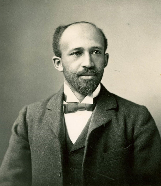
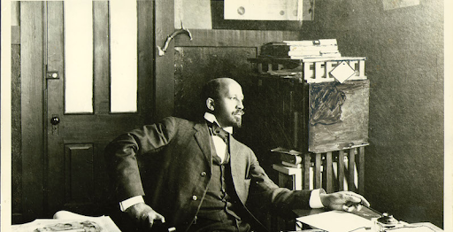
William Edward Burghardt Du Bois was a well known writer, sociologist, historian, and civil-rights activist. He was born Feb 23, 1868 in Great Barrington, Massachusetts, and grew up in a relatively tolerant and integrated community. He completed his graduate work at the University of Berlin and Harvard — becoming the first African American to earn a doctorate. Commonly known as W.E.B. Du Bois, he was also a data visualization pioneer. While he is known for his collection of essays, Souls of Black Folks, he also architected the nation’s most sophisticated quantitative research on race and the black population. I wasn’t aware of this research until a few years ago when I was looking to honor a data visualization expert for Black History Month. The revolutionary graphics, now about 121 years old, depict how far the African-American community had advanced in less than half a century following the abolition of slavery in the United States in 1863. It’s a data narrative of resilience and perseverance.
Du Bois was a professor of history, sociology and economics at Atlanta University. He established a sociology program in 1897, now recognized as the first school of American sociology. It was here that he led a team of students to produce 60 full-color charts, graphs, maps and tables on what had changed for African Americans since slavery. This collection was generated from a mix of existing records and empirical data collected by his sociological laboratory. The visualizations stressed one narrative; that the African American community had made progress. The colorful, hand-drawn illustrations showed that literacy rates for African Americans were rising and that African American ownership of property and land was increasing. African American businesses were growing and so were the number of patents for inventions.
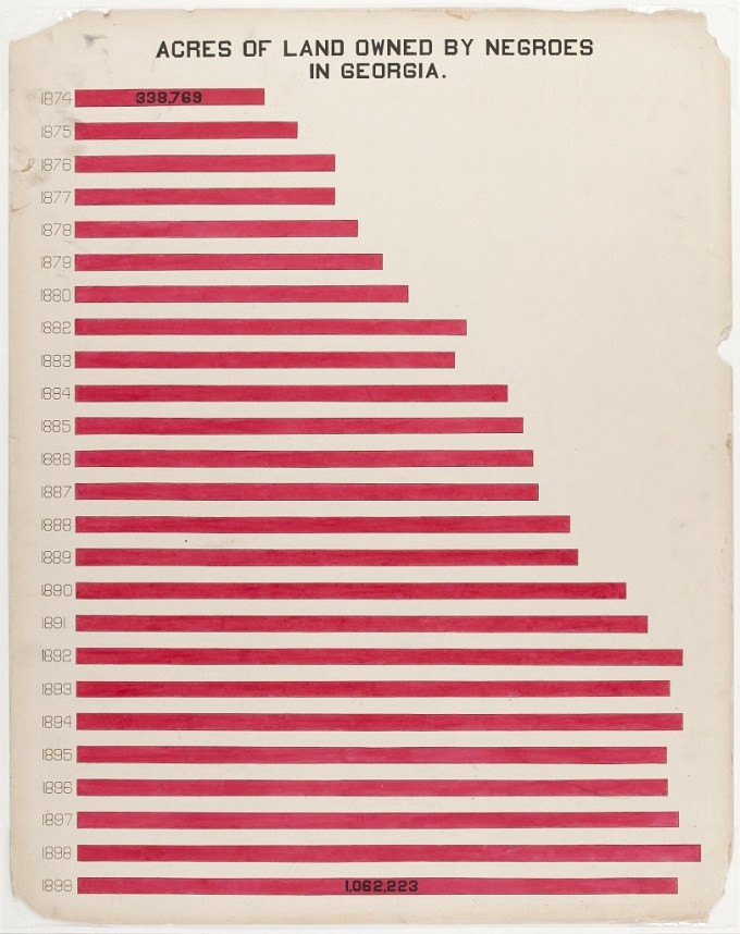
This data visualization shows that land ownership by African Americans had been steadily increasing over time.
In addition to the use of color and lettering what made this work impactful was the delivery and presentation. This collection of work was displayed at the 1900 Paris World Fair, Exposition Universelle. Du Bois wrote that he viewed the contribution of the visualizations to the Paris Exposition as an opportunity to display the work of the Atlanta School of Sociology to the “thinking world.” At the time, Social Darwinism — a prevailing theory based on the notion of survival of the fittest — was used to suggest that the Black race would soon become extinct due to its perceived inferiority. This was a view held by the majority of Du Bois’ peers. His work presented statistical data showing that the Black population was increasing rather than decreasing — a direct contradiction to this popular theory.
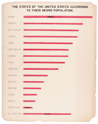
This data visualization used comparison to show how the African American population in Georgia compared to other states in the US.
Du Bois took a very uncomfortable topic and presented it to an uncompromising audience who used science to perpetuate that Black people were inferior to people of European descent. These data visualizations did not convey a utopian narrative about Black progress in a forward-looking, modern nation. Instead, they highlighted the gains made by African Americans in spite of systematic laws like Jim Crow, put in place to un-level the playing field for newly freed African Americans. Given all of the potential skepticism DuBois was going to face from his peers, he set out to present an argument that spoke for itself in hopes of effectively persuading the audience, or at the very least to show them a different view.
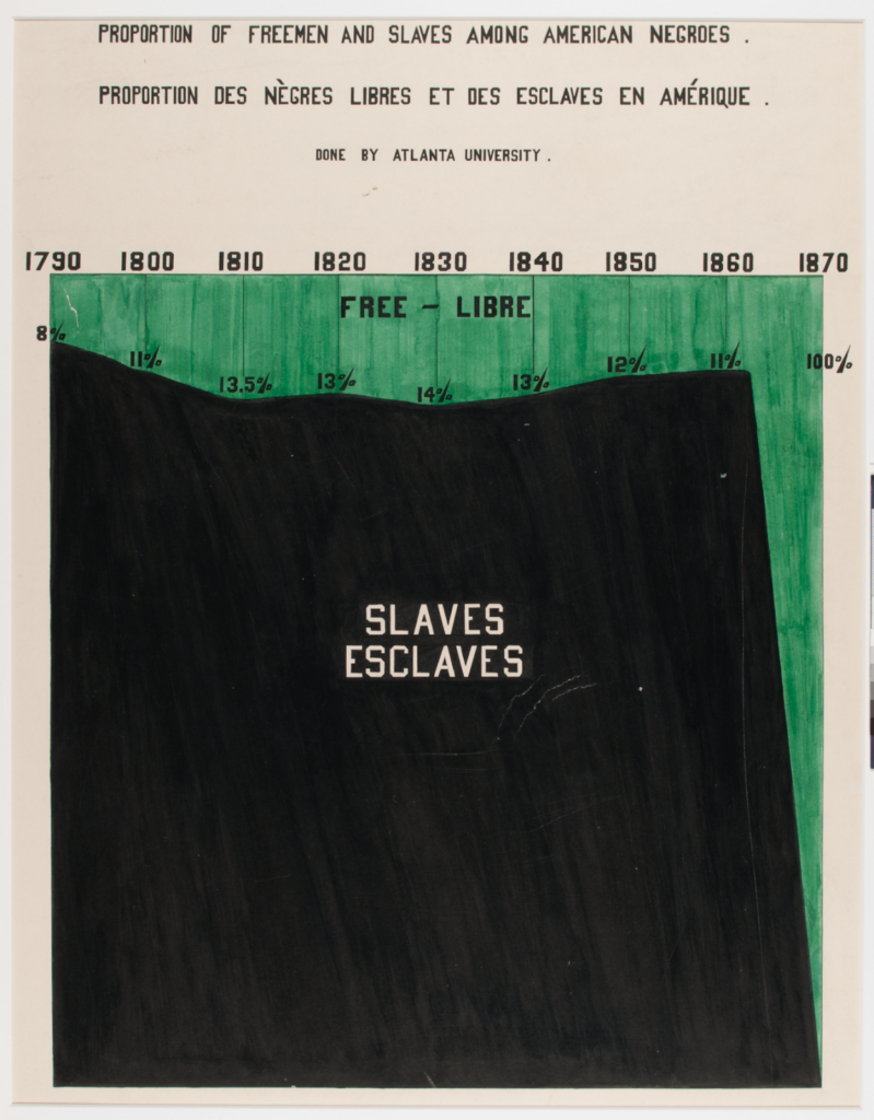
This relatively simple visualization evokes a powerful message on the percentage of African Americans who remain enslaved. For 76 years at least 86% of African Americans were slaves.
The use of color is purposeful and the annotations help quantify the enslaved vs free populations.
There will be times in our lives and career where we will need to convince people of an idea or position they don’t currently hold or agree with. This is where data storytelling is so pertinent. W.E.B. Du Bois knew the importance of framing the argument that Black America was progressing. He made sure that there was vivid supporting evidence through data, photographs and handwritten Jim Crow law codes to bolster a story of perseverance by Black Americans post emancipation. He also found the right balance of connecting emotionally with his audience through national pride in the form of pursuing the “American Dream”. Du Bois’ work showed that in spite of this and laws put in place to discourage progress, some still emerged based on Black homeownership and educational attainment.
Based on Jay A. Conger’s article from the Harvard Business Review, “The Necessary Art of Persuasion”, effective persuasion becomes a negotiating and learning process through which a persuader leads colleagues to a problem’s shared solution. It can be a difficult and time consuming journey but can be powerful when executed with precision and intent. I can imagine that it took Du Bois weeks, if not months to design and position his visualizations to address his audience and their perspectives. As Conger stated, you have to appeal to your audience to help them get from “here to there” by establishing some credibility and by giving them some reason to help get there. Using Conger’s framework this is how I believe Du Bois prepared his work:
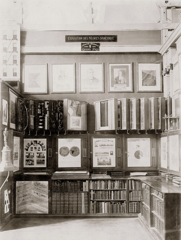
The American Negro Exhbit at the 1900 Paris World Fair, Exposition Universelle
He established credibility. While Du Bois’ achievements and accreditations should have established him as a thought leader in his field, this was not enough for those who held Social-Darwinist beliefs. In addition to his credentials, he leveraged data sources like the U.S. Census data, U.S. Bureau of Labor statistics and various government reports. The more skilled one is about a topic or skill, the easier for the audience to accept the author and their work.
He framed his goals around common ground. Du Bois used this invitation to the Paris World Fair as an opportunity to contribute two unique sets of data visualizations to the American Negro Exhibit. The first set of infographics created for the exhibit used the state of Georgia to represent the Black population across the country. Georgia represented the U.S. state with the largest African American population at the time. Du Bois and his team used Georgia’s diverse and growing Black population as a case study to demonstrate the progress made by African Americans since the Civil War. Presenting this data on a state level helped position the exhibit for the second set of infographics, which compared national and international data sets. Given this was an international conference, Du Bois and his team made sure to make comparisons of literacy rates, for example, between African Americans and European countries to establish context.
He reinforced his position using vivid language and compelling evidence. When presenting an argument it’s important to supplement numerical data with examples and stories to make your position captivating and come alive. Du Bois and his Atlanta team decided to make the American Negro Exhibit stand out. They produced hand-drawn graphs, charts, and maps arrayed in lively, vibrant colors punctuated by artistically intersecting lines. Bar data contained blocks of contrasting colors documenting the Black experience. They also included photographs in the exhibit. to complement their work. However, the art did not distract from science; it served to reinforce the comprehensive scientific data chronicling the African American Journey.
He connected with his audience emotionally. Alongside the Georgia study’s data visualizations and photo albums, Du Bois included a three-volume, handwritten compilation of the Black Codes of Georgia, stretching from the slave codes of the colonial and antebellum period to the segregationist policies and laws of the present. This produced a much more complicated narrative that Du Bois is able to meticulously navigate us through while drawing the audience deeper into Black American life. His work showed that Black Americans hadn’t prospered because of America; they were beginning to flourish in spite of it. The irony skillfully weaved in was that It was this same determination for independence that is reminiscent of the ideals the nation was built on.
W.E.B Du Bois was a burgeoning sociologist who introduced a methodology that combined history, statistics and demographics. His sociology program would later be recognized as the first school of American sociology.
Du Bois’ exhibit received praise and accolades by the world fair officials. He and his design team used clean lines, bright color, and a sparse style to visually convey the growing population of African Americans and their gains since the abolishment of slavery to persuade their audience. An audience that, in general, used Social Darwinist theories of civilization to justify a belief that Europeans and Anglo-Americans were superior to non-white peoples. This message did not get the press coverage it rightfully deserved. While it received coverage in the African-American press, it received minimal coverage in European media and practically none in mainstream America.
Fortunately we are able to recount W.E.B Du Bois’s story of firsts. In addition to being an American pioneer of data visualization, he pioneered a new way to use sociology. In 1897, he leveraged history, statistics and demographics to quantify Black America. He established a sociology program at Atlanta University that is now recognized as the first school of American sociology. The data his team collected became a part of one of the most impactful stories ever. As Du Bois puts it, “I got a couple of my best students and put a series of facts into charts.”



[…] visual turns and de-turns – but the call for visual literacy, issued as far back as the times of Du Bois, has too often remained unheard. This leaves us with the question of how critical visualisation is […]