Data Journaling: an Analog Way to Learn About Data
Rebecca Gourley is a multimedia storyteller with a background in journalism and design. She’s a self-proclaimed nerd with interests in gaming, coding, hiking, crafts and plant-keeping. She’s been involved in data visualization work for the last couple of years and just completed the Certificate in Data Visualization program at the University of Washington in June 2021. She lives in the Seattle area with her fiancé Ryan and two fur-kids, Ziva (dog) and Gary (cat).
Data is having a moment. For the last year and a half, you’d be in the minority if you didn’t see some kind of chart in the first 30 minutes of turning on the news. Whether it was news of the pandemic, climate change, politics or issues related racial and social injustice, the average person has likely consumed a daily dose of data since 2020 began.
While I personally appreciate a good line chart, there has been something lacking in all this new exposure to data: how to understand it. Understanding complex data is a skill that’s not easily learned overnight — much like learning how infectious diseases spread. That’s why I created a tool to help folks dip their toes, so to speak, into data tracking, analysis and visualization — and you don’t have to download it. My tool isn’t some fancy app that gives you a ton of data to sift through — it’s analog.
At the start of the pandemic, I decided to enroll in a data visualization certificate program. In my application letter, I explicitly said that I wanted to do this program right now because of the pandemic.
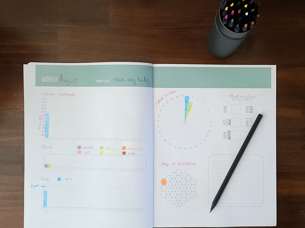
I created a data journal to track various aspects of your own wellness. It gives you the freedom to start learning about data by tracking your own: Running, walking, hiking or literally any activity you do often; daily habits; water intake; moods and sleep.
- This is how I use my journal.
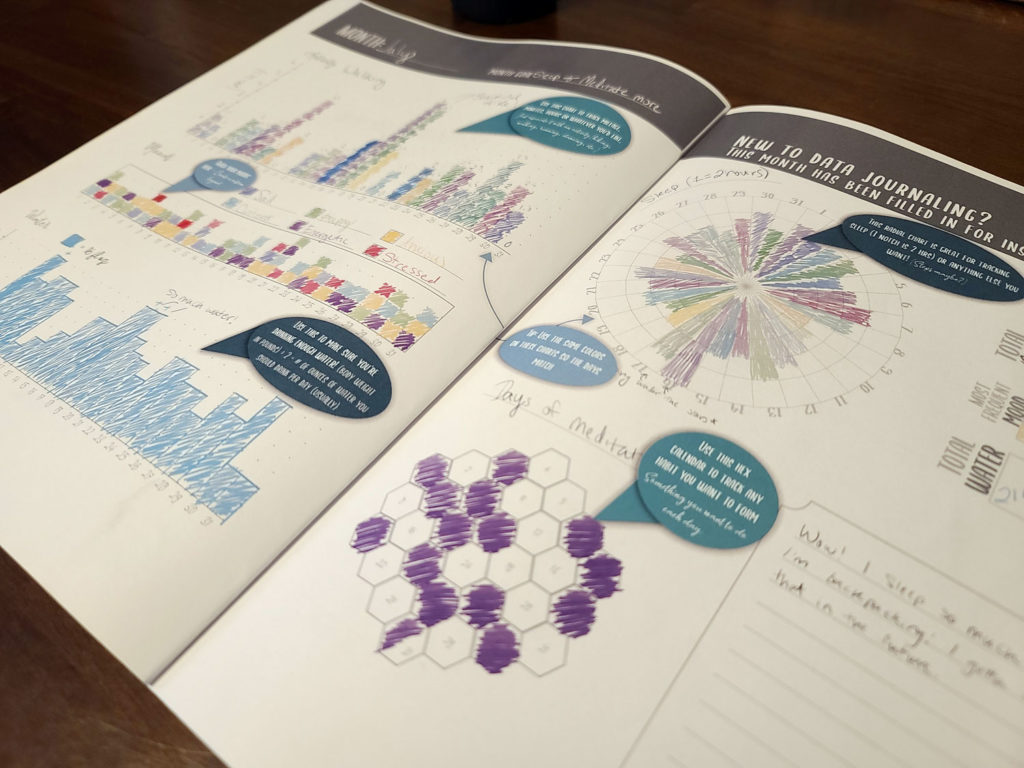
- The first spread of the data journal has prefilled charts and instructions for those new to data journaling.
Each two-page spread is an entire month of your personal data. Is there already an app that can do this? Yes, probably dozens or even hundreds. But what I’ve found with many fitness-tracking apps is that the customization options are limited, and the user doesn’t usually get to look at the data in different formats or time periods to spot trends.
Tracking your personal data in this pen-and-paper format is a great way to get started on becoming data literate. It doesn’t require technical skills, so it is more accessible to folks who might be a little scared by the sometimes-daunting task of creating their own charts and graphs in a program like Tableau or even Excel.
Visualizing data is one thing, but aggregating it and making decisions based on it is another. But I’ve thought about that aspect of data literacy in the process of designing this journal. Each month has an “at a glance” section where each chart can be aggregated in various forms (sums, most frequently occurring, etc.)
Then at the end of the year, there’s a two-page spread dedicated to even greater aggregation — summation of some data points, averaging for others — as well as some space for written reflection and goal-setting.
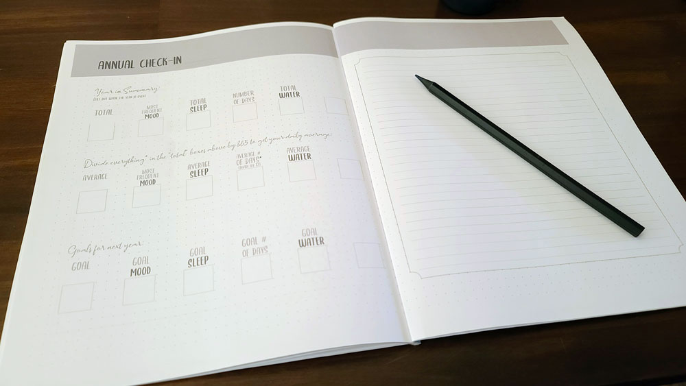
The two-page spread at the end of the journal allows for reflection and goal-setting for the next year.
This type of workflow is similar to that in a business setting in which you’re gathering metrics about your company — whether that’s employee performance, sales or livestream viewership. After the data collection and visualization process, you then typically have to analyze it through aggregation (averages, summations, medians, etc.). Once you have the analysis and you can visualize trends, you can then make decisions (or set goals) for the next month or year.
My plan is to design more styles of data journals in the future, each with a different primary focus (learning new skills, pregnancy, etc.).
Learning something using an analog tool — like taking notes on paper versus a laptop — has been shown to deepen understanding, according to a 2014 research paper by Pam Mueller and Daniel Oppenheimer. While the researchers didn’t specifically study data journaling, it’s worth noting that, much like when you’re taking notes during a lecture, physically marking data points on a chart may help you connect with the numbers on a deeper level.
The first edition, “Data Journal: Wellness” is available on Amazon.


