Spatial Data is Messy – How to Make Peace with It
Written by Sarah Battersby
Spatial data is just like all of your other data – it’s messy. But decoding the problems can be a bit trickier since spatial data isn’t often a normal string or number that you can inspect in a data table. It’s important for professionals dealing with spatial data to be aware of the sources of errors in order to accurately interpret and use spatial data.
A main challenge with spatial data is that it’s data that we’re all intimately familiar with, and digital map data will never be as rich and detailed as what we experience in the real world. We live in the world, we have a sense of how it works, and our brains are just wired to make sense of location. However, no matter how high quality the spatial data we work with is, it is still just a representation of the real world. That means that it’s been sampled and simplified to turn it into digital bits and bytes to use in analyses and to render on a map.
Let’s take a look at a few common problems with spatial data and the impact they might have on your analytics…
Pitfall #1: Generalization
We’ll start with the fundamental problem of spatial data needing to be simplified and sampled to put on a map. This process involves generalization, or simplification of the structure of the data.
As an example, perhaps you are mapping data that align with US Counties. You might grab a dataset for the county boundaries from the US Census cartographic boundary files. But wait, there are three different versions!
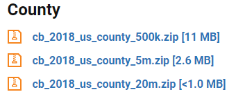
Each of the files represents the same spatial data (US Counties), but at different resolutions. This means that the lines representing the edges of the counties will be more (1:500k) or less detailed (1:20m) depending on the version you select. The change in detail between the data sets can impact your analyses both visually and analytically.

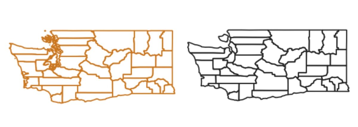
You won’t always have a choice regarding the resolution of your spatial data, but when you do, why shouldn’t you just always pick the most detailed version? If you’re worried about file size, the more detailed spatial dataset will be larger – sometimes a lot larger. Or, if you’re worried about how the data will look cartographically when you’re styling your map, the most detailed version may have too much detail for the scale of your map and the lines will look messy. For instance, compare these two maps of Washington state counties. The 1:500k map on the left looks blurry and chaotic along the coast; the 1:20m map on the right looks cleaner and easier to read.
Pitfall #2: Positional Accuracy
Beyond generalization impacting the resolution of a data set, there are other potential issues related to the position of your points, lines, and polygons. Sometimes these are easy to spot, for instance if your data doesn’t align with the base map or other data sets on your map. Maybe you see data points for buildings in the middle of the street, in a lake, or even in the middle of nowhere. It’s clear that many of the data points below are misplaced, but why?

Sometimes the data set just isn’t of sufficient quality for your task and, unfortunately, the main solution there is to find higher quality data, or adjust your tolerance for positional accuracy. But, often there are problems that you can quickly identify and fix in your data pipeline. Here are a few common problems:
- Latitude and Longitude coordinates were accidentally truncated. At the equator, a degree of latitude and longitude is about 111km, so with no decimal places, the true location of your data point is probably somewhere within 111km. Note the caveat that this is true at the equator – a degree of latitude is the same size everywhere, but a degree of longitude represents a shorter and shorter distance as you approach the poles. For reference, what is the distance represented by a degree at the equator?
| Dec. places | Distance |
|---|---|
| 0 (1.0) | 111 km |
| 1 (0.1) | 11.1 km |
| 2 (0.01) | 1.11 km |
| 3 (0.001) | 111 m |
| 4 (0.0001) | 11.1 m |
| 5 (0.00001) | 1.11 m |
| 6 (0.000001) | 0.111 m |
| 7+ | probably suggests a higher precision than you really have |
Let’s look at the impact of number of decimal places on the map:
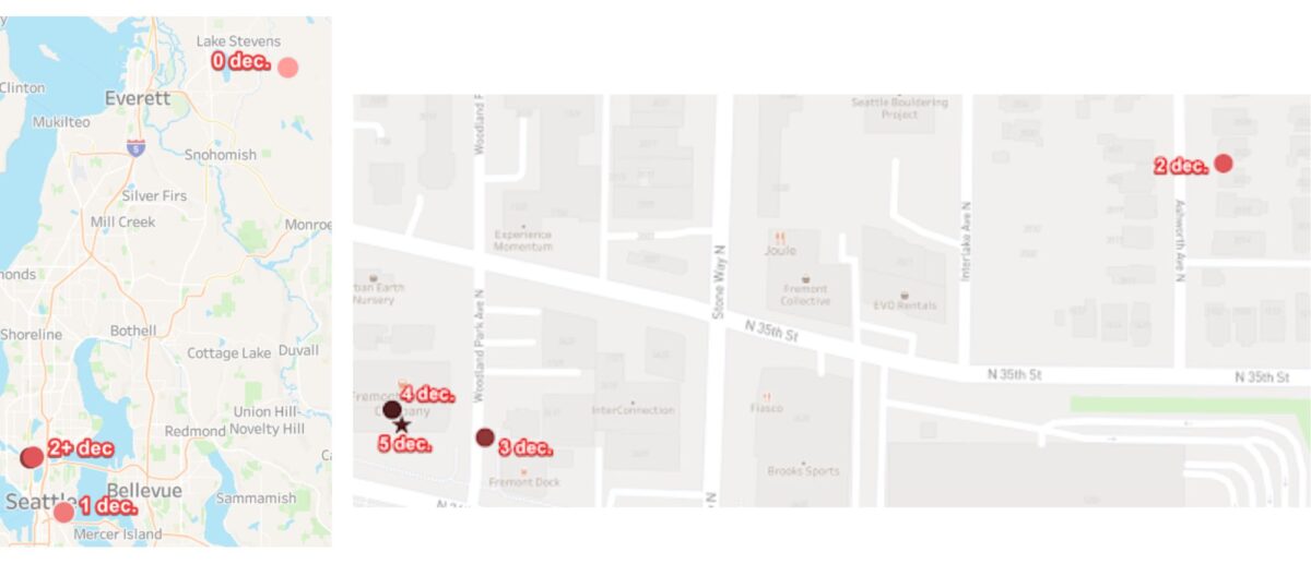
If you have data with a large number of decimal places, don’t fool yourself into thinking that it is super accurate data. Unless you really are working with survey-grade data, it’s more likely to be false precision due to data processing.
- Latitude and longitude coordinates were swapped! If your data aren’t showing up where you think they should, make sure that you have the latitude and longitude in the right order. Latitude is your Y coordinate and Longitude is your X coordinate. Different mapping tools want them in different orders when defining a point, so sometimes you’ll define the points with the coordinates as (Longitude, Latitude) and sometimes it’ll be (Latitude, Longitude) – though most often it is (Longitude, Latitude). If your points are in the wrong place, check the help files to make sure you haven’t swapped coordinates! Swapping coordinates may lead to data in the wrong place, or data that won’t map at all because latitude values (+/- 90°) have a smaller range than longitude (+/- 180°).
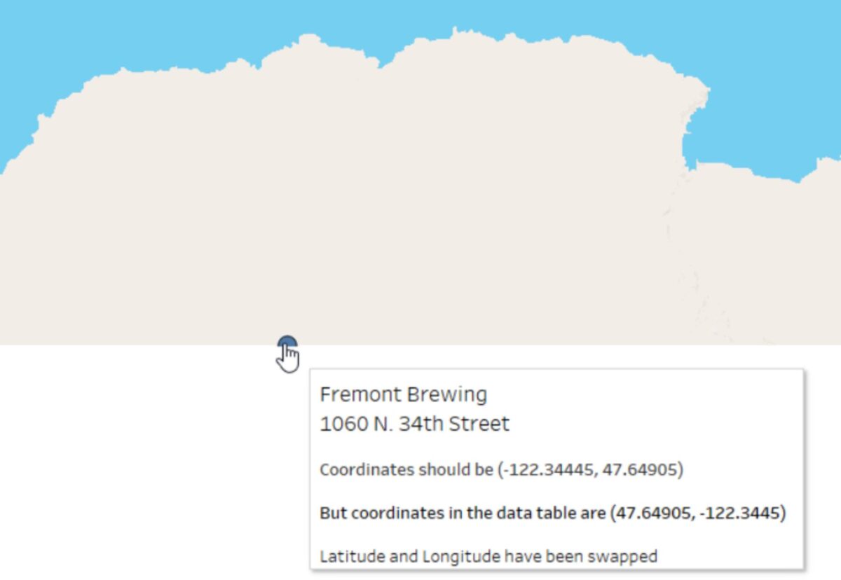
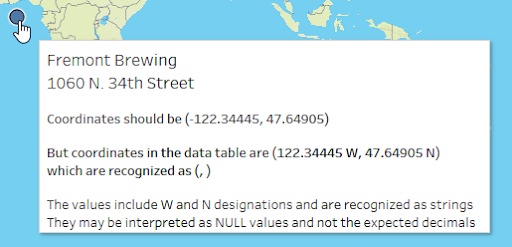
- Decimal points or negative signs may be missing. Sometimes coordinates are given as text strings with an East, West, North, or South designation. If those coordinates are converted to numeric data and they aren’t appropriately adjusted to reflect the sign of the coordinate (e.g., negative coordinates for West or South), the locations may map incorrectly. For instance, if the longitude for Fremont brewing was listed as 122.34445 instead of -122.34445 (aka 122.3445 West) the location would be mapped in China!
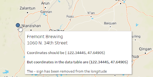
Or, the location may not map at all if the text string for the coordinate isn’t recognized as a number. In that case it might be seen as a Null value and default to Null Island (0,0).
Pitfall #3: Temporal Accuracy
Another common problem is that geographic boundaries and attributes change ALL THE TIME. For instance, Census boundaries are often redrawn with the decennial census, school district boundaries shift, postal codes are updated, and sometimes even country boundaries change. But spatial data generally represents a single snapshot in time. It’s important to know that date to ensure it’s right for your analysis and visualization.
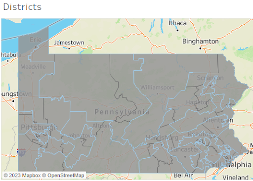
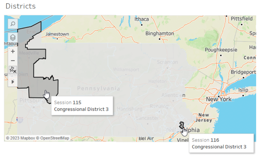
Perhaps you have a great dataset of historical election results, but need the spatial data to go with them? There isn’t a single spatial file that you can use for this, because the boundaries change! This is particularly important to consider when you work with mapping tools that provide built in geocoding datasets. You might be able to match a district name to a district polygon, but the geographic boundary may not be correct for the year of the data. Consider the districts in Pennsylvania between the 115th and 116th Congress. The map below shows the 115th boundaries in blue and the 116th in black. Pretty different!
Imagine if you were trying to match up your attributes using a join on the district name, e.g., “Congressional District 3.” You might get an unexpected result depending on which year’s data was used!
Pitfall #4: Attribute Accuracy
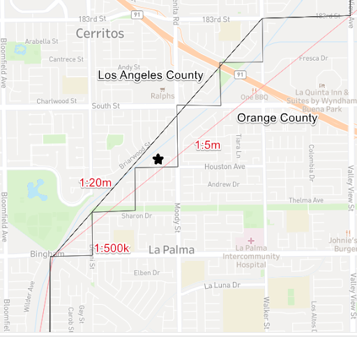
On a final note, all of the potential challenges with generalization, positional accuracy, and temporal accuracy can lead to problems with attribute accuracy. For instance, if you assign attributes based on geographic location – and it involves a geography with temporally sensitive boundaries – the attributes assigned will be based on that one time. Or, if you determine a county of residence based on which county polygon a point falls inside, the level of generalization may impact the resulting attribute. For instance, consider which county the starred location below would fall… with the 1:20m data set, it would be in Orange County; with the 1:5m or 1:500k data sets it would be in Los Angeles County.
While there are quite a few potential pitfalls with spatial data, many of them can be easily understood through careful visual exploration. Some will require adjustment to your data pipeline – for instance, to ensure that point coordinates are represented correctly. Some will require adjustment of your expectations – for instance, the level of generalization or time period available for your data. In your analytics workflow, understanding and keeping your eyes open for these sources of errors in spatial data can help ensure that your analysis results are more accurate and reliable.

Sarah Battersby is a cartographer that loves thinking about how people think about maps. Her research and technology work emphasizes how to help everyone visualize and use spatial information more effectively – no advanced degree in geospatial required. Sarah holds a PhD in Geographic Information Science from the University of California at Santa Barbara. She is a member of the International Cartographic Association Commission on Map Projections, and is a Past President of the Cartography and Geographic Information Society (CaGIS). Sarah can be found lurking about and talking maps on Twitter at @mapsOverlord


