Handmade in Punjab: embroidered data in phulkaris
The following Women’s History Month guest blog post was written by Sana Ahmed Wilder.
Sana is a data visualizer specializing in building capacity of federal and state education agencies. She analyzes and communicates student data using modern visualization and storytelling techniques. Sana lives in DC with her family.
As data interpreters, we aim to see, show, and tell stories. Acknowledging history and origins are a fundamental part of every important story. So it was revelatory to learn from Bowman et al, that Incan people developed the khipu, a data management system. They used the khipu to track census, military, and calendar data, and were doing so in the 1100s, long before Florence Nightingale or Joseph Priestly. Inspired by Bowman et al, and projects like BIPOC Design History, I thought about my own.
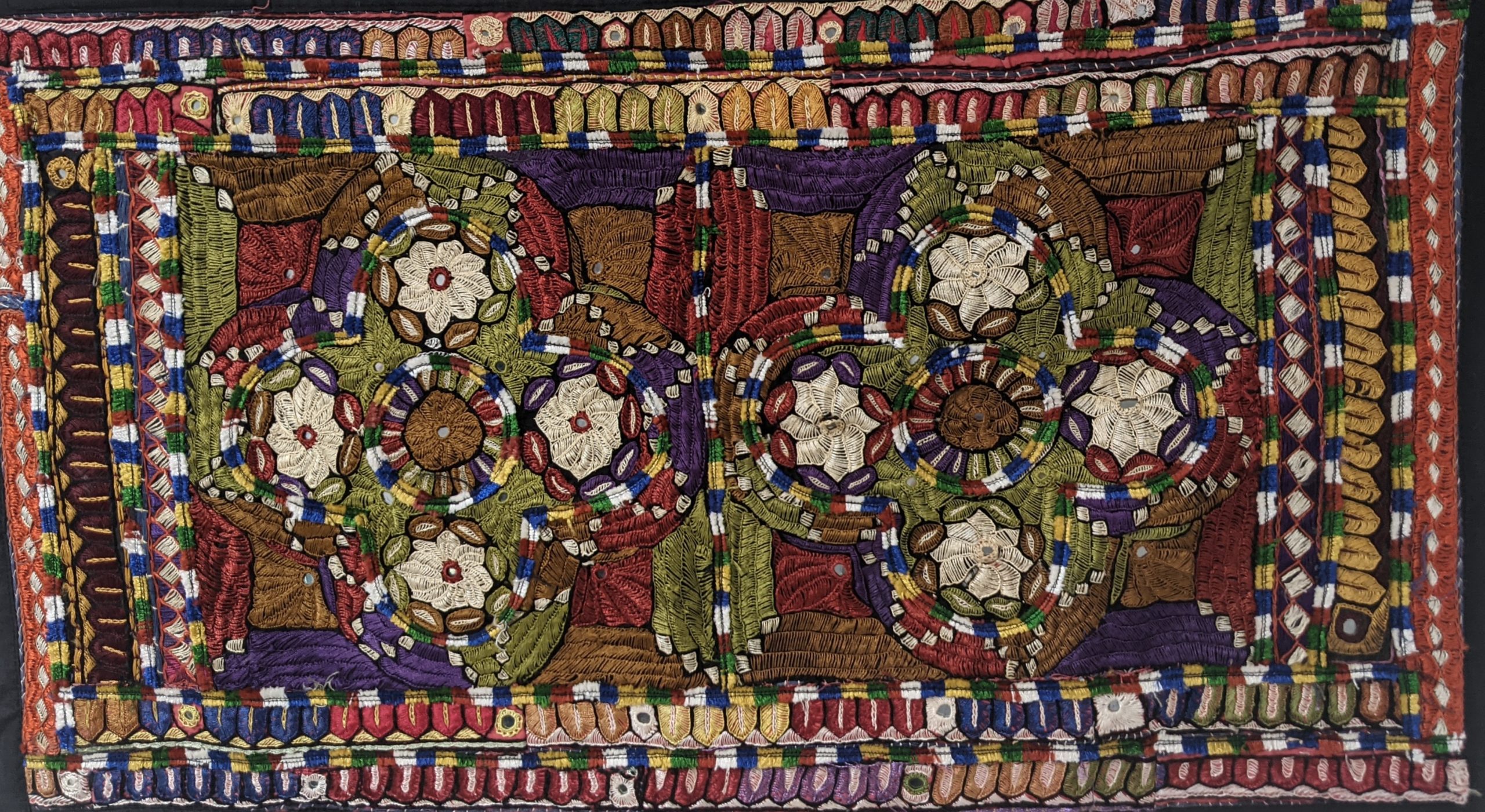
Punjabi women have been practicing phulkari embroidery since the 15th century. Translated literally, phulkari means “flower work.” Meticulously sewn by hand, phulkari designs are found on odhnis (long scarves), kurtis (tunics), tapestries, and more. This form of embroidery was practiced widely up until the 19th century; women and girls would gather to embroider work for themselves, daughters, and daughter-in-laws. They would pass their knowledge to the newer generations, who would continue the tradition of phulkari to be worn or gifted at life’s major events.

An undated Pakistani tapestry, in my office.
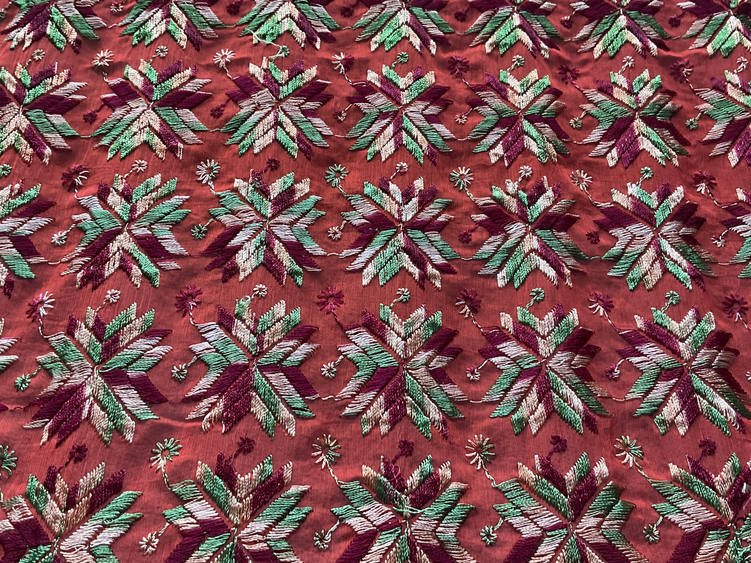
Colors were chosen with intention, purposefully considering the use of the odhni. A vibrant yellow indicated fertility and prosperity. Red represented passion and love. Blue, violet and green were used to depict waves, jasmine flowers, gardens, birds and other scenes from daily life. Most phulkari designs were geometric, and many bhags (scarves embroidered so heavily that the khaddar, base cloth, wasn’t visible) were tessellated. Some tessellations of triangles represent the male and female union. Other tessellations formed flowers, herbs, and plants. Since patterns were not sketched on the khaddar beforehand, women counted each stitch to construct the design. In some instances, the total stitch count was the number of grains donated during that season’s harvest. Incredibly, the women doing this work didn’t read nor write. Yet they encoded and visualized data in artifacts using complex mathematical concepts that most of us would require graphing software to do today. Within each handmade phulkari piece are the design considerations that we make in interpreting and visualizing data – those of alignment, symmetry, enclosure, color, and more.
Time and time again, I’ve read the origins of data visualization. It goes like this. The origins of quantitative data visualization are in coordinates and mapmaking, made with the pursuit of adventure, discovery, conquering, and/or colonizing. The credit given to those with the power and privilege to read and write, or those who knew them.
When colonizers arrived to exploit India and its people, phulkari shifted from a community and familial tradition to one with a price tag. Years later, suffering at the hands of capitalism, flighty European tastes abroad, and forced introduction low-quality fabrics and thread, the ubiquity of phulkari declined. Punjabi women whose hands had joyfully created during social and recreational time were now bound to other, more profitable tasks for the empire. But recently, mechanized phulkari and home-grown South Asian brands have revived this. Though rarely done with tight, small stitches by hand, it is seen in bazaars throughout South Asia.

Phulkari on an orange odhni. This embroidery work was completed with a machine.
Thanks to these sewing machines, I have several baghs in my closet, one tapestry in the dining room, and another in my office. Before thinking of the Venn diagram between my paid work and culture, I considered these works simply beautiful, decorative. I was looking at them, but I wasn’t paying attention. Why? Because I’ve internalized the principle that in order to be counted, it must be written.
In this way, I’ve upheld white supremacy by forgetting the lives of women like my own grandmothers and ancestors, who didn’t read or write, yet were documentarians of my history. So in these last days of Women’s History month, I encourage you to turn to your grandmothers’ quilts, temperature blankets, writing, and art. What data exists there that we’ve been passing off as relics of domestic work, instead of paying attention to their deeper meaning?
References:
BIPOC Design History. Accessed here: https://bipocdesignhistory.com/
Bowman, N. R., Evergreen, S., Parman, M., & O’Connor, J. (2020, October 28). Indigenous Data Visualization. A Presentation during American Evaluation Association Conference 2020.
Friendly, M. (2006). A Brief History of Data Visualization. In C. Chen, W. Hardle, & A. Unwin (Eds.), Handbook of Computational Statistics: Data Visualization (Vol. III). Heidelberg: Springer-Verlag. doi:10.1007/978-3-540-33037-0_2
Gupta, A. H. & Mehta, S. The Effect of Colonization and Globalization in the shaping of Phulkari: A case study of the Textiles of Punjab, India. Crosscurrents: Land, Labor, and the Port. Textile society of America’s 15th Biennial Symposium. Savannah, GA. October 19-23, 2016.
Khipu Database Project. Accessed here: https://khipukamayuq.fas.harvard.edu/
McKnight Sethi, C. (2016). Women’s Work: Phulkari, Flora Annie Steel, and Collecting Textiles in British India. In B. M. Bose (Author), Women, gender and art in Asia: C. 1500-1900. London; New York: Routledge.
Okun, T. (2019). White Supremacy Culture in Organizations [PDF]. Montreal: Center for Community Organizations.


