How to Make a Beeswarm Plot in RAWGraphs and Then Edit in PowerPoint
Do you want to create more complex chart types, but you feel like you don’t have the skills or the time to learn a new tool?
I’m here to help! Let me show you how to make a beeswarm plot using RawGraphs and PowerPoint. We’ll go from spreadsheet to polished visualization that’s ready to impress your team in under 15 minutes!
When I first started interviewing data visualization designers on my podcast, many said their workflow was to code up a custom data visualization and then clean it up in Adobe Illustrator. So, I began learning how to use Illustrator, but it took hours and hours of tutorials to finally figure it out.
Now that I’m more experienced, I know that there are many different workflows that a data visualization designer might use.
I’ll show you a simple workflow that you can use to create advanced chart types without installing anything or pouring over user guides.
So let’s make this beeswarm plot together!
What is a beeswarm plot?
It’s a chart that shows the distribution of data along one axis while also showing individual points. Think about a time you reached for a box plot or histogram. You wanted to show how the data was distributed, but you can’t see individual points with these charts, and these summary statistics might be hiding something interesting. If you use a strip plot, there can be over-plotting (i.e. points overlap).
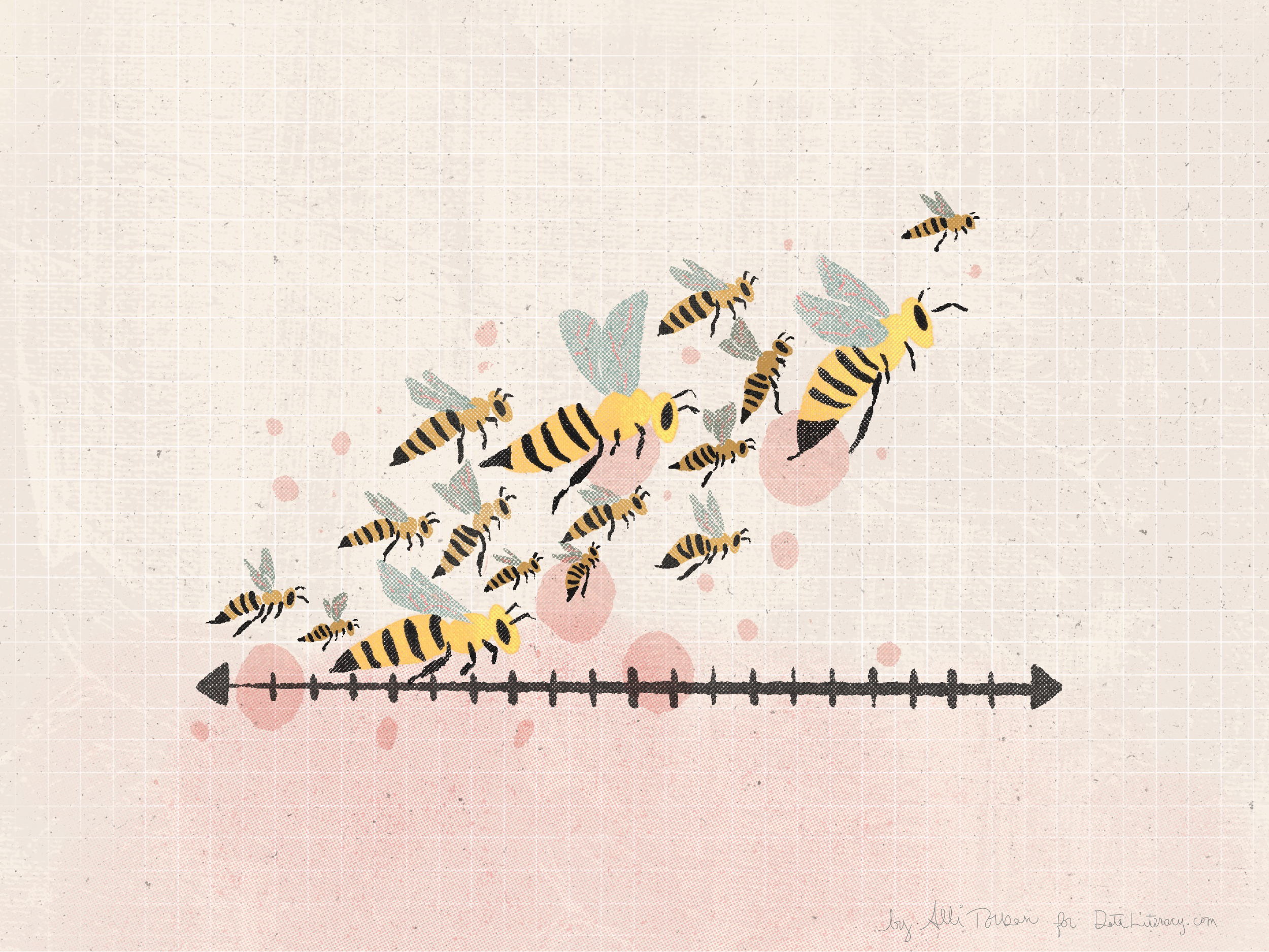
Enter the beeswarm plot! It’s basically a strip plot where the points are moved aside a bit so none of them overlap (this is what data viz designers call “jitter”), which makes the points look like a swarm of bees. Because of this, you wouldn’t want to use a beeswarm plot if it’s important for your reader to be able to find the exact value of a point, but it’s great to get the overall feel of a distribution. Another benefit is that you can change the size or color of the points to encode more information that can help you identify patterns.
Beeswarm plots are my absolute favorite chart type because it’s a very organic and intuitive way to show distributions. If you want to learn more about these plots, check out this video in Jon Schwabish’s One Chart at a Time video series with Cédric Scherer.
Now let’s start creating!
STEP 1: Get the data
Because it’s Clean Air Month and we’re making a beeswarm plot, I thought it would be interesting to investigate the insect that pollinates a huge number of plant species and is vital to our ecosystem: the honey bee!
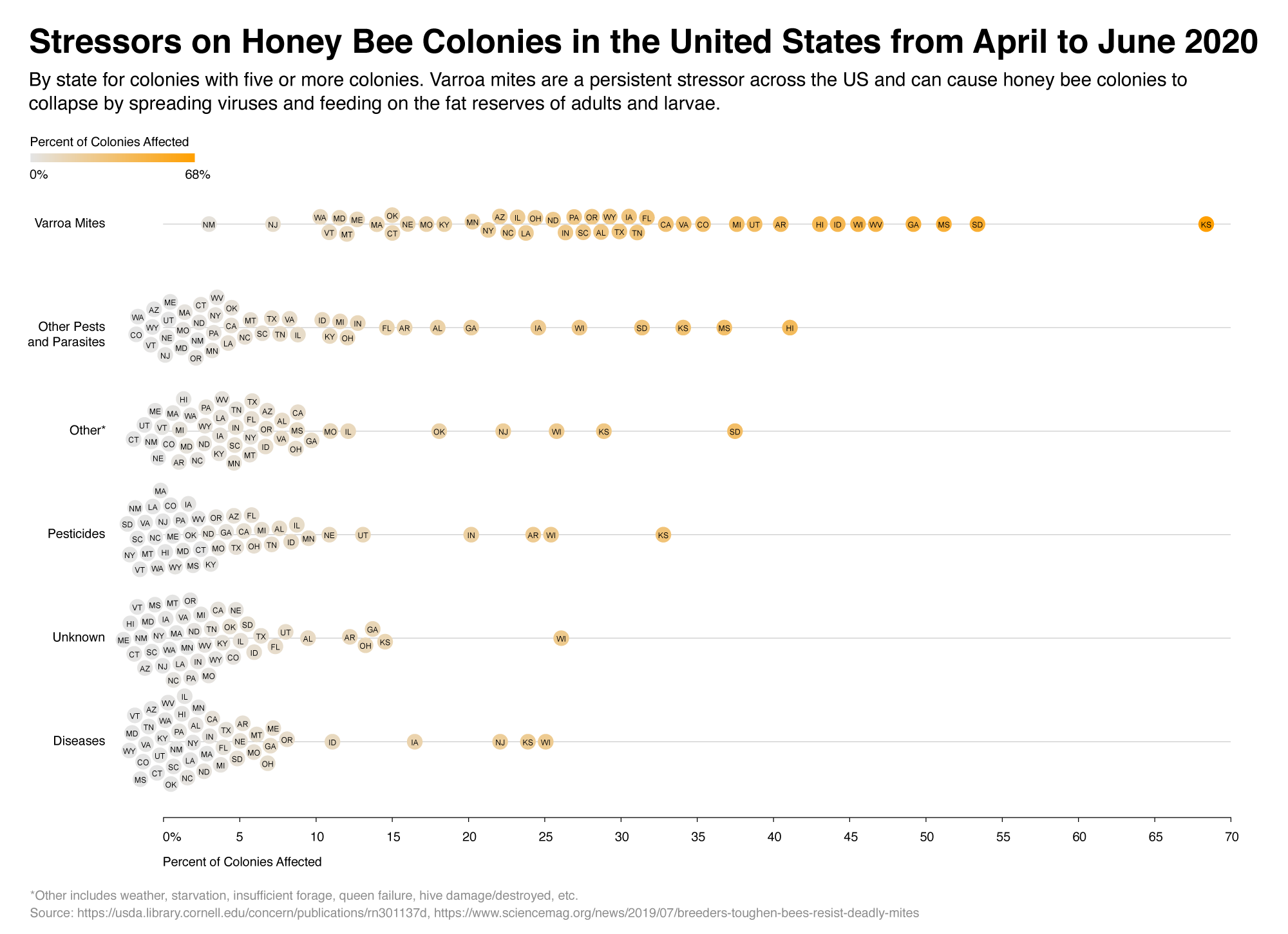
The United States Department of Agriculture publishes data on honey bee colony health stressors (with five or more colonies) across all states. A health stressor could be Varroa Mites, other pests or parasites, diseases, pesticides, or other causes (such as weather, starvation or unknown reasons).
Let’s use a beeswarm plot to see how these stressors are distributed.
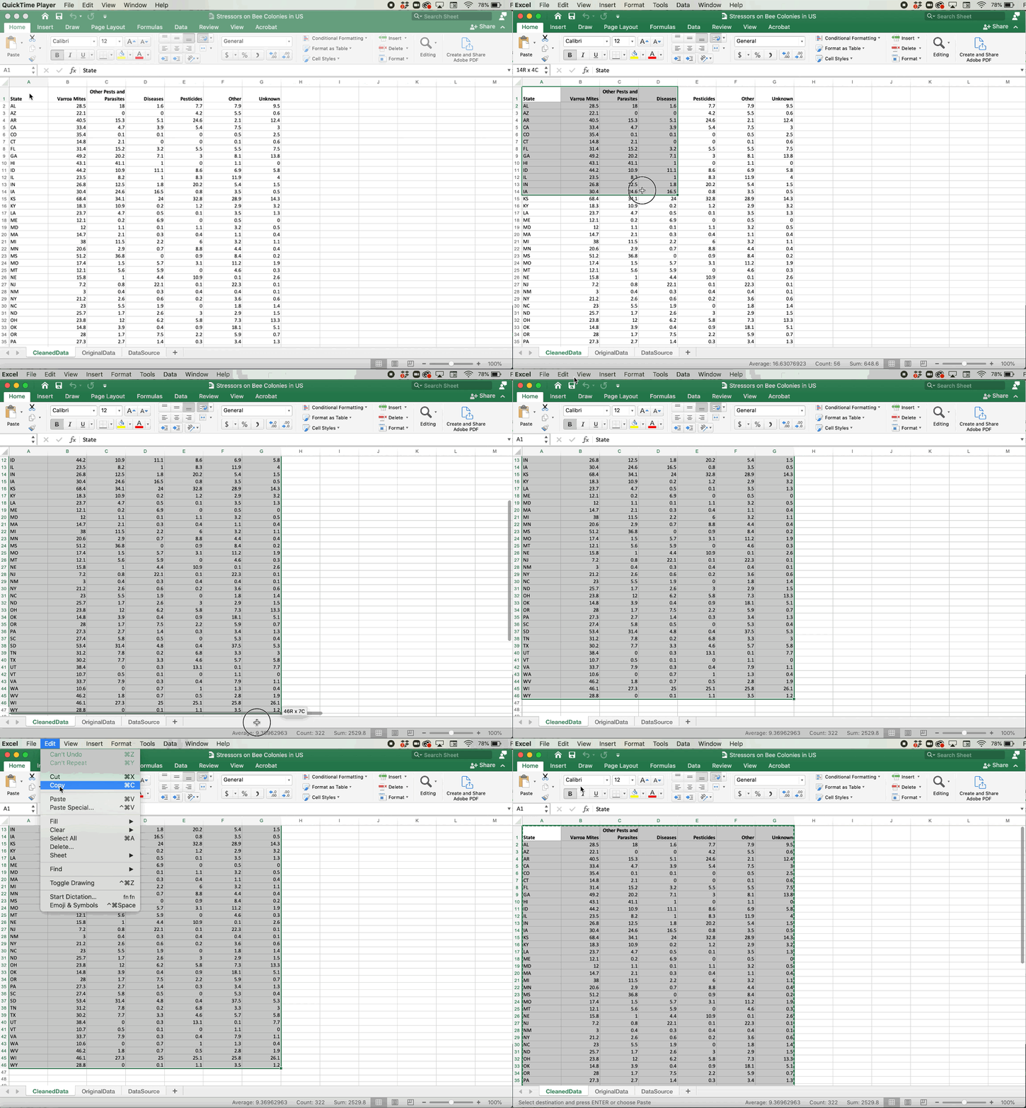
I downloaded the dataset for April-June 2020 and added the state abbreviation. Feel free to download the original data set from the Department of Agriculture site yourself, but I’ve included the cleaned Excel file in this tutorial for you to use.
- Click here to download the Excel file with the cleaned data set
- In the CleanedData tab, select all the cells with data
- Copy the data by clicking Edit > Copy
STEP 2: Create the beeswarm plot in RawGraphs
- In an internet browser (like Chrome, Firefox, etc.), navigate to App.RawGraphs.io
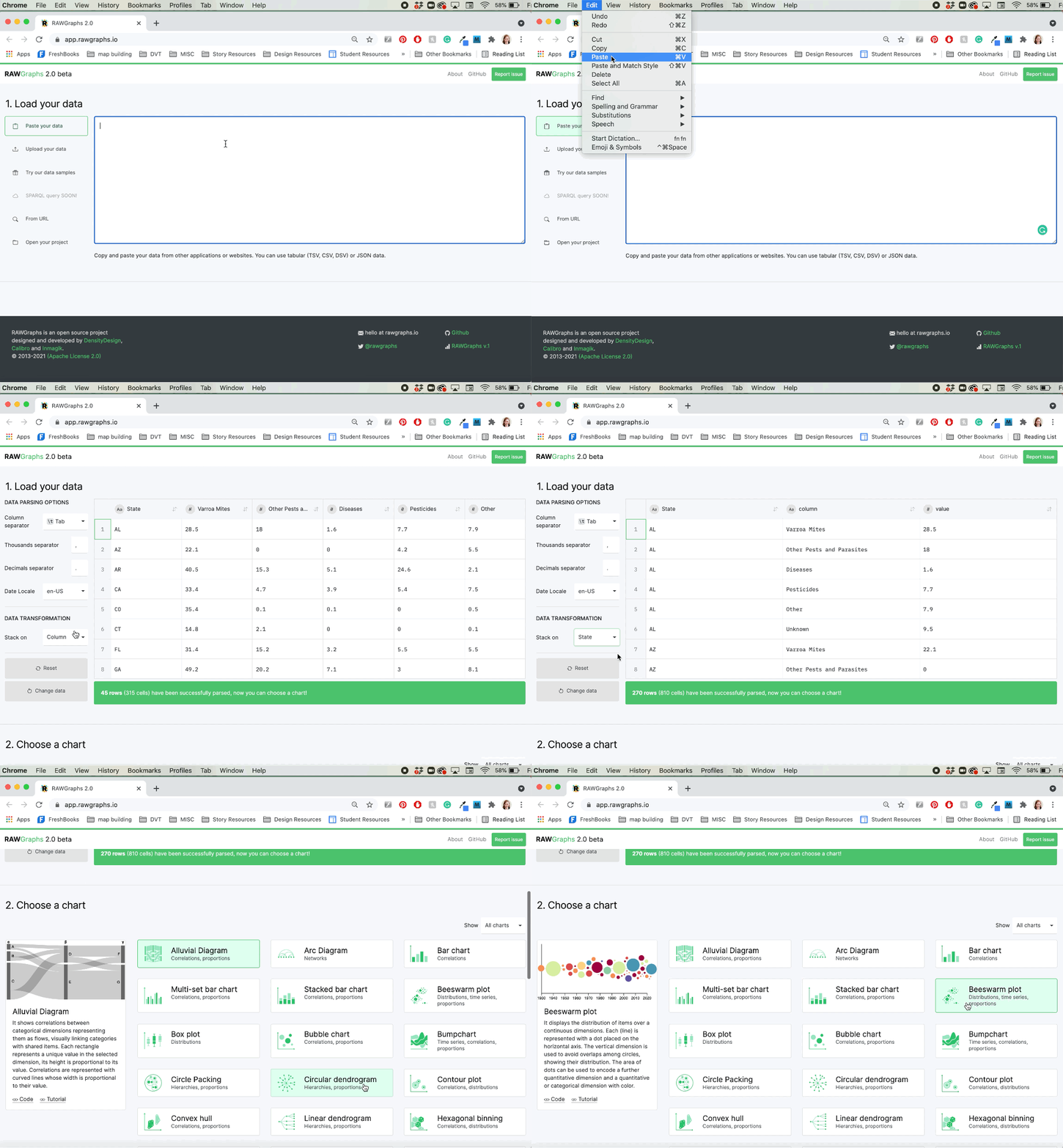
- In the “Load Your Data” section, click inside the white box
- Paste in your data by going to Edit > Paste
- In the left-hand column under “Data Transformation”, choose to stack on the State variable (this changes our data from a wide format to a narrow format, you can read more here)
- Scroll down to the “Choose a Chart” section, and select “beeswarm plot”
- Scroll down to the “Mapping” section
- Drag Value to “X axis”
- Drag Value to “Color”
- Drag State to “Label”
- Drag Column to “Series”
- Scroll down to the “Customize” section
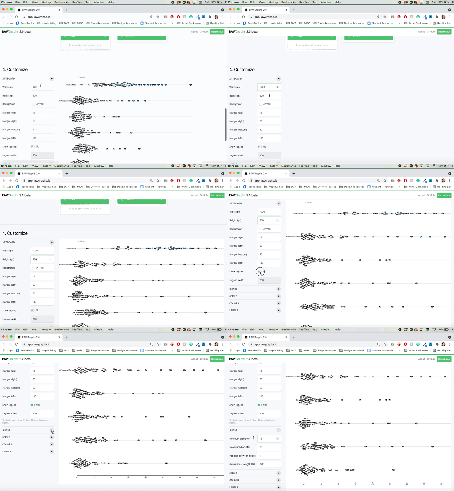
- Change “Width (px)” to 1500
- Change “Height (px)” to 850
- Change “Show Legend” to Yes
- Expand the “Chart” section
- Change “Minimum Diameter” to 15
- Expand the “Color” section
- Click on the “Start” color and type in the hex code E1E1E1
- Click on the “End” color and type in the hex code F5A623
- Expand the “Labels” section
- Change “Label” to Secondary
- Scroll down and select SVG as the file type and click Download
The SVG filetype stands for Scalable Vector Graphics. The gist is that this file type will allow you to edit each element individually (every circle, line, text) in software programs like Adobe Illustrator or PowerPoint. You can’t do that with a raster image (like PNG or JPG). Let’s make some tweaks in PowerPoint now!
STEP 3: Clean it up in PowerPoint
- Open up PowerPoint and click Insert > Picture > Picture from file
- Choose the SVG that you downloaded from RawGraphs
- Click on the button “Convert to Shape”
-
- NOTE: if you don’t have this button, you can update to the latest version of MS PowerPoint if you have a Microsoft 365 subscription, or make sure your version is 2018 or more recent.
- Right-click on the beeswarm plot and select Group > Ungroup
- Right-click somewhere on the circles two more times and ungroup (this allows us to select and edit each object individually, such as the circles, the text, the lines, etc.)
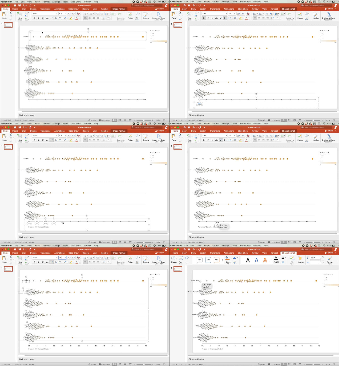
Now you’re free to tweak any element the way you’d like, but if you’d like yours to look like my example, do these steps:
- Select the group of State labels in each beeswarm and press the down arrow on your keyboard four times to center the state labels inside the circles
- Delete the Y-axis line and the Y-axis label
- Move the X-axis label down and toward the 0 mark, change the text size to 15, and rename it “Percent of Colonies Affected”
- In the 0 label, add %
- Select all the X-axis number labels by clicking on one, holding down the Shift key and selecting the others, then increase the text size to 15, and press the down arrow on your keyboard 10 times
- Select one of the horizontal lines (it will select the whole group), right-click and choose Bring to Front
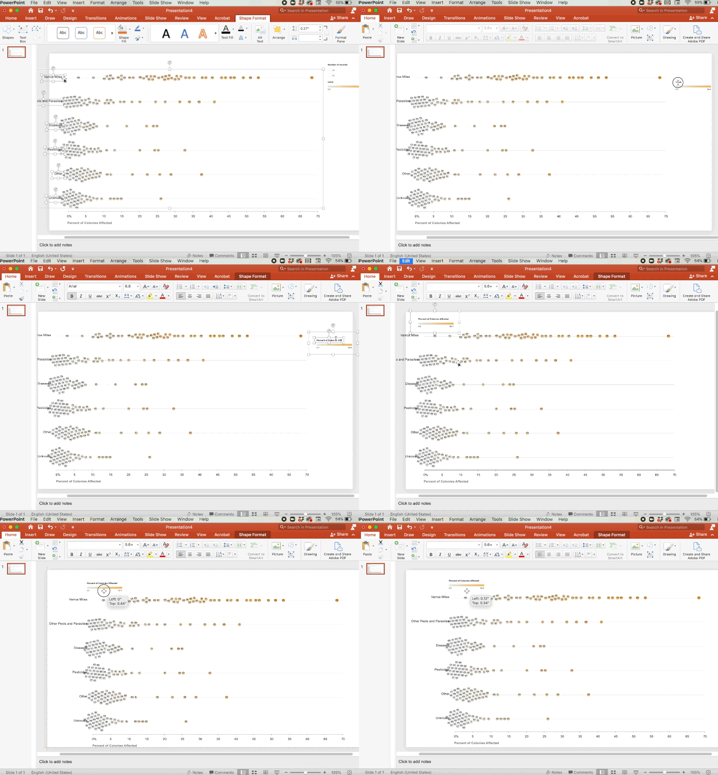
- Select all of the stressor labels (e.g. Varroa Mites, Other Pests…) by clicking on one, holding down the Shift key and selecting the others, and change the text size to 15, go to Arrange > Align > Align Right, and then move the labels to the left until you can see them clearly
- Right-click the legend and select Group > Ungroup
- Select the “Number of Records” legend and delete it
- Move the color legend to the top left of the page and rename it “Percent of Colonies Affected”
- Add a text box to the top for a title and subtitle and paste in this text:
- Stressors on Honey Bee Colonies in the United States from April to June 2020
- By state for colonies with five or more colonies. Varroa mites are a persistent stressor across the US and can cause honey bee colonies to collapse by spreading viruses and feeding on the fat reserves of adults and larvae.
- Add a text box for the footer and paste in this text:
- *Other includes weather, starvation, insufficient forage, queen failure, hive damage/destroyed, etc.
- Source: https://usda.library.cornell.edu/concern/publications/rn301137d, https://www.sciencemag.org/news/2019/07/breeders-toughen-bees-resist-deadly-mites
- Go to File > Export and choose any file type you need (e.g. JPG, PNG)
And there you have it! A slick beeswarm plot that’s ready to *shine* without days of tutorials. Making complex charts doesn’t need to be so time-consuming; you just need to know the right workflow. Try out the other chart types in RawGraphs, and you’ll be your team’s go-to chart designer in no time!
Never miss an opportunity to level up your data skills and subscribe to the Data Literacy newsletter.
—
Alli Torban is a contributor to Data Literacy LLC. She’s an Information Design Consultant based in Washington, D.C. and hosts the podcast Data Viz Today. Alli specializes in designing data visualizations for industry experts to help get their work seen and understood by a wider audience. She enjoys creating whimsical patterns and spending time with her husband and two daughters.

