Anthony Starks on Recreating Du Bois’s Iconic Style
Allen would like to acknowledge Anthony Starks for his expert assistance with this article.
Earlier this month, Sekou Tyler, Anthony Starks and I thought it was important to recognize the accomplishments of W.E.B. Du Bois. Du Bois’ sophisticated quantitative research leveraging data visualization, is not as widely known as it should be. We decided that we were going to run a Twitter challenge where participants can recreate Du Bois’s data visualizations. We’re fortunate to have Anthony on our team because he has recreated all of the Du Bois 1900 visualizations!
Anthony is a developer and designer who likes to combine art with code. His career started in the 1980’s as an IT person in the pharmaceutical industry. One of the things he’s most proud of is helping to bring the Internet and the Web to a large corporation when these were nascent concepts in the early 90’s. Later, he was introduced to a free graphical library and developer environment called Processing. This integrated development environment (IDE) helped him discover the power of using code to generate visuals. He began to use this concept to generate diagrams to communicate ideas at work. This led to him building his own tools to make his bespoke visualizations and diagrams. “It was easier to let the computer do the work instead of laboriously pushing pixels around”.
When Sekou and I met with Anthony to discuss his Du Bois recreations, he explained that he was “immediately struck” by Howard Wainer’s presentation on “Historical Development of W.E.B. Du Bois Graphical Narrative.” This was back in May 2017 at a Data Visualization New York meetup hosted by data viz pioneer Naomi Robbins. He was in awe of the existence and artistry of Du Bois’s work. The thought that immediately came to his mind was, “How can I reproduce this?”
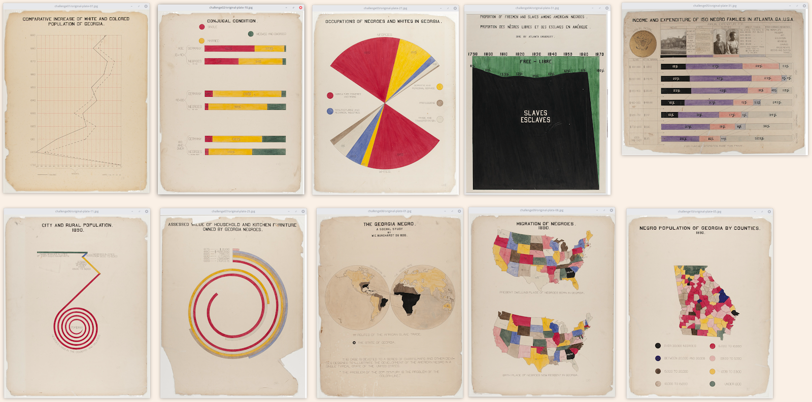
Du Bois’s original visualizations, one for each week of the challenge. These plates range from line graphs, maps, bar charts, pie charts, area charts all the way to the more advanced spiral graphs.
Sparked by Jason Forrest’s scholarship on Du Bois, Anthony started his recreation journey in July 2019 while on vacation. His goal was to be very faithful to the originals, at times making analog measurements with a ruler and protractor to make sure the proportions were correct. As guides, he used “W.E.B Dubois’s Data Portraits Visualizing Black America” by Whitney Battle-Baptise and Britt Rusert as well as the collection from the Library of Congress. The order of the re-creations was somewhat random – choosing what looked interesting and diving in. He continued the process until fifty-seven plates were completed in October 2019.
When you look at Du Bois’ work collectively we have to be reminded of their intent. Du Bois put this work together for the 1900 Paris World Fair to emphasize the progress Black Americans had made 35 years after emancipation from slavery. Every element was intentional in drawing the audience member’s eye to the visual. Anthony explained that scale is very important. The visualizations at the World Fair were poster-sized (22×28”) and using bold colors. The color palette is used to denote racial characteristics and concepts like freedom, and the red, black and green is reminiscent of the Pan African Flag adopted 20 years later. Anthony summarizes it like this, “This style can be used in many areas— specifically where you want to hook the audience and be bold, to stretch conventions, not shying away from invention and unconventional forms. He’s created a style guide here.
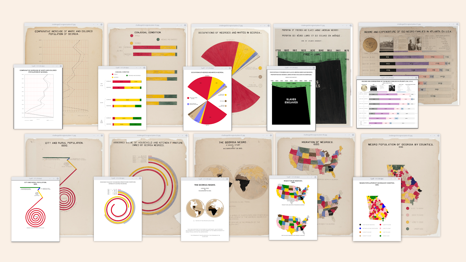
Anthony started his recreation journey in July 2019 finishing in October 2019. His goal was to be faithful to the originals.
The #DuBoisChallenge is a 10 week event currently in its 3rd week. The response from the data community about the challenge has been exciting and encouraging. You can find instructions and links to data sets here. For those in the R community looking to participate in #TidyTuesday the link for that is here. We encourage everyone to join and have fun with it!


