How to Annotate Like a Designer
Do you wish the text in your charts looked more refined?
I’ll show you how to make your annotations look more professionally designed with a few small tweaks using PowerPoint. Once you see these tweaks in action, you’ll begin to make these refinements more naturally just like a designer.
What are annotations? Nathan Yau says in his book Data Points that annotations are an extra layer of information on top of a visualization that provides context and directs readers to points of interest. This could include boxes, arrows, lines, and text in a chart.
First, I’ll give you an overview of my guidelines or rules-of-thumb for nicely designed annotations, and then I’ll show you how I improved the annotations in this real-life example in under 2 minutes.
Guidelines
- Start simple. Start with as few elements and colors as you can. Get your point across, and then add more as necessary. This includes placing text as close to the data point as you can, removing boxes around text, and keeping lines or arrows short.
- Align with purpose. Decide how an element will be placed and do it the same way for each instance of that element (e.g. all data labels are centered over the point or all sentence annotations are left-justified) unless there’s a strong reason to not follow the pattern. Also, strive to align each object with something else.
- Create a hierarchy with your text size. There’s a lot of text in a chart from the title, subtitle, axes labels, data labels, and extra explainer text. Each one should be sized consistently to guide your reader to the important parts and create a clean appearance. I use the Urban Institute’s Data Visualization Style Guide’s advice as my starting point. Rule-of-thumb: Title size 18, subtitle 14, axes labels 12, data or direct labels 12 or 14 (can include bolding).
In Action
Here’s a real-life example to see these guidelines in action. My sister is an accomplished electrical engineer who occasionally makes charts, and she doesn’t consider herself a designer.
She also just had a baby who spent a month in the NICU, which means at the beginning she exclusively pumped her breastmilk to give to the hospital. She Googled for how much milk she could expect to pump in the first few days and when she would establish a pumping routine, but she was really frustrated by what little information she found. So she decided to track her own data!
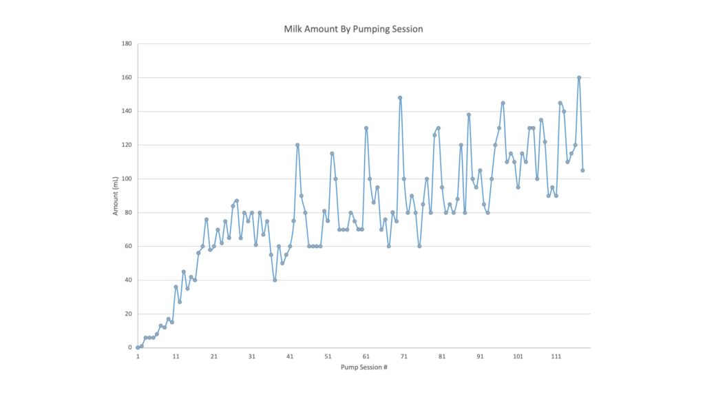
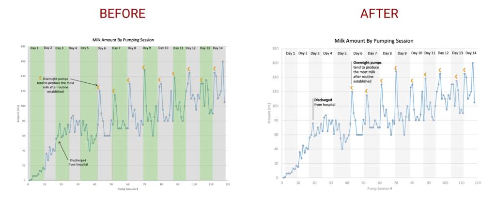
She kept diligent notes of every pumping session and created a chart of the amount of milk she got from each session. Here’s the original chart from Excel:
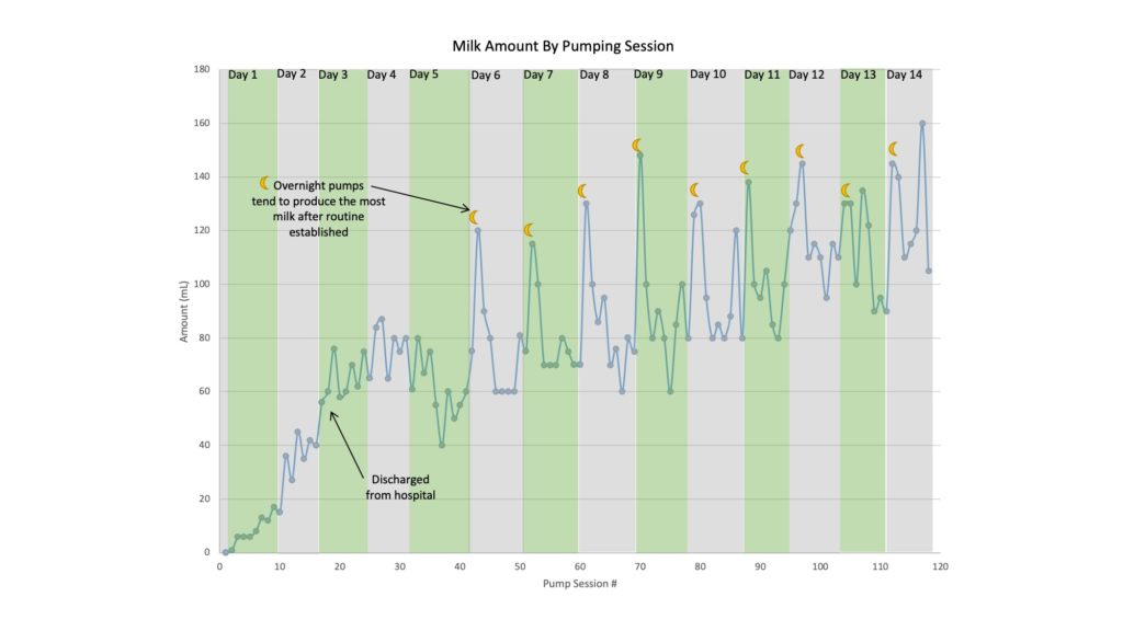
It’s hard to see a pattern without the individual days annotated, so she decided to add the annotations using PowerPoint.
She created boxes for each day and added a text box to label each one. Then she added a moon icon over her night-time pumping sessions to see if there was a pattern. It turned out that her overnight pumps were the most substantial once she got into a routine, and it took about 5 days to get into a routine.
Adding the annotations gave her a lot of great insights! Having a baby and navigating the ups and downs of breastfeeding is an extreme challenge. Seeing what to expect in this chart was helpful to her, and I thought it could be invaluable to other new moms who are trying to navigate the same thing.
Since this chart would be so beneficial to other new moms, I wanted to make the annotations easier to read, so I asked her if I could make a few quick tweaks to make the annotations look a bit more polished.
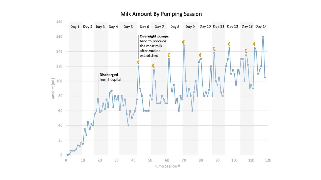
I followed my guidelines and made a few quick tweaks in under 2 minutes:
- Start simple.
- She used grey and green boxes to highlight each day, but you can use white space in your favor! I deleted every other box and used a light grey color.
- The annotations within the chart can be closer to the points they’re referencing. Try to keep lines short, vertical or horizontal, and arrowheads aren’t necessary here.
- Align with purpose.
- Longer sentences are easier to read when they’re left-justified so I did that for the two sentences inside the chart.
- The labels for the day number were left-justified in the top corner, but they looked squished up there. I center-aligned them within the box and gave them padding along the top. I made sure they were all aligned by selecting them and clicking Align > Arrange > Align Middle.
- Create hierarchy with your text size.
- The text in the chart is all Excel defaults, but we want the text to be easy to read and guide the reader to the important aspects. I changed the title size to 18, axes labels to 12, and the in-chart call-outs to 12.
- To add more emphasis to the call-outs in the charts, I added some bold text, and I changed the color of the axes labels to grey.
Here’s a video to show you each step in action:
And there you have it! A few simple guidelines that will help you create more polished annotations in your charts just like a designer. Please share with anyone trying to refine their chart design skills (or an expecting mom who could use the intel!).
Never miss an opportunity to level up your data skills and subscribe to the Data Literacy newsletter.
Alli Torban is a contributor to Data Literacy LLC. She’s an Information Design Consultant based in Washington, D.C., and hosts the podcast Data Viz Today. Alli specializes in designing data visualizations for researchers to help get their work understood by a wider audience. She enjoys creating whimsical patterns and spending time with her husband and two daughters.

