ChatGPT + Wolfram: A First Look

It seems the marriage of statistical AI (LLMs such as OpenAI’s ChatGPT) and symbolic AI (rules-based programming languages such as Wolfram Language) is poised to revolutionize how we perform some of the tasks of data analysis and data visualization, as well as how we go about describing the results of that analysis using everyday language. Based on my early exploration of the Wolfram plugin to ChatGPT, currently in alpha, I believe this will have a major impact on how we interact with data, and what it means to be highly data literate.
In this blog post, I’ll review an advanced feature of ChatGPT, one that’s only available to select individuals chosen from a waitlist. If instead you’d like a primer on more basic uses of ChatGPT, along with important warnings and caveats about its use, you can take our recently launched ChatGPT Basics on-demand course, and you can pre-order the ebook of the same name on Amazon. The ebook will come out next week.
So, cutting to the chase, what happens when ChatGPT is connected to Wolfram? Here’s the result of a series of prompts I entered asking for a short news blurb about the current temperature (March 28, 2023) in Seattle and Palm Springs, and then asking for a bar chart that visualized those temperatures:
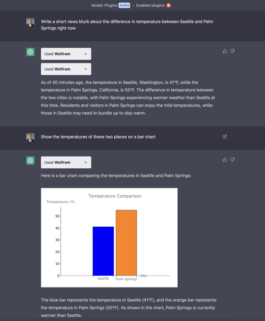
What’s notable about this simple exchange is not the insight itself – temperature differences don’t exactly amount to advanced analytics. Nor is the visualization it made remarkable – it’s a rather bland bar chart, and we can argue about whether a y-axis that starts at 0 is needed for an interval scale variable like Fahrenheit. Even the news blurb itself, while kind of clever, is not what you would call articulate prose.
What’s remarkable about this exchange is the workflow itself. I did all of this using everyday language. I didn’t search for the data. I didn’t prepare it for analysis. I didn’t analyze the data myself in Excel or Tableau or Python or any other analytics tool or programming language. I just asked it to do it for me, and it did. Based on my prompts, here is the code ChatGPT wrote in the Wolfram Language:
It’s interesting to note that the temperatures provided are for today, March 29, 2023. How is that possible if ChatGPT is only trained on data up to September 2021? It’s possible because ChatGPT is not using its training data to guess about the two cities’ temperatures. It’s getting the data from Wolfram, and Wolfram has today’s weather data.
People in the data visualization world are wondering what this all means for those of use who have spent a lot of time thinking about charts and how to make really good ones. Nick Desbarats of Practical Reporting published an article yesterday titled “Will AI Automate Data Visualization?” that’s worthy of your time if you’re at all interested in how this could play out in the coming months and years as the technology evolves. In the article, Nick explores the question “Will AIs be able to create expert-level charts without any human intervention, and, if so, when might that happen?”
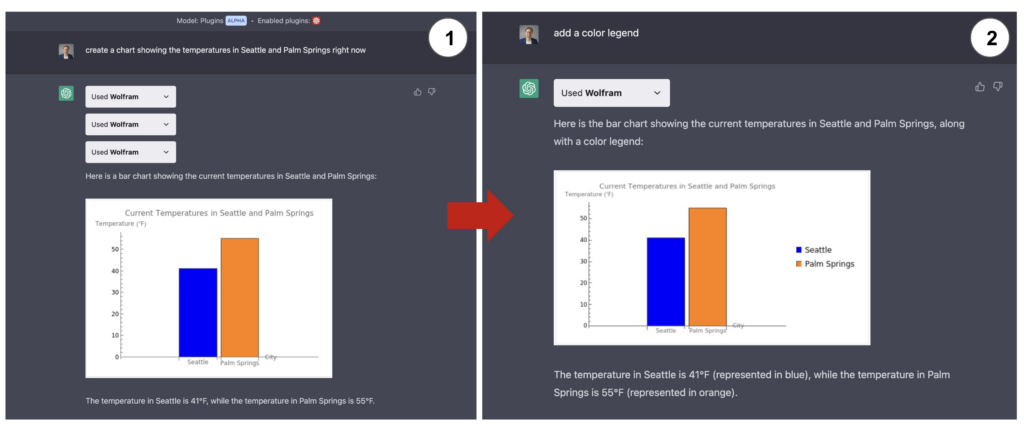
When I shared a screenshot of this prompt on Twitter today, Steve Wexler of DataRevelations asked, “What would have happened had you not specified “bar” chart, but just “create a chart”? This is an interesting question because it probes an aspect of data visualization about which much ink has been spilled: Chart Choice. Given a particular dataset and a particular question, what type of chart should we choose to show the data and answer the question? What will AIs choose? So I tried the more generic prompt that Steve suggested. It generated a bar chart again:
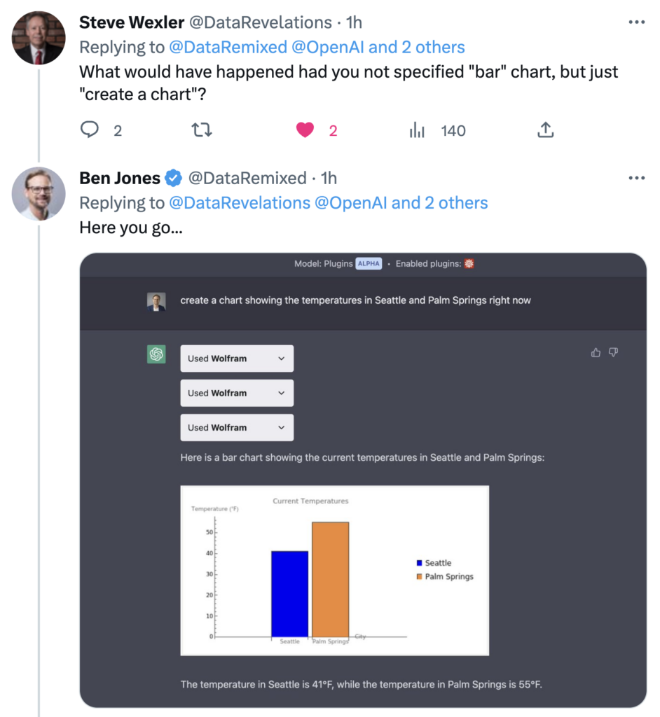
Steve pointed out that the new bar chart included an unnecessary color legend. After all, the bars themselves have a city name label below them, so there’s no ambiguity there. It’s interesting to note that the first time, ChatGPT translated my prompt into Wolfram code that created a bar chart without a legend, and the second time it generated code that added the legend. This, I believe, demonstrates the somewhat random nature of the LLM (ChatGPT).
Based on Steve’s question, I tried a few more rounds of interaction, asking ChatGPT to add a legend, then remove it, then change the color of the bars to gray. All of these chart modifications were generated without hesitation:
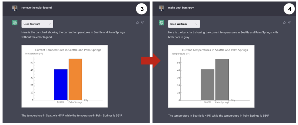
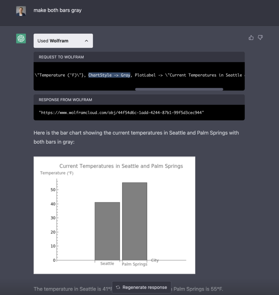
But what actually happened when I asked ChatGPT to make the bars gray? If we “open the box” by clicking the down arrow in the “Used Wolfram” box, we can see if we scroll to the right in the code box, we can see that ChatGPT added the “ChartStyle -> Gray” parameter to the Wolfram Language code it generated and sent to Wolfram. If we look below, we can see that the chart itself is what Wolfram created and sent back to us in the ChatGPT interface.
Andy Cotgreave of Tableau, who has published early video sessions exploring how ChatGPT struggles with data analysis, replied to my tweet: “Wowsers! Have you managed to check if it’s capable of doing correct numerical analysis with Wolfram? That will change the game significantly… (I’m still waiting to get access to the Plugin)”
This has been the biggest concern that data professionals have had with ChatGPT to date: the way it’s designed and built means that it doesn’t have explicit mathematical or logical rules, per se. GPT-4 seems to be an improvement over GPT-3.5, but the numerical and analytical outputs remain dubious and necessary of verification.
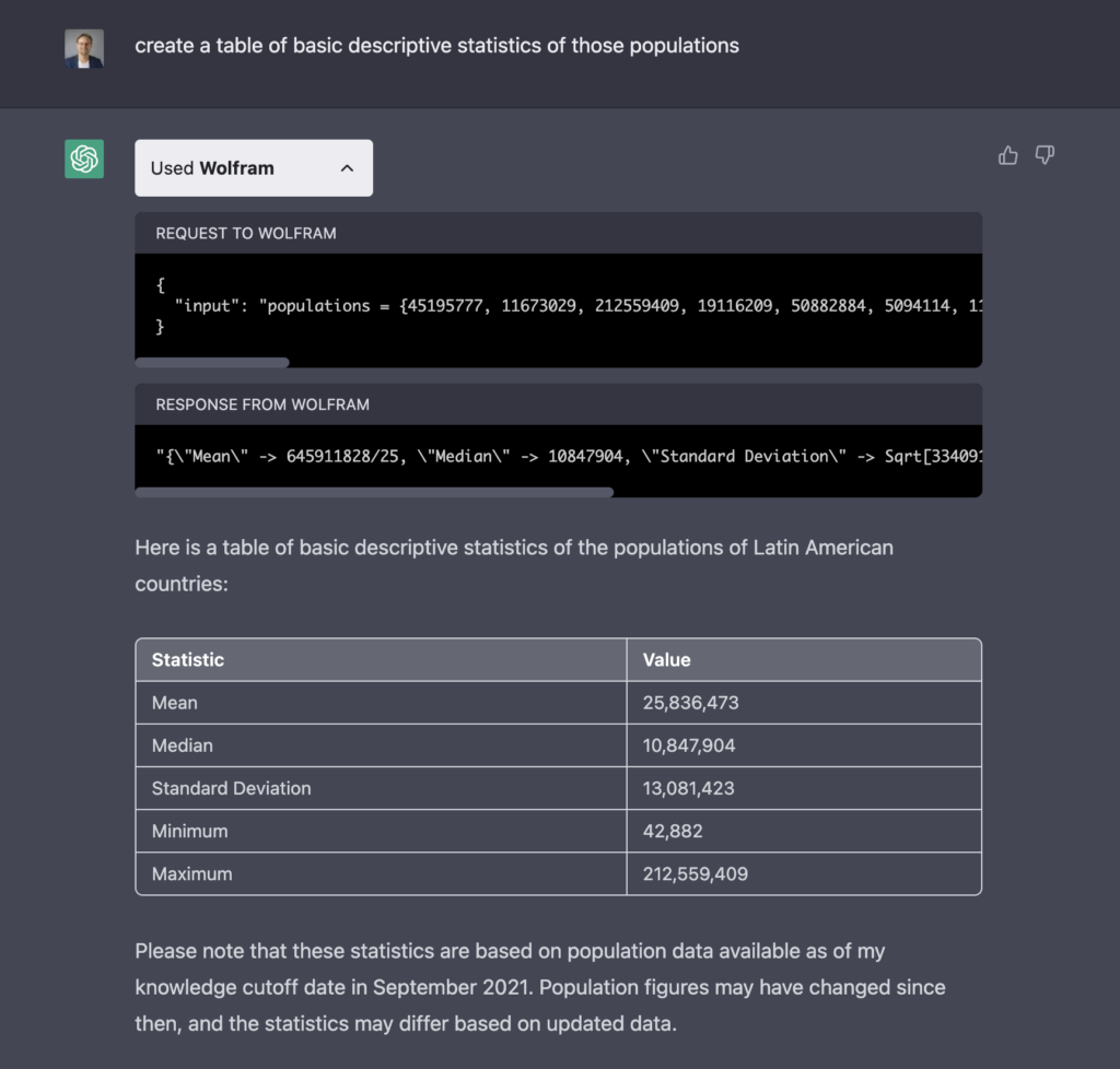
To answer Andy’s question, I tried asking the ChatGPT + Wolfram plugin about populations of Latin American countries, and then asked it to return a table of descriptive statistics of those populations. The part of the application that provided the table and performed the calculations on the values in the table was Wolfram, not ChatGPT:
It’s interesting to note that based on the way I carried out the “conversation” with ChatGPT, it decided to create a command for Wolfram that found the mean, median, standard deviation, etc, using the actual population values themselves, instead of calling a dataset of country populations.
Now, these two exchanges with ChatGPT enabled by the alpha version of the Wolfram plugin are basic and not groundbreaking in the type of data or in the depth of the analysis. But they do illustrate the possibilities of this combination. And there’s no doubt that it is very awe-inspiring. For more examples of how this combination of technologies can be used to solve problems in mathematics, chemistry, and other academic subjects, I suggest you watch the recording of the March 29th, 2023 live stream of Wolfram Dev team members on the Wolfram YouTube channel.
What potential issues arise when we put these two technologies together? What concerns does this marriage raise for humanity? How can we identify and prevent harm from being done?
I have no idea. For a sobering glimpse into what some thinkers in the field believe is possible, read this article by Eliezer Yudkowsy. I have a distinct feeling that the train has left the station, and it won’t be stopping or coming back.
Exciting, terrifying.

