A Data Journey Through Breast Cancer
In honor of Breast Cancer Awareness Month, I wanted to share some of my personal journey with breast cancer and how data impacted my experience.
August 6th, 2019 would become a date that I would never forget. I had just pulled into the parking garage at Amazon around 7:30am which I had done for over 7 years day after day uneventfully when I received a call from my primary care practitioner with news that would change my life. This seemingly normal Tuesday morning quickly became anything but normal as I heard the words, “I’m sorry to tell you this Becky, but it’s cancer” uttered to me in nervous and broken voice. This began the journey of my encounter with breast cancer where data became more important to me than it had ever been before.
It was just a matter of days before I was inundated with percentages, rates, ratios and many other forms of data to sift through, comprehend and analyze in order to make decisions for my health and ultimately, to preserve my life. Working at Amazon for over 7 years at that time, I was consistently challenged and overwhelmed by data and definitely considered myself “data-phobic”. Now, data was more critical than ever and my phobia needed to take a backseat so that I could make educated decisions for my health. Luckily for me, my soon-to-be spouse at that time and co-founder and CEO of Data Literacy, Ben Jones is the opposite of data-phobic and was able to help me navigate and understand all the data that was coming my way from my newly assigned care team and our independent research.
This story can’t be shared without one very key detail: Ben had just proposed to me seven days before this fateful diagnosis. To say we went from an incredible high to a record low in a very short period of time is an understatement. We were already in active wedding planing mode for a wedding the summer of 2020 (which little did we know then wouldn’t be possible due to Covid-19 which was looming in the unseen background at that point). Cancer wasn’t even a thought or on our radar in any way until that day. My PCP is a life-saver as she unexpectedly detected something off in a routine annual exam and though my mammogram had just come back clear, she wanted me to get an ultrasound. Her abundance of caution is what ultimately saved my life, as otherwise, it would have been a year or more before my cancer was detected and by then, the stage would likely have been much further progressed with a not-so-positive prognosis.
In an effort to preserve your treasured life minutes, I’ll move quickly through this next phase and get to the data. But first, I have to praise my then fiancé for showing me he was putting both feet into our future as uncertain as it may have felt at the time, by suggesting we just get married “now” before my treatment started so he could be by my side through whatever was ahead as my husband. If tears didn’t well up in your eyes from reading that, it’s all good – I cried them all for you that day. So, we wed on August 30th, 2019 on a beautiful Seattle rooftop, overlooking Lake Union with our three boys, closest family and friends. In 3 weeks we planned a beautiful wedding and had one of the best weekends of our lives! This all ended up being a silver lining given that the big and beautiful wedding we were planning for August of 2020 would have been cancelled due to Covid – so somehow, cancer saved the day, at least in regards to our wedding. Mr. and Mrs. Jones now locked arms and took on cancer, together.

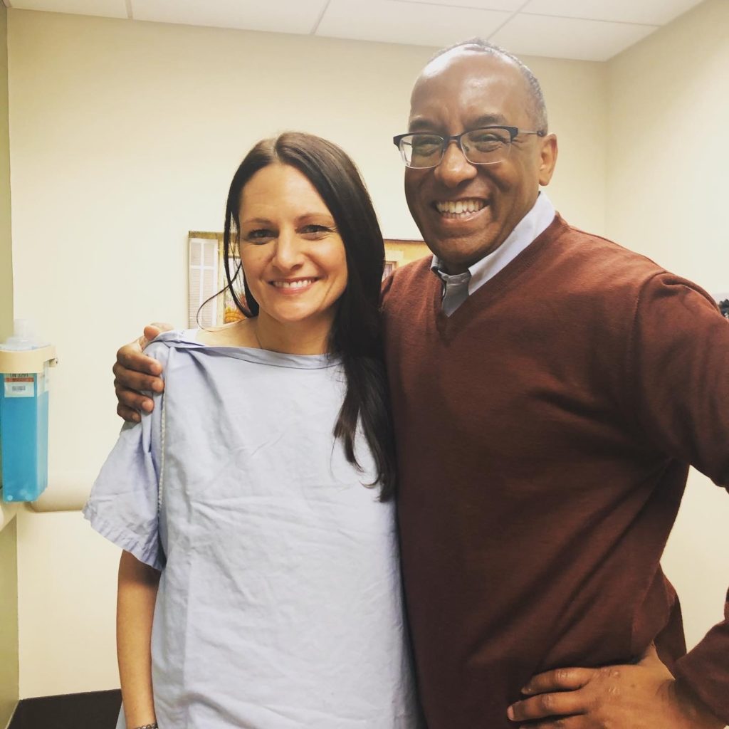
My oncologist, Dr. Carol Van Haelst and my incredible radiation oncologist, Dr. Michael Hunter (pictured with me below on my last day of radiation) laid out the land for me – helping me to understand what my prognosis looked like, what treatment was recommended and what the months ahead would consist of. All of this information of course based on yep, you guessed it, data. I’ll never forget Dr. Hunter telling me that I struck the cancer lottery and that if I had to have breast cancer, I essentially had the best one. After weeks of uncertainty, I now had answers and good ones at that. I felt an actual weight lifting off my chest. When you are waiting on diagnosis and prognosis – your mind goes in all directions. Waiting in the unknown I learned is the hardest part. The question of whether I was going to have to plan for my death or a very dark and long road was definitely present in my mind in those waiting days.
Now I had data and information and could start building out a plan and begin to see what was ahead of me. After more tests and a battle to avoid chemotherapy (which I won thanks to science and new testing available, and again, data), I was to have surgery (lumpectomy and sentinel node removal) followed by a month of recovery and then 4 weeks of daily radiation and 5 years of hormone therapy medication (Tamoxifen). Ok, I can do this. I felt so incredibly lucky to avoid 6 months of nausea, vomiting, hair loss and many other not-so-pleasant side-effects and also elated that with this treatment I had less than a 5% risk of “distant” recurrence within 5 years. Distant recurrence is when cancer comes back in another part of the body (e.g. breast cancer shows up in your lungs). This is known as metastatic cancer or stage IV which is what you are ultimately trying to avoid at all costs as this is often attached to pretty poor long-term prognosis. So off I went to surgery and radiation which I finished on Christmas Eve 2019 where I was surprised by a crowd of family and friends as I walked out of my final radiation appointment (thanks again to my now husband Ben who always goes above and beyond).
Interesting side-note: just 2.5 months later, the hospital where I received all of my treatment, EvergreenHealth went into lockdown over the first Covid-19 case in the United States! I was incredibly lucky to have finished all of my in-hospital treatment just prior to this virus that quickly took over our world and is still going strong almost two years later.
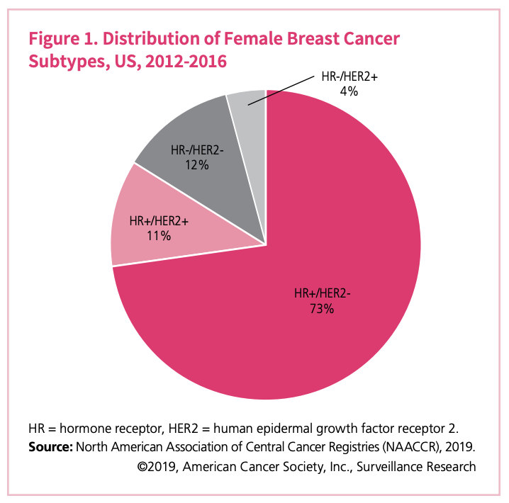
Within a few weeks of my diagnosis I learned several important data points about my cancer prognosis. For one, I learned I had the most common form of invasive breast cancer: HR+HER2-, Stage 1A. I won’t break down the acronyms themselves, though you can see what they represent in the pie chart below, but all-in-all this was a “good” diagnosis in the cancer world. From 2012 through 2016, 73% of women who were diagnosed with breast cancer in the U.S. had this type of invasive cancer (see pie chart). Additionally, I learned that I had one of the less common “histologic subtypes” (the size, shape and arrangement of the cancer cells in the tumor), which was lobular versus ductal. Lobular represents about 15% of invasive breast cancers.
Bottom line, my official diagnosis of Luminal A, HR+HER2-, with Luminal A being slower-growing and less aggressive type than other subtypes and associated with a positive prognosis, data was pointing me to a positive, and much less grim prognosis.
One side-note regarding cancer.org’s pie chart; pie charts are a hotly debated chart type and while I personally believe there is a place for them where the data is well-represented, you’ll learn through our Level 1 training here at Data Literacy that they can also get you into trouble! Cancer.org has used the pie chart somewhat effectively here, but you can see that had they not used color or clearly noted the percentages in the pie segments, you would have a hard time determining the difference in size between HR+HER2+ and HR-HER2-. Shameful plug to learn more about the many pitfalls to avoid in interpreting charts and graphs in our Data Literacy Level 1: Learning to See Data course!
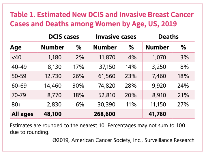
Back to the diagnosis. When I was diagnosed with cancer in August of 2019, you can see by taking a look at the chart above and right, 14% of women in the United States that were diagnosed with invasive breast cancer (IBC) were in my age group of 40 – 49 which also represented 8% of invasive breast cancer deaths in 2019.
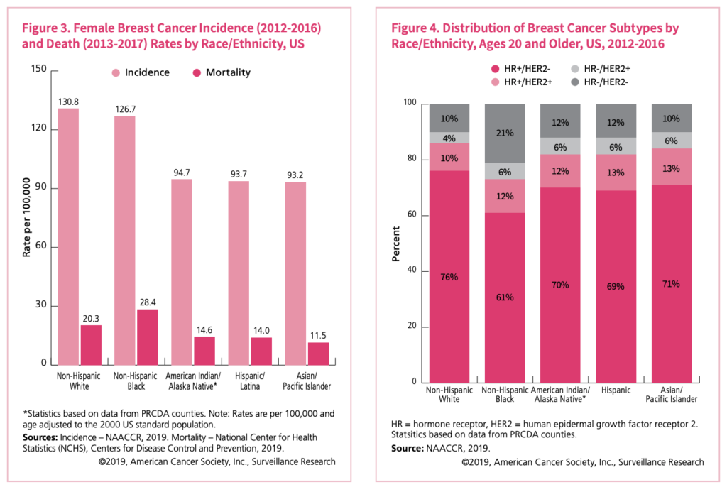
In researching, I also learned that ethnicity impacted the incidence of IBC diagnosis. A higher incidence of IBC is reported in the US for those that are ethnically represented as Non-Hispanic White (130.8 per 100,000) whereas the incidence for Asian/Pacific-Islanders is the lowest (93.2 per 100,000). See the below graph for details. Also, you can learn more about incidence versus prevalence in Alli Torban’s blog post from a few month’s back.
There are many data points that are important to understand when it comes to breast cancer and your risk of getting it and what type and severity you’re more likely to have based on where you live, your race, your age and your lifestyle. There is way more data available about all of this than we can cover in one short blog post. When it comes to health, data matters and we also have to become our own personal advocates. Data helps us advocate and is therefore critical in all health matters. I encourage you to take a look at Cancer.org’s Breast Cancer Facts & Figures 2019-2020 where they show all angles of breast cancer data in a highly visual and easy to interpret way. Learn the risk factors and where you fit within these risks and share what you learn with the women (and men) in your life.
I will end this with two points:
- My life was saved by early detection and a conscientious doctor. If you are ever told “you have dense breast tissue” or see this listed on your mammogram results, demand an ultrasound. Even if you have to beg. Do it. My cancer was missed, as are many for those that have dense breasts. Spread this to as many women (and men, too) as you can. Do self breast exams. Get your annual mammos. Know your body.
- Data is what guided my treatment, and without some baseline understanding of the numbers and data coming my way I would not have been able to make sound decisions about my treatment. Data matters. Data saves lives. Data prevented me from getting chemotherapy. Every human on this planet living in this world today should have a baseline understanding of data. Therefore, learning about data should be accessible and easy to obtain. We’re striving to do that here at Data Literacy and there is much more to come very soon so stay tuned.
Today, I’m alive. I’m healthy. I have a bright future ahead. Cancer is now a part of my life, and it always will be. I’ve been lucky enough however to allow it to fall in the backdrop and it’s no longer a frontline issue looming ahead of me. Thank you, science. Thank you, data. Thank you, Ben for your love and support always.
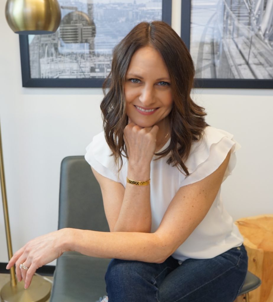
Becky Jones is the Co-Founder and COO of Data Literacy and leads all operations, business development and sales. When not building Data Literacy with her husband and Co-Founder Ben Jones, you’ll find Becky teaching yoga as a Registered Yoga Teacher at a few local Seattle studios, practicing yoga herself, cooking flavorful vegan food, hiking, Pelotoning or petting her favorite fur-ball, Winston. This is all in addition to raising 3 teenage boys! Busy and full life indeed.

