How to Make an Interactive Map with No Code
Do you want to create your own interactive maps, but you don’t know where to start?
I’m here to help! Let me show you how to make a map using Flourish Studio. We’ll go from spreadsheet to polished map that’s ready to embed in your website without a single line of code.
A few years ago, I found the data viz field through my love of maps. I’ve thought a lot about why I’m so enchanted by maps, and I think it’s because I can instantly relate to it. I can always find where I am right now in relation to the map. That’s pretty powerful.
I’ve also learned that just because I have the power to make a map, it doesn’t mean that the data needs to be shown on a map.
If I have a geographic component to my data and am tempted to make a map, I ask myself: what do I want my audience to take away from this graphic? The answer could indicate that a different chart type would highlight my takeaway more effectively (my favorite resource to review different chart types is the Financial Times Visual Vocabulary).
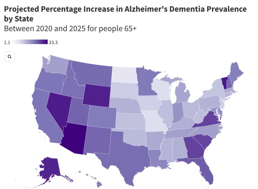
With that important caveat in mind, here’s the map that we’re making today:
First, what kind of map is this?
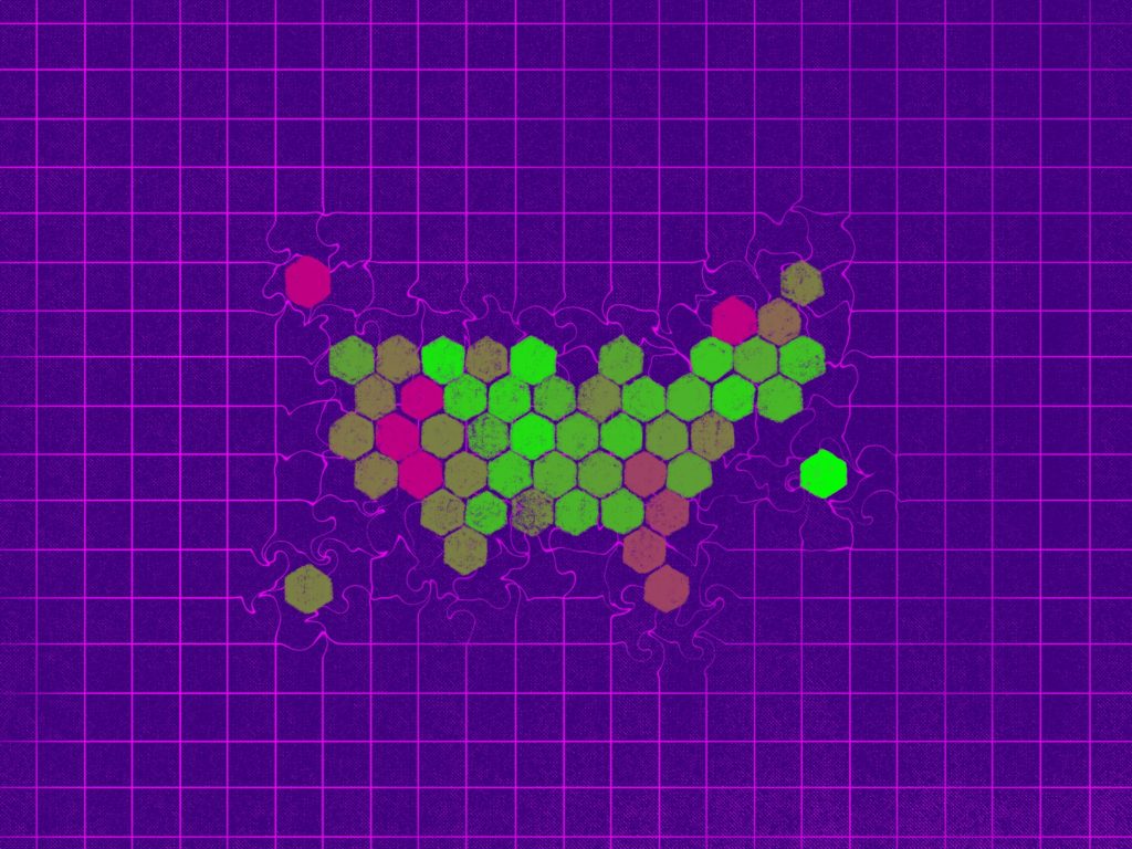
This is called a hex map or a hexagon grid map.
A hex map is a type of gridded cartogram, where each area is represented by an equally sized hexagon. In this case, each hexagon represents a state, and the color of the hexagon is determined by our data.
The benefit of a hex map is that each state looks equally important because each state is the same size. The downside is that the geography is shifted a little so it can be a little less intuitive (e.g. Virginia is to the left of North Carolina, rather than above it).
In cases where accurate geography is more important to you, then you may want to create a choropleth map instead.
“Choropleth maps use colors, shades, or patterns on geographic units to show proportional quantities and magnitudes.” (source: Better Data Visualizations by Jonathan Schwabish)
I’m sure you’ve seen plenty of choropleth maps on the news and online. If pre-defined areas of a map (like countries or states) are colored in based on data, then it’s a choropleth. Here is our hex map as a choropleth map instead:
Choropleth maps are easy to understand, but there are some important considerations to keep in mind:
- Smaller areas will seem less important or be harder to see than larger areas (e.g. Since Texas takes up so much more space than Delaware, does it mean it’s more important?).
- If the data is raw (i.e. no calculations have been done, like cases per 100,000 people), then your choropleth may just be a reflection of an area’s population.
- Subtle differences can be hard to see. If there isn’t an obvious geographical pattern, perhaps a different chart type is better.
To dive deeper into considerations for choropleth maps, this is a very thorough article by Lisa Charlotte Muth for Datawrapper.
Because of the first consideration, I’ve chosen to use a hex map for this data set. Did you notice how Vermont is hardly noticeable in the choropleth map but it has one of the highest percentage increases?
Now let’s start creating!
____
STEP 1: Get the data
Because September 21 is World Alzheimer’s Day, I wanted to highlight the increasing concern we should have around Alzheimer’s in the United States.
Keeping the second consideration in mind, I chose a data set that has the projected percentage change in the number of people with Alzheimer’s between 2020 and 2025 by state.
Let’s make a map to see if there are any geographical patterns.
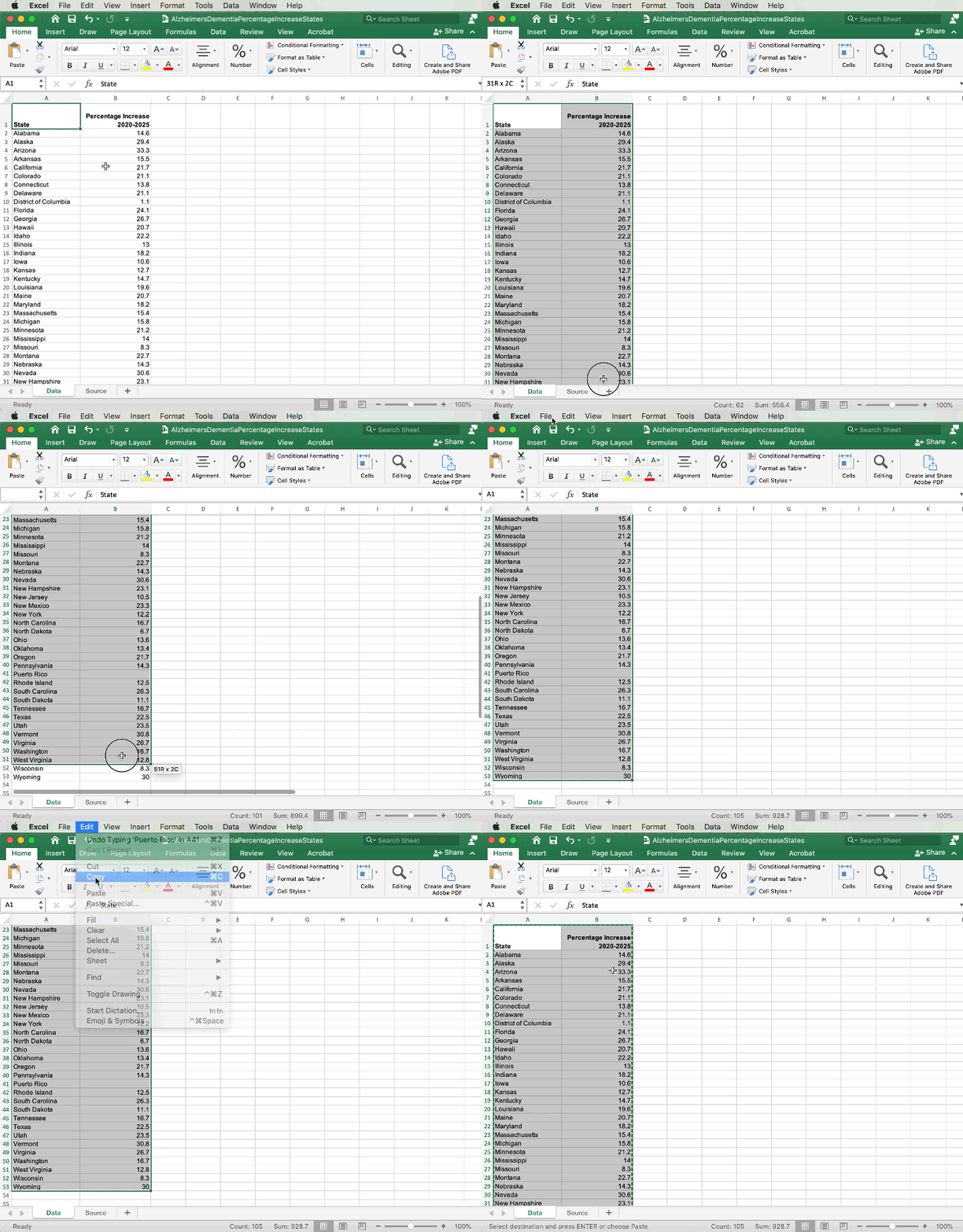
I downloaded the dataset from this Alzheimer’s Association Report. Please feel free to read the article and review the data from there, but I’ve created a spreadsheet that you can download below.
- Click here to download the Excel file with the data set
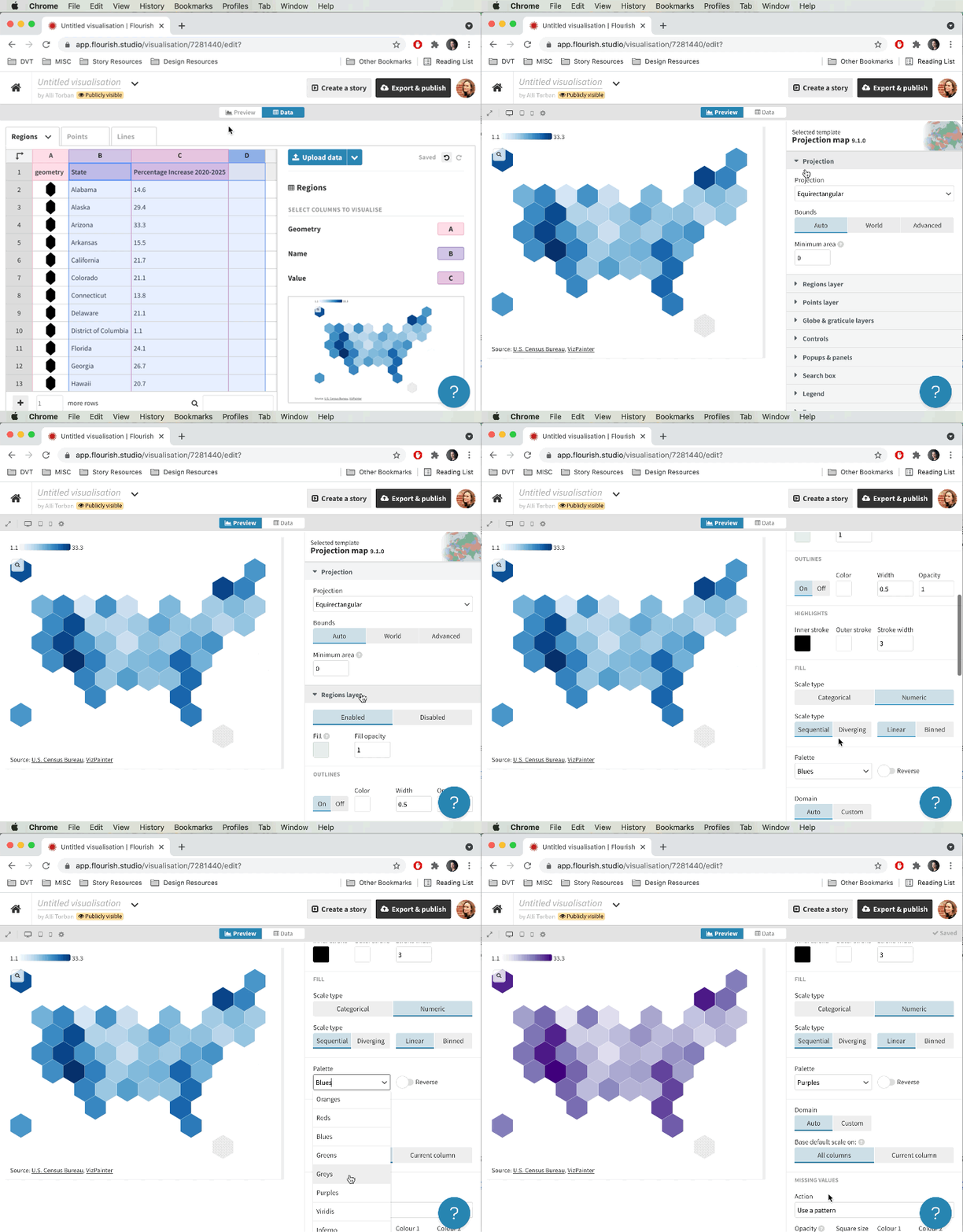
- In the Data tab, select all the cells with data
- Copy the data by clicking Edit > Copy
STEP 2: Create the map in Flourish
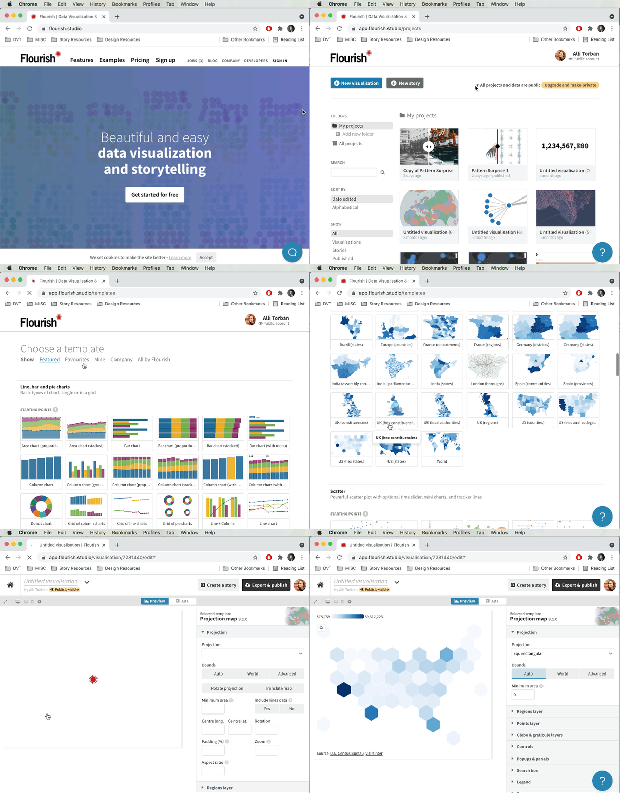
- In an internet browser (like Chrome, Firefox, etc.), navigate to Flourish.Studio
- In the upper right-hand corner, click Sign In
- Create a free account if you don’t have one
- Click New Visualization
- Select US (hex states)
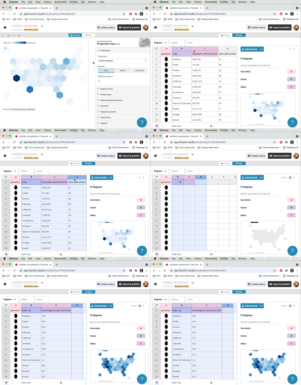
- Click on the Data tab
- Highlight columns B, C, D and press Delete on your keyboard
- Press Ctrl-V (Windows) or Command-V (Mac) on your keyboard to paste in the data that you copied from the spreadsheet
- Click on the Preview tab
- On the right-hand side panel, click on Regions layer
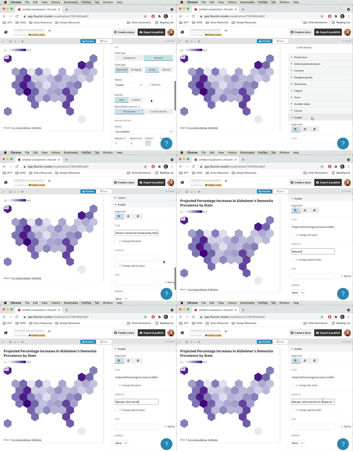
- Under Palette, choose “Purples”
- Scroll down and click on Header
- In the Title field, type in “Projected Percentage Increase in Alzheimer’s Dementia Prevalence by State”
- In the Subtitle field, type in “Between 2020 and 2025 for people 65+”
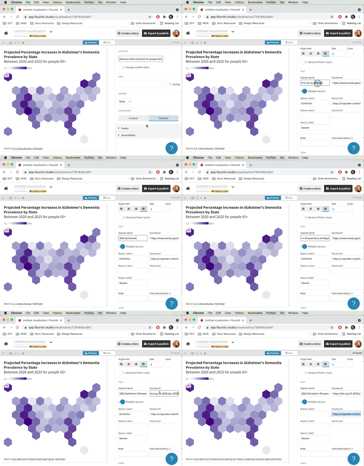
- Scroll down and click on Footer
- In the Source name field, type in “2021 Alzheimer’s disease facts and figures”
- In the Source URL field, type in “https://doi.org/10.1002/alz.12328”
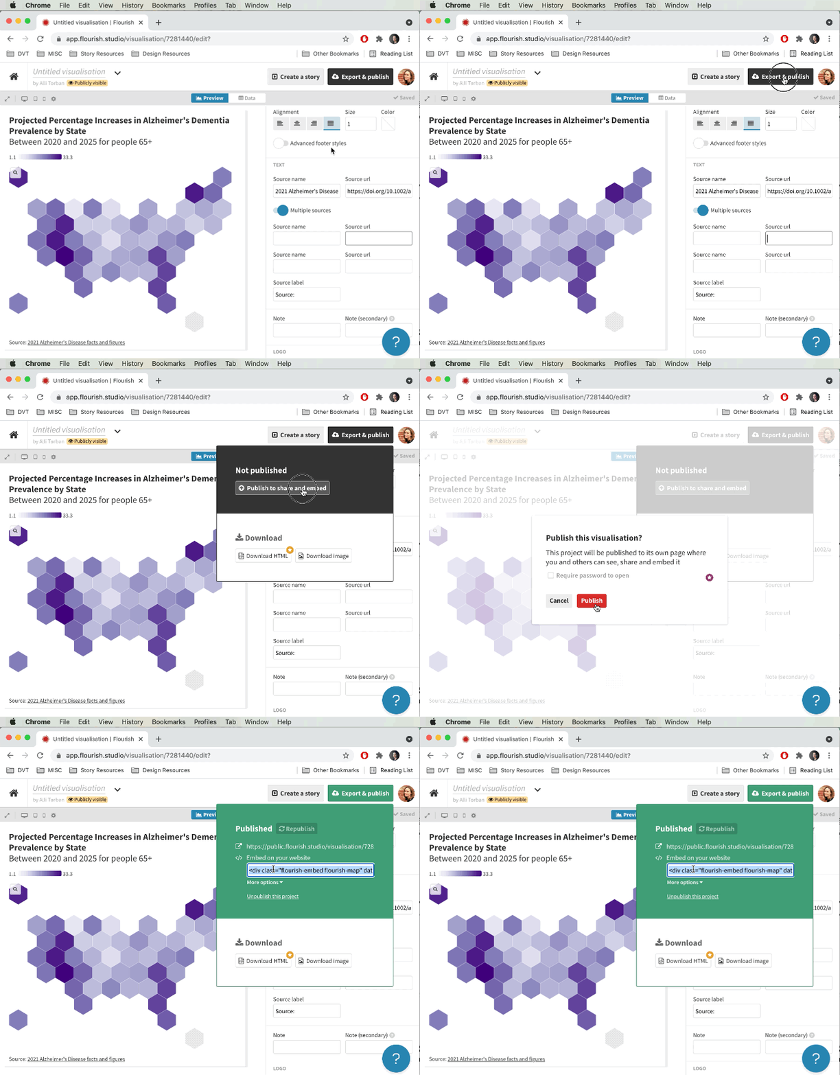
- In the top, right-hand corner, click on Export & publish
- Click Publish to share and embed
- In the pop-up, click Publish
- In the Embed on your website field, select the code in the window and press Ctrl-C (Windows) or Command-C (Mac) on your keyboard to copy the embed code.
*Note that your map is now publicly accessible. If you publish something that you’d like to keep private, you will need to upgrade your Flourish account.
STEP 3: Embed it in your website
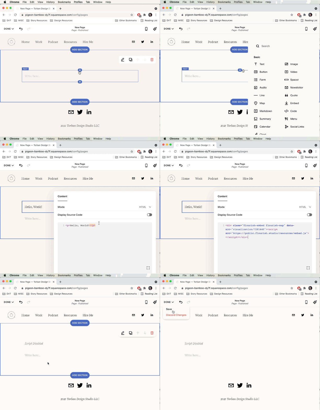
- Open up your Content Management System (such as WordPress, Squarespace, etc.) and create a new page with a code block
- Paste in the code you copied from Flourish by pressing Ctrl-V (Windows) or Command-V (Mac) on your keyboard
- Save and publish your page
And there you have it! An interactive map that’s embedded in your website without writing one line of code. Making your own maps is empowering; just keep in mind that it’s not always necessary. Try out the other chart types in Flourish, and you’ll be your team’s go-to chart designer in no time!
Never miss an opportunity to level up your data skills and subscribe to the Data Literacy newsletter.
____
Alli Torban is a contributor to Data Literacy LLC. She’s an Information Design Consultant based in Washington, D.C., and hosts the podcast Data Viz Today. Alli specializes in designing data visualizations for researchers to help get their work understood by a wider audience. She enjoys creating whimsical patterns and spending time with her husband and two daughters.

