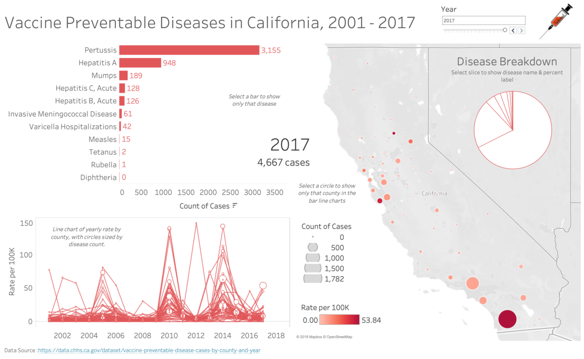
This past weekend, founder Ben Jones had the chance to travel to Los Angeles to train a group of professional journalists at USC on how to use Tableau Public, a free software product, to create an exploratory dashboard showing where high rates of vaccine preventable diseases had been recorded across California counties from 2001 to 2017.
Here’s the final version of the dashboard (click to go to an interactive version):
You can see the 40 slide instruction set that shows the steps the group walked through in order to join a disease count data CSV provided by the California Health and Human Services with a county population Excel file in order to compute rates and then visualize them:
Additionally, the data files can all be found in this Google Drive folder.
Huge thanks to the team at USC Annenberg School of Journalism for hosting the event and for inviting us to conduct the training!
If you’d like to schedule a similar training session customized to your data and needs, contact us using the “Lets Talk” button above.


